From design intent to working components
-
 Moe Hachem
 - March 13, 2026
From Design Intent to Working Components
A codebase-first pipeline for turning visual decisions into deterministic AI build rules
Most teams solve visual consistency the same way: they rely on developers remembering the design decisions, or they schedule periodic design reviews to catch drift, or they invest in a design system that slowly falls out of sync with the code. All three approaches treat consistency as a discipline problem. Something to be enforced through attention and effort.
The approach described here treats it differently. Consistency is a context problem. When an AI agent produces inconsistent UI, it’s not because it lacks taste — it’s because it lacks the structured context to make the right decision without guessing. Give it that context in the right form, and consistency becomes a procedural output rather than something you have to police.
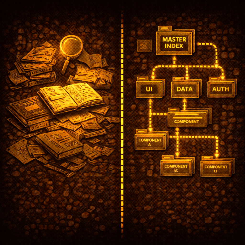
The mechanism is a two-file system: a design JSON that encodes visual intent, and a component index that encodes structural composition. Both are shallow indexes — lightweight, directional, consulted before the agent acts. The underlying principle (indexing decisions externally so agents can retrieve and apply them rather than reconstruct them from scratch) is explored in depth in the SR-SI white paper. This article stays focused on the practical implementation: how to build these two files, how to apply them, and how to keep them current.
The Starting Point: Design Decisions Need to Be Made Explicit
Before anything can be systematized, the design decisions have to exist somewhere in a form the system can use. This is true regardless of where the design intent comes from — an external agency, your own style guide, an existing brand you’re applying to a product context, or a visual identity you’re building from scratch.
The goal is not a full design system. A full design system specifies every component in every state. That’s valuable but expensive, and it breaks the moment the code diverges from the spec — which it always does. The goal here is narrower: a design DNA package that captures the rules, the palette, and the intent, and lets the system infer the applications.
The distinction is important. A design system tells you what a disabled button looks like. Design DNA gives you the rule — disabled means 40% opacity, cursor not-allowed, no state changes — and lets the system apply that rule to every interactive element consistently, including ones the designer never explicitly specced.
The Design JSON — A Shallow Index for Visual Intent
The design JSON is the first of the two files. Its job is to make every visual decision machine-readable: not just the value, but the intent behind it and the rules for applying it. An agent reading this file should be able to answer “what goes here?” without guessing.
Colors: value, purpose, location, rationale
Every color needs four things attached: its hex value in light and dark mode, its purpose (what it does), its location (where in the UI it lives), and its rationale (why it was chosen). The rationale is the piece most handoffs omit — and it’s what allows the system to apply the same logic to components that were never explicitly designed.
#1E293B :: {
  purpose: "Primary sidebar background",
  where: "Side navigation container, settings panel background",
  why: "Dark neutral that recedes visually, lets content area dominate.
        Chosen over pure black to maintain depth without harshness.",
  light_mode: "#F8FAFC",
  dark_mode: "#1E293B"
}
Every color family needs a full 50–950 scale, annotated by intended use. Without the scale, the system has to guess derivatives — hover states, disabled tints, background washes. With the scale, every derivative is predetermined.
brand-50:   #F0F9FF   (lightest tint — backgrounds, hover surfaces)
brand-100:  #E0F2FE   (light backgrounds, selected states)
brand-200:  #BAE6FD   (borders on light backgrounds)
brand-300:  #7DD3FC   (secondary accents)
brand-400:  #38BDF8   (icons, decorative elements)
brand-500:  #0EA5E9   (primary brand — buttons, links)
brand-600:  #0284C7   (hover on primary elements)
brand-700:  #0369A1   (active/pressed states)
brand-800:  #075985   (high-contrast text on light backgrounds)
brand-900:  #0C4A6E   (headings, emphasis)
brand-950:  #082F49   (darkest — dark mode surfaces)
Surface tokens: roles, not components
The key abstraction that keeps the design JSON tractable is surface roles. Instead of speccing each component individually, you name the role each color plays in the visual hierarchy. The same surface token applies across many components. Name it once, apply it everywhere.
bg-surface-page          (overall page background)
bg-surface-card          (elevated content containers)
bg-surface-card-nested   (card-within-card, secondary elevation)
bg-sidenav               (side navigation container)
bg-header                (top bar background)
border-surface-card      (card border, both modes)
border-divider           (section dividers, rule lines)
text-on-surface          (body text on card surfaces)
text-on-surface-muted    (secondary/helper text)
text-on-sidenav          (nav item text in default state)
text-on-sidenav-active   (active nav item text)
Notice what’s not here: button states, input variants, interactive behaviors. Those come from transformation rules, not per-component specs.
State rules: once, not per component
Universal transformation rules replace per-component state specs. One rule set, applied by inference to every interactive element.
hover:    Surface lightens 8% (light mode) / darkens 8% (dark mode).
          Border shifts to one shade more prominent.

focus:    2px ring in brand-300, 2px offset. Always visible.
          WCAG 2.0 compliant. Never suppressed.

active:   Surface darkens 12% from default.
          Transition: 100ms ease.

disabled: Opacity 40% on the element.
          Cursor: not-allowed. No state changes on interaction.
The design source defines the rules. The system infers the applications. This is the leverage point — a minimal spec, scaled by reasoning.
The aesthetic description
The design JSON also includes a qualitative description of the visual language — not a list of values but a narrative. This becomes the system’s fallback context for decisions not explicitly covered in the token maps.
It should answer: what is the overall visual personality? How does whitespace work? What creates depth — shadows, borders, background shifts? Are interactions snappy or smooth? Is the typography authoritative or approachable?
When the agent encounters an ambiguous edge case, it falls back to this description rather than guessing.
Building the design JSON: extraction then enrichment
The design DNA doesn’t become the design JSON automatically. It goes through two passes.
Pass 1 — Extraction (deterministic). Parse every design decision from the source materials into structured data. Every hex value, every surface role name, every rule. Nothing invented — if it exists in the source, it gets captured; if it doesn’t, it doesn’t get added. For designs with both light and dark modes, cross-reference the two to validate every surface has a counterpart. Output: a flat token list where every entry is a provable fact.
Pass 2 — Enrichment (inferential). Annotate each token with a machine-readable usage instruction. Every annotation must be grounded in evidence from the source — the system doesn’t invent usage patterns. For each token: locate it in the example screens, confirm against the surface annotations, write an instruction covering scope, constraints, and rationale. Output: the enriched design JSON.
The schema for each token entry:
| Field | Description | Example |
|---|---|---|
token_id | Surface-role identifier | bg-surface-card |
value_light | Hex value in light mode | #FFFFFF |
value_dark | Hex value in dark mode | #1E1E2E |
category | Token category | surface · text · border · spacing · type · state · shadow |
usage_instruction | When and where to apply — written for the agent | ”Use for elevated content containers above page background. Not for modals or overlays.” |
component_scope | Which component types this applies to | card, panel, data-table-container |
state_context | Applicable state transformations | hover: +8% lightness · focus: ring brand-300 |
design_rationale | Why this decision was made | ”Neutral white surface creates clear separation without adding visual weight.” |
evidence_source | Which screen or annotation proves this usage | Dashboard screen, card containers |
Then a human audit. The enrichment pass produces good output. The audit makes it trustworthy enough to be deterministic. Review the inferred instructions grouped by semantic category — not token by token, but by function. A token inferred as a card surface that’s actually used as a modal overlay will cause silent, hard-to-trace inconsistency in everything built downstream. The audit catches this before it gets encoded.
Once audited and committed, the JSON becomes the source of truth. Every agent that builds UI reads it before writing styled components. Consistency is enforced at generation time, not reviewed after the fact.
The CSS token file — design DNA in code
The design JSON has a direct companion: a CSS token file that expresses the same semantic decisions as custom properties. Same naming conventions, same surface roles, same usage semantics — just in the form the codebase actually consumes. This is the design DNA rendered in code: the intent that started as a color inventory and a set of surface annotations now lives directly in the styling layer.
/* Generated from enriched.json — do not edit manually */
:root {
  --bg-surface-card: #FFFFFF;
  --bg-surface-card-nested: #F8FAFC;
  --bg-sidenav: #F1F5F9;
  --bg-header: #FFFFFF;
  --border-surface-card: #E2E8F0;
  --text-on-surface: #0F172A;
  --text-on-surface-muted: #64748B;
}
.dark {
  --bg-surface-card: #1E1E2E;
  --bg-surface-card-nested: #16162A;
  --bg-sidenav: #0F0F1A;
  /* ... */
}
These two files — the JSON and the CSS — are generated together and committed together. The JSON is what the agent reasons from. The CSS is what the code applies. Neither gets edited manually after generation.
The Prerequisite: Atomic Readiness
The design JSON tells the agent what things should look like. But there’s a prerequisite that most pipelines skip, and it’s why most pipelines quietly fail: the codebase needs to be coherent before the tokens can be applied to it.
If a component is a haphazard collection of nested elements with no clear structural identity, the agent has no frame of reference for what token belongs where. You cannot apply a finish to one sixth of a furniture piece without knowing which piece it belongs to.
Atomic readiness means every component in the codebase has a defined level in a clear hierarchy:
- Atoms: the smallest indivisible elements. A button. An input. A badge. One file, one responsibility.
- Molecules: groups of atoms functioning as a unit. A search bar (input + button + icon). A form field (label + input + helper text).
- Organisms: larger compositions forming a distinct UI section. A sidebar. A data table. A card with header, body, and actions.
- Templates: page-level layouts defining where organisms sit.
An agent operating in this hierarchy knows what level it’s at before it starts. It composes from what exists rather than building from scratch. It knows which atoms a molecule is made from and which organisms use that molecule.
Diagnosing readiness before doing anything else
Before applying tokens or producing the component index, the codebase needs a readiness audit. The Atomizer agent reads the codebase and produces a diagnosis: which components violate atomic principles, which elements have no reuse path, where abstraction layers are missing.
Hard gate: remediation does not begin until the diagnosis is reviewed. Mapping a broken structure produces a map of chaos. The gate exists to prevent encoding the wrong thing.
After the gate: remediation restructures components to follow atomic hierarchy. No new functionality — only structural clarity. Then mapping: the Atomizer produces the initial component index.
The Component Index — A Shallow Index for Structural Composition
The component index is the second of the two files. Where the design JSON answers “what does it look like,” the component index answers “what exists and how do I build with it.”
Like the design JSON, it’s a shallow index — minimal, directional, consulted before the agent acts. Not exhaustive documentation. Enough context to act correctly.
Every entry:
{
  "component_id": "search-bar",
  "level": "molecule",
  "file_path": "components/molecules/SearchBar/SearchBar.tsx",

  "purpose": "Inline search input for filtering visible content. Not for global search.",

  "usage_rules": [
    "Use for in-page filtering of tables, lists, or grids.",
    "Do not use for global search — that is a separate component.",
    "Always include a clear/reset action when a query is active.",
    "Debounce input 300ms before triggering filter."
  ],

  "composed_of": ["input-field", "button-ghost", "icon"],
  "used_in": ["data-table-header", "sidebar-nav", "content-filter-bar"],

  "design_tokens": {
    "references": ["bg-surface-card", "border-surface-card", "text-on-surface"]
  },

  "variants": ["default", "compact", "with-filters"],
  "instance_count": 7,
  "dark_mode": "fully supported — token-driven, no overrides needed"
}
composed_of points downward — what this component is built from.
used_in points upward — where this component appears.
The two directions together let the agent traverse the component tree in either direction: downward to find the atoms it needs, upward to understand the blast radius of a change.
Context co-located with the code
Every component file carries a structured comment block at the top that mirrors the index entry. This is intentional redundancy — the agent may be reading the file directly during an edit, not consulting the index. The context needs to be locally available, co-located with the thing it describes.
/**
 * @component SearchBar
 * @level molecule
 * @purpose Inline search input for filtering visible content.
 *          Not for global search.
 *
 * @usage
 * - Use for in-page filtering of tables, lists, or grids.
 * - Do not use for global search.
 * - Always include a clear/reset action when a query is active.
 * - Debounce input 300ms before triggering filter.
 *
 * @composed_of  input-field, button-ghost, icon
 * @used_in      data-table-header, sidebar-nav, content-filter-bar
 * @variants     default | compact | with-filters
 * @tokens       bg-surface-card, border-surface-card, text-on-surface
 */
This isn’t documentation. It’s a mandatory context layer for agents — formatted for machine legibility, present at the point of action.
Applying the Tokens: The Aesthetic Pass
With both files in place, the system runs a single pass across all components replacing existing styling with the correct tokens.
One absolute constraint: zero functionality changes. This pass is purely aesthetic. Class names and style values get replaced. Props, logic, state management, event handlers, and component structure are untouched. Any change that touches functionality is flagged, not made.
The separation matters. If something breaks visually after this pass, it’s a token mapping issue. If something breaks functionally, it happened somewhere else. Keeping the scopes separate keeps the debugging tractable.
Human QA: Storybook as the Review Surface
After the aesthetic pass, a manual review phase catches what automated replacement cannot. Storybook is the right surface — it lets you see every component at every level of the atomic hierarchy without navigating the live product. Check an atom in isolation. Then the molecule it belongs to. Then the organism that contains the molecule. The hierarchy makes review tractable.
This is also where functionality changes are permitted if a component’s logic needs adjustment to support the new design correctly. With the full component map established, every change is traceable — you know exactly what you’re touching and what else uses it.
The audit also validates the component index itself. Do the composition relationships reflect reality? Do usage instructions match what components actually do? Any discrepancies get corrected before the system goes into ongoing operation.
Ongoing Operation: Building New Features
Once the pipeline is running, the operating model is the same for every new feature request. Before writing anything, the agent consults the two files.
The lookup sequence:
- Does this component already exist in the index? Use it.
- Does a close variant exist? Use the variant, or create a new one and register it.
- Can this be composed from existing atoms and molecules? Compose it and register it.
- Is this genuinely new? Create it following the same rules — and register it.
Consulting the index before acting is the enforced first step, not an optional one. An agent that skips this step and reasons from scratch will produce drift. The index is only useful if consultation is mandatory.
Tracking one-offs
Not every new component belongs in the shared library immediately. One-offs — components needed in exactly one place, highly context-specific — get created in-page. But they don’t disappear into the codebase untracked.
The Atomizer stamps a data-cid attribute on the root element of every one-off at creation time. This is the tracking thread.
<div data-cid="cid-settings-audio-mixer" class="...">
  <!-- one-off component markup -->
</div>
The data-cid is committed to the source file — not derived at runtime, not regenerated on build. A Curator agent scans the codebase on every build, counting every data-cid occurrence and every shared component import.
When a one-off appears in a second location, promotion triggers automatically: extract to a shared file, strip the data-cid, assign a real component ID, register in the index, update both usage sites to import from the shared location. The promotion threshold is binary — one location = one-off, two or more = shared component.
Knowing what a change affects
The Curator maintains a usage tally:
COMPONENT USAGE REPORT (auto-generated)
────────────────────────────────────────
button-primary          340 instances   [product-a, product-b, product-c]
input-field             285 instances   [product-a, product-b, product-c]
card                    156 instances   [product-a, product-b]
data-table               42 instances   [product-a, product-b]
────────────────────────────────────────
ONE-OFFS (tracked via data-cid)
cid-settings-audio-mixer    1 instance   [product-a]
cid-onboarding-welcome      1 instance   [product-b]
Before any token change, design update, or refactor: check the count. A change to button-primary touches 340 places across three products. A change to a one-off touches one. The blast radius is visible before the decision is made.
The Curator also keeps the index current without human intervention — scanning on every build, writing instance counts and product distribution back to the index automatically. The human’s role is setting the governance policy once (promotion threshold, one-off criteria). Maintenance is agent-operated from that point forward.
The Full Pipeline
Design Intent (style guide, screens, rules)
        ↓
    Extraction → Enrichment → Human Audit
        ↓
    Enriched Design JSON + CSS Token File          ← shallow index for visual intent
        ↓
    Atomizer Diagnosis → [HARD GATE] → Remediation → Mapping
        ↓
    Component Index                                 ← shallow index for structural composition
        ↓
    Aesthetic Pass (zero functionality changes)
        ↓
    UX Audit (Storybook)
        ↓
    Feature Builder (ongoing)
    Agent consults both files before every build
        ↓
    Atomizer (creates) ↔ Curator (tracks + promotes)
Setup is one-time: intake produces the design JSON, the Atomizer produces the component index, the aesthetic pass applies them. The UX audit is the single manual gate. Everything after is ongoing, with the Atomizer and Curator running as standing agents that keep the system coherent.
What This Actually Solves
The conventional design-to-code process treats visual consistency as something you achieve through effort — careful developers, thorough reviews, good communication between design and engineering. It degrades whenever attention lapses, which is always.
This pipeline makes visual consistency a structural property. The design DNA — the rules, the palette, the rationale — gets encoded once into a format the agent reads before acting. The component structure gets mapped once into a format the agent traverses before building. There is no guessing. There is no relying on the agent to remember what it was told in a previous session. The context is always there, always current, always consulted first.
When the agent produces inconsistent output, the diagnosis is clear: either the design JSON has a gap, or the component index has a gap, or both. The failure mode is a visible flag, not a silent inconsistency that looks right until you compare it to something else.
The design intent gets encoded once. The agents apply it everywhere. Consistency stops being a taste problem and becomes a procedural output.
This pipeline is part of broader ongoing work on codebase-first design tooling — where visual truth is extracted from code rather than maintained in parallel design files. The indexing principles underlying the design JSON and component index are explored in depth in the SR-SI white paper.