Information Layout Affects Perception
-
 Moe Hachem
 - March 6, 2021
Information Layout Affects Perception
The information that we are exposed to strongly affects how we perceive our world or environment. How we arrange information is just as important as the message behind it. We might perceive some information as incredibly important when it might be factually mundane and of no consequence. The principle applies in the opposite direction as well, where vital information might appear so insignificant to the point that we pay it no attention.
There’s a reason an adage such as “read the fine print” exists. The fine-print tends to contain vital information that could completely change how you perceive a contract but is more often than not ignored because it looks insignificant.
What is the importance of information layout?
If you’ve followed through the previous articles on the processing and breakdown of information, you’ll know that how we consume information is highly dependent on its arrangement. As a designer, you need to pay attention to how we, as humans, understand information because it affects how well you deliver your message or experience.
I won’t get into it much in this specific post, but there’s a much more crucial facet as to why we must treat information carefully: Ethics.
How you visually treat information can mean the difference between your user or audience’s well being, and putting them in harm’s way, which at times could be potentially fatal.
You could design the most beautiful experience or product, but how you advertise it or teach users about it can potentially ruin your hard work. What if the product you designed came with a one-time non-refundable $10,000 fee hidden in the fine print? How likely will users purchase your products after word spreads about it’s hidden fees? You’d have compromised a user’s financial well-being and heavily damaged the credibility and reputation of your brand.
That might be an exaggerated situation, but how many times have you been on a website only to find yourself somehow accidentally ordering an additional item that you never wanted? Or think back to a time you’ve subscribed to a service expecting it to be a one-month subscription, only to find yourself subscribed to year-long, oh, and you paid the sum upfront. If you’ve been in a similar situation, you probably felt very cheated.
Three Dimensional Information
Now let’s take this into the physical world. Let’s zoom out a fair and look at how malls work.
Malls are designed in a way to increase the likelihood you’re going to spend money. The more time you spend in the mall, the more you’ll end up spending. Next time you’re in a mall, pay attention to how you navigate through it. Chances are you’re going to find yourself walking around aimlessly in a loop.
Malls are effective systems that carefully fine-tune how they arrange information or signages inside them. How often do you tend to find a mall that has signage or wayfinding that explicitly state “Turn left to exit”? It’s unlikely that you’ll find malls with easy-to-find signage. You’ll usually find the signage carefully placed out of the way by mall architects or management. Why would a mall want you to leave without spending a dime?
The idea here is that information arrangement is incredibly important for both a two or three-dimensional experience.
The Ecommerce Example
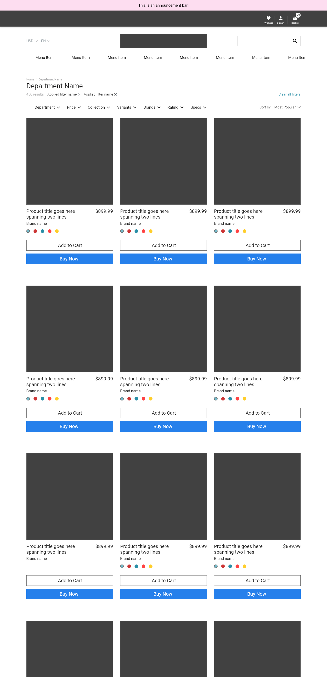
Let’s look at how the arrangement of information can affect us by examining a common aspect of an e-commerce website: The product card.
The product card is usually a small card found on a listing page where you’ll find the base information about the product, such as its name, price, available colours, and ratings.
You’re going to find two examples of a product card below. Before you go through them, I want you to consciously pay attention to how your eyes behave as you go through the designs.
I want you to keep in mind that we aren’t doing this exercise to determine which design is “better”.
Let’s take a look at this first example:

Where do your eyes find themselves gravitating?
It’ll typically be between two things, the title and the price. Your eyes might read the remaining information, but you’ll find that the price acts like a magnet to your eyes.
Now, let’s take a look at this example:

How’d your eyes behave this time?
Chances you’ve gone through the list from top to bottom. Your eyes most likely didn’t fixate on the price but rather on the product itself.
Now, did you notice I change the price? If you did, great! If not, that’s fine, it doesn’t say anything about your abilities, but it does speak about how the design influenced how you processed the information.
Now let’s take these two examples and place them in the context of a product listing page where you would typically find them grouped.
I want you to pay attention to how each page ‘feels’ and where your eyes focus. The facts and figures don’t matter.
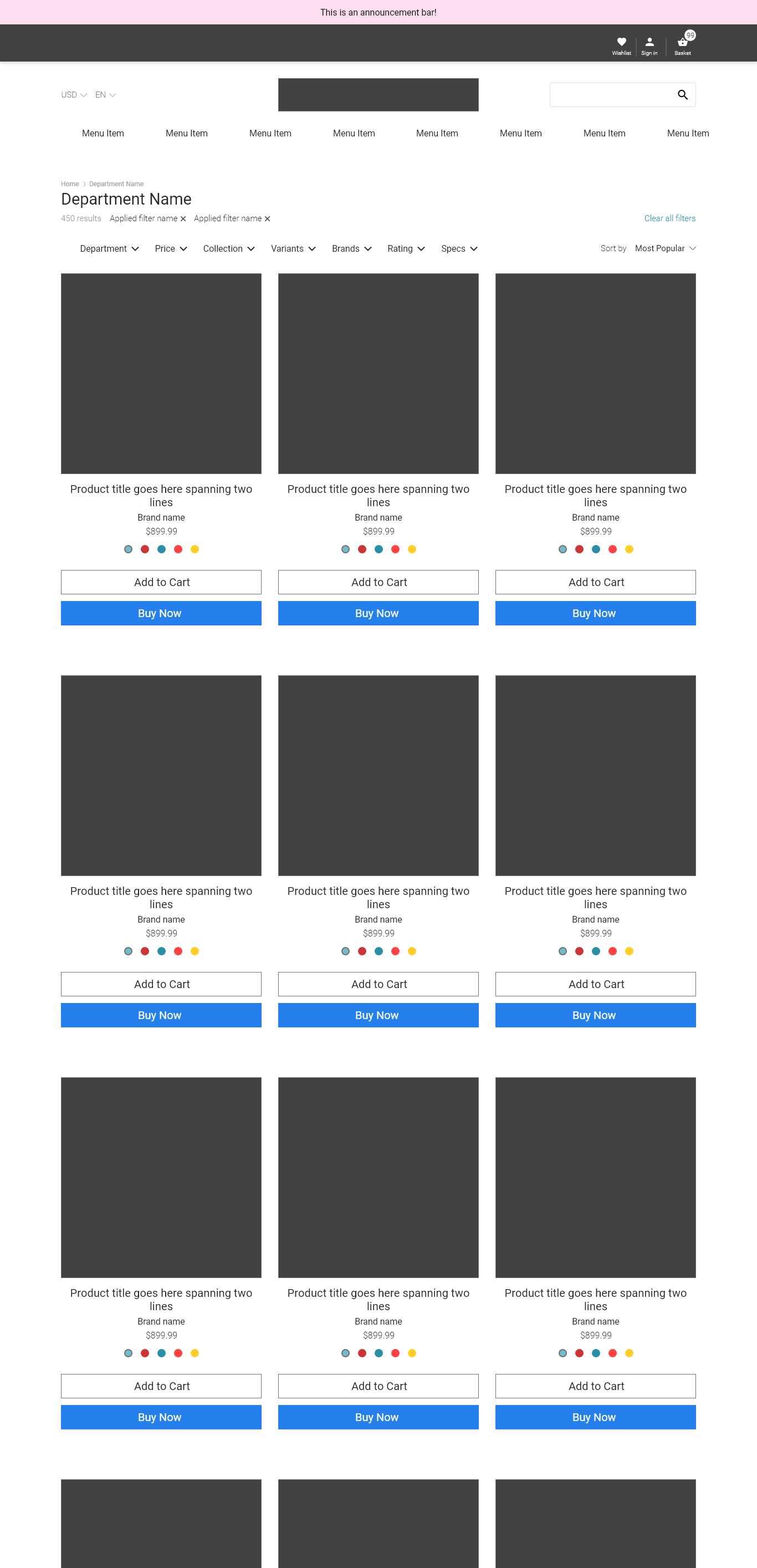
The first example might appear as if the products listed under it might cost a lot more, whereas, with the second example, the price doesn’t have as heavy an impact. The difference is incredibly subtle, but its impact on how you subconsciously process the page is very telling.
Why does this happen?
In the context of a product listing, we’re typically talking about prices, and prices mean cost, and cost means money. Money that we work day and night to earn to be able to make it through the month. In many ways, money is a very intimate part of us, even if we might consider ourselves non-materialistic. Today, we have a very ‘intimate’ and psychological relationship with money, but that’s a learned behaviour. Who knows how humans might behave in a world where money plays no role in our lives?
The first website places a lot more emphasis on cost, and you’re more likely to remember the price of the item because it’s right there and hard to miss. In the second example, the price is still there, but there’s no emphasis on its price.
We’ve shifted focuses from cost-based to product-based shopping. Now we can get into the question of ethics here - Is the second website less ethical? I would argue in this specific scenario that the website so far does not exhibit anything strictly unethical. The price isn’t the main focus, but it is still visible and accessible.
There’s a fine line between taking the focus away from the price and outright hiding the price in an obscure location. Take a look at this product highlight card:

The item clearly states it costs $89.99, but there’s also a pre-selected checkbox that tacks on an extra $238.00 to the final price. Here we’ve shamelessly crossed the line into very unethical territories. I’ll discuss these types of dark UX patterns in a later post. Make no mistake that this kind of arrangement is misleading and damaging to the brand and your reputation.
I want to emphasize this point: Dark UX patterns are always unethical and are also potentially illegal.
These arrangements will never grab you and force you to do something, but they play a role in subconsciously influencing your decision making. They’re the online equivalent of a conman trying to shortchange you.
Final Thoughts
I’m always amazed at how information order strongly changes how we experience a design. In the previous examples, we didn’t even touch any design tool other than subtle layout changes. We’re only scratching the surface here. When we start including other design methods, we begin to mold a completely different story depending on how we treat the information we laid out.
Design allows us to tell a completely different story, even if the two arrangements use the same information. We’ve only begun to scratch the surface of how a simple design manipulation can completely change a narrative.
Designers have a social and ethical responsibility to arrange information in the most direct and honest way possible.