The Basic Elements of Design
-
 Moe Hachem
 - August 19, 2020

What makes up a design? Design can be very overwhelming to get into when all you look at are the finished compositions. To kick off your journey into design, it’s fundamental that you first understand what the difference is between a design element and a design principle.
- Design Elements
- Design elements are the basic building blocks that come together to create a composition. These are the tools designers have to create their work.
- Design Principles
- If a design element is a tool a designer has, then design principles describe how a designer uses these tools. We will get into more details about the principles of design in the next post, for now, we’re going to focus on the basics.
The Elements of Design
Point
A point takes on the form of a dot or a perceivable mark in space. You use a point to delineate a point in space, and you use it to create other more complex design elements. The point is the building block that allows other design elements to manifest.

Line
The line is the most basic design element. It is typically the starting point for almost every other design element conceivable.
To create a line, you need to create two points that define that start and end positions of the element.
A line has more length than it does thickness and can come in different appearances: a line can be continuous, broken/dashed, or even implied. The line can have other design elements applied to it, such as texture, colour, and movement.

Shape
You create shape when you enclose a space between points delineated by lines or by contrast to its surroundings. You typically need at least three points in space to create a shape.
You can break down every object you see into simple shapes regardless of how complex that object might appear.

Form
Form is where things get unclear since many people use “form” and “shape” interchangeably.
Form can also be called positive space.
It is the (positive) element over the (negative) space.
The relationship between positive and negative space can be used to create tension, and add three-dimensional depth to the composition and increase viewer engagement.
Positive and negative space are dependent on one another because changing one will affect the other.
Some people use “form” to refer to the three-dimensional quality of an object, but I recommend you shy away from that definition. You can achieve three-dimensional depth by adding volume to shape or object, but not by applying form. Form can be both three dimensional and two dimensional. There will always be form as long as there is positive and negative space.

Texture
Texture adds a tactile quality to compositions, and this quality can be experienced either through touch or visually.
Tactile texture can be experienced through touch and have a three-dimensional aspect to them. Think about how your fingers feel when you run them across gravel versus when you run them across a whiteboard.
Visual texture can take on the same sensation visually, but you will not be able to experience it with your fingers (yet).
You can add texture either by creating patterns through the use of geometric or organic shapes or by embossing real texture on to paper or your digital artboard.

Negative Space
Negative space, sometimes referred to as white-space, is the area in a composition that does not have any forms or shapes in it.
Many beginners tend to feel the need to pack a composition with as many design elements as possible because they fear the presence of emptiness. Instead of avoiding negative space, learn to embrace it because this space is essential in determining the visual impact your design will have.
Negative space allows a design breathing space and can help give importance to elements or set a pattern or rhythm. You can be playful with negative space and create shapes or complex objects by playing with the relationship between negative and positive space.
A good designer is a design that is sensitive to the relationship between negative and positive space.

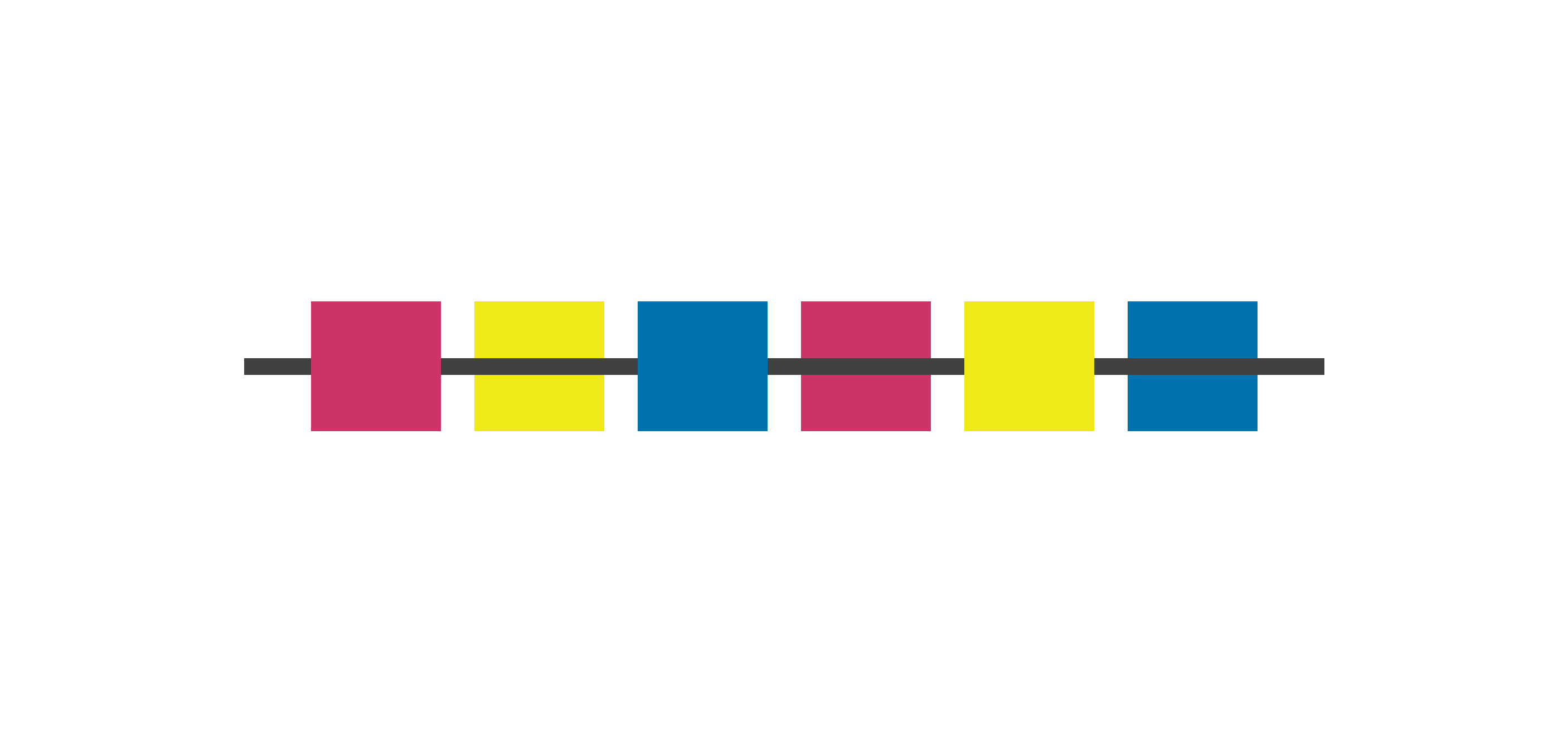
Colour
Many designers struggle to use colour properly, even though the basics appear simple at first sight.
Colour can be used to emphasize specific elements. The main difference between colour and other design elements is that a composition does not need colour to be successful.
You can apply colour to any design element, and you can use it to create specific moods. Each colour has a different connotation attached to it which is typically globally accepted. You should, however, be sensitive to any possible cultural meanings attached to a colour when designing for cultures that are not your own.
Colour has four properties:
Hue
The hue is the name of the colour in it’s purest form. For example, cyan is a pure colour.
Shade
The shade signifies how much black is added to a hue to make it a dark version of its pure form.
Tint
The tint tells us how much white is added to a hue to make it a lighter version of it’s the purest form.
Tone
Tone measures how much grey is added to a colour to determine how muted the colour is.
Saturation
The saturation level tells us how pure a colour is, which is determined by how much black or white is mixed in it. To create the most intense form of a colour, all you need to do is remove any black or white that might be in it.
Colour Systems
There are two colour systems used worldwide: RGB and CMYK. I will not go into the gritty details but do keep in mind the following facts since I used to be pretty guilty of this myself early on in my career:
- Only use RGB for digital design projects or anything that will only ever appear on a screen.
- Only use CMYK for print design projects or anything that will exist in the real world outside a screen.
- Make sure that you use the correct colour system when creating a new design file to avoid any output problems.

Movement
Movement is a new entry in the designer’s toolkit with the emergence of digital design. If you’re working with traditional media, you can begin to imply movement, but the objects themselves would not actually move.
Before the emergence of digital design, only architecture used movement as a part of its toolkit where the viewer could move within and interact with the physical space.
In digital design, design elements can move, and this movement can begin to provide a narrative to the viewer. Movement can direct a user’s attention, provide valuable feedback to the user, or keep the user engaged between interactions.

Listing Out the Elements
Here’s a handy list containing the elements of design:
- Point
- Line
- Shape
- Form
- Texture
- Negative Space
- Colour
- Movement
Final thoughts
The elements of design are the basic toolkits a designer uses. A designer needs to understand what each design element is and how to use it.
Think of it this way: You have a toolkit, but you only ever use the hammer. If you don’t learn to use your other tools, then all you’ll ever do is treat each problem by smacking it, and if you only use a hammer to hit things, then you’re not using its full potential.
When you know how to use your toolkit, you will be able to deconstruct other design work down to their most basic elements and learn how another designer created their work.
Good design comes out of a proper understanding of how to use the elements of design.