Oasis
Preface
The e-commerce wave is on the rise. Online grocery shopping is one of the fastest-growing niches within e-commerce. The Lebanese market is no different, and the growth of this niche was accelerated after the COVID pandemic landed in Lebanon. Oasis is a grocery delivery scheduled to launch in Lebanon.
My role in this project is one that encompasses: product design, product management, user experience design, and customer experience design. As the design lead, or well the only designer on this project, the goals were simple: To create an app that will place the user right in the centre of the business model.
Due Diligence
Market Research
While it's tempting to jump straight into the design process, we need to make sure we gather the data we need for a data-informed/driven design process. I can't share the full market research finding, but I can share a summary:
- The market is young and fast-growing.
- COVID has accelerated market-growth.
-
Most apps in the market fall into one of the following categories:
- Dedicated online grocers.
- Extensions of supermarket chains.
- Apps that allow different sellers to operate under their name.
Competitive Analysis
The following are the common issues found between the apps that currently exist in the market:
- Most applications fail WCAG (Web Content Accessibility Guidelines) requirements.
- Most applications have not applied basic best practices.
- The apps only cover specific areas but not the entire country.
- OTP verification is widely adopted to ease the registration process.
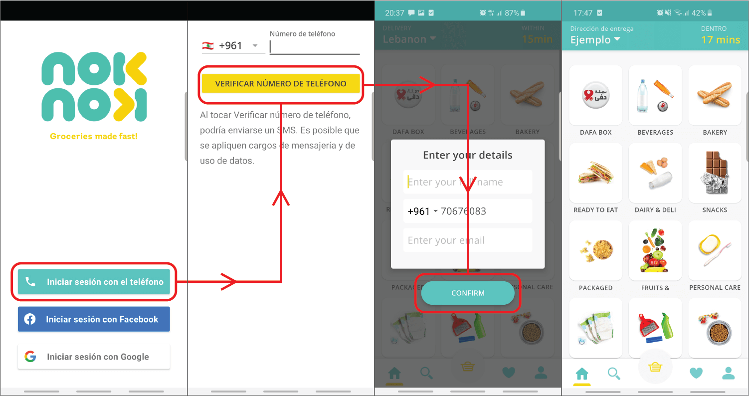
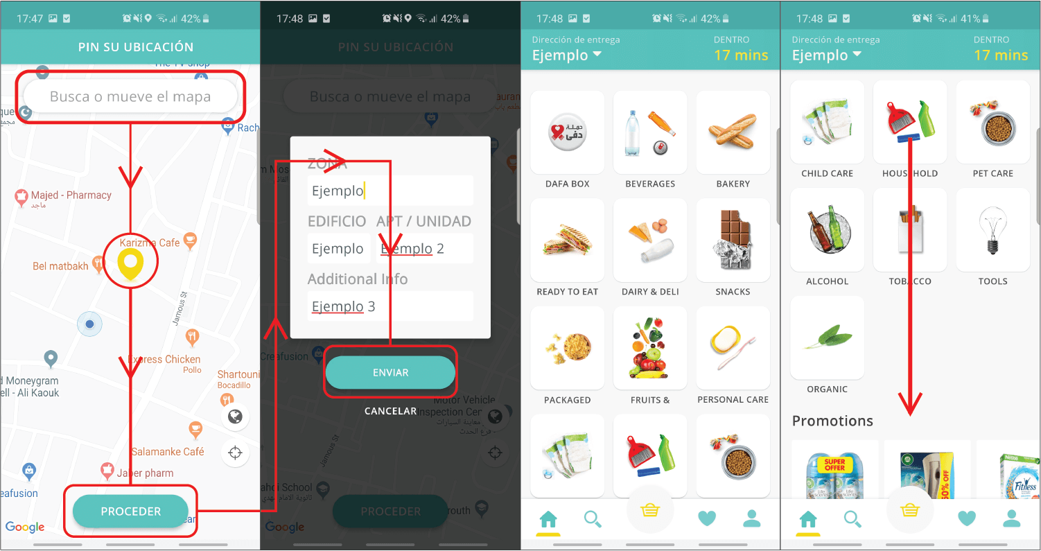
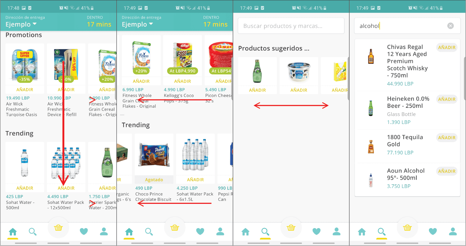
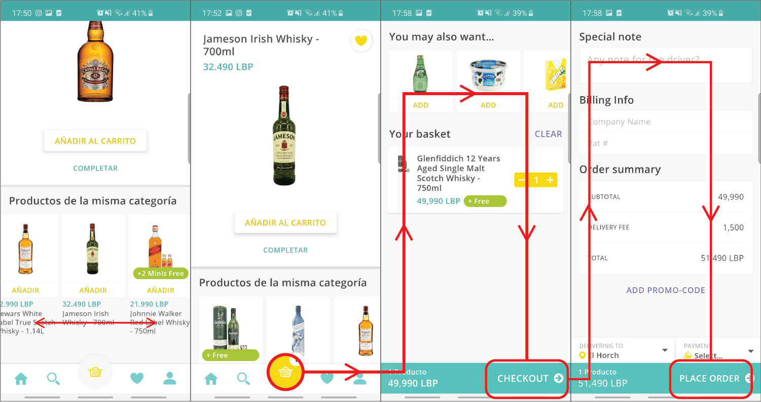
I've shared a small snippet of the case study conducted on several existing applications in the market. The example I'm sharing looks at Noknok, one of the more successful players in the Lebanese market.
Application Pain Points
The checkout process is simple and straight forward, but there are quite a few awkward moments. Below is a basic list of pain-points the Noknok application has the is detrimental to the user experience:
-
Button colours are not optimised to meet accessibility requirements
- Contrast ratio of 1.78 at worst and 2.77 at best failing to meet at least the AA requirements
-
The target hit area is small.
- The Add (Añadir) button measures roughly 24px in height, if you aren't careful you'll end up opening the product detail page
- There are two different "Add Item" patterns which might cause a temporary bit of confusion for users.
-
The "Recommended Items" section in the cart page is awkwardly
placed.
- Noknok did address the "Recommended Items" section in a later update but ruined it by naming it "Impulse Buy".
Defining the Problems
We now have data backed by market data and an in-depth analysis of our main competitor. It's time to identify the problems we hope to address with this application.
Based on the 5 Whys Principles established in the IBM Enterprise Design Thinking process:
Initial Statement 1
We need to reduce the time spent by users shopping for groceries.
Why?People have less spare time during their day to devote to shopping.
Why?Modern life and careers have become to difficult to balance with one another.
Why?We have 16 waking hours per day of which we: spend 9 hours at work, 2 hours in commute, and only 5 hours worth of personal time. Weekly this would mean we only have 35 hours worth of free time, and we would have to sacrifice our free time to go grocery shopping.
Why?The average consumer goes shopping an average of 1.7 times for approximately 5 hours a week.
Initial Statement 2
Most people would prefer to go grocery shopping at their local markets.
Why?People find it hard to trust applications and strangers to purchase their produce.
Why?People like to touch their products and interact with it to judge if they're adequate or not, even if they don't know what they're doing.
Why?Food is a very personal experience, and people like to believe they have control over what they're consuming.
Why?People are fearful of consuming products that might be potentially harmful due to a lack of quality control.
Final Statement 1
People have to spend 15% of their free time to shop for groceries when they could use that time to do the things they want.
Final Statement 2
People care for their well-being even and need to feel in control over the choices they make for their health.
The User
We've identified the problems that we're going to take on, and we've conducted our research. After combining market research and going through a series of qualitative and quantitative surveys, we've identified our primary user groups.
- person48 Years Old
- schoolLebanese University
- business_centerSecretary
- account_balance_wallet$2,100/mo
- location_onBeirut, Lebanon
- homeLives with Family
Personality
- Healthy
- Extrovert
- Friendly
- Frugal
- Homebody
About Marwa
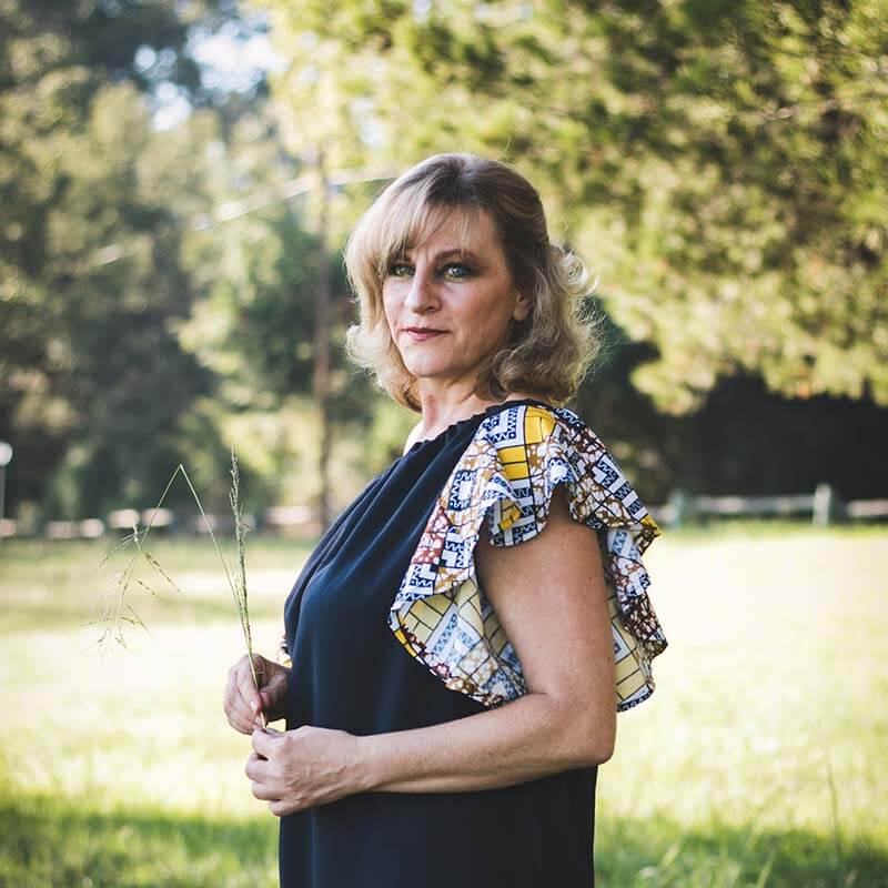
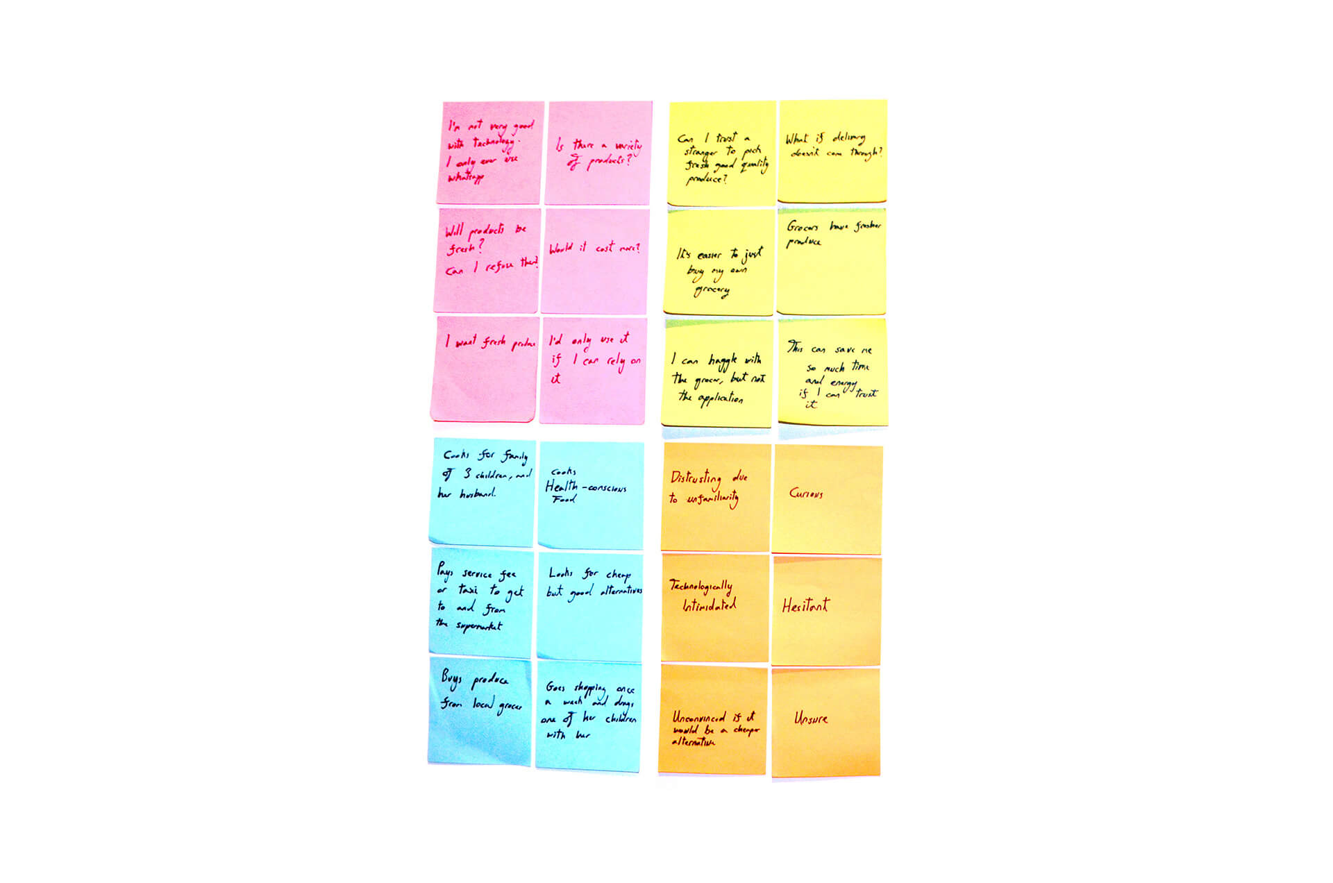
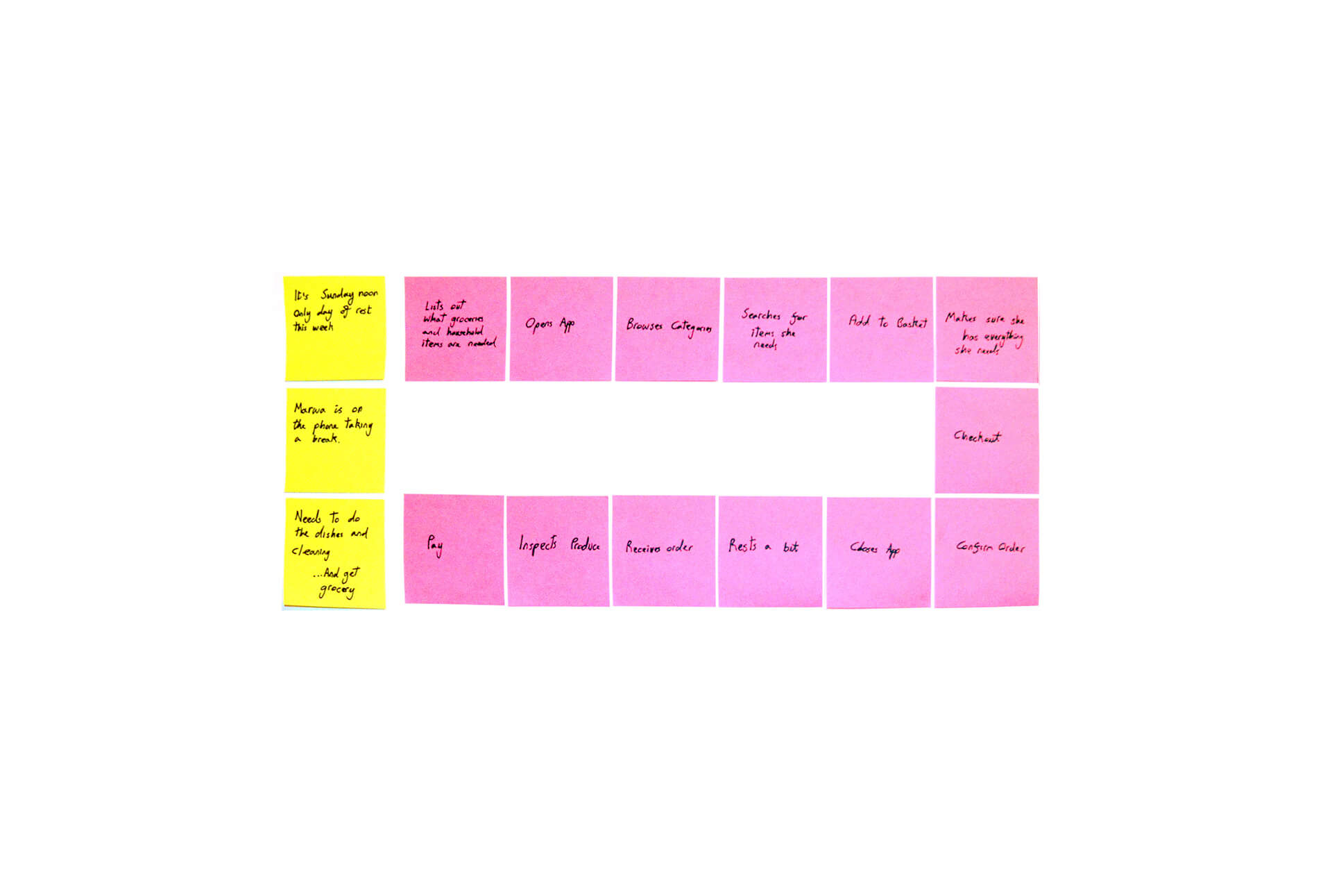
Marwa is a mother of three. She cooks healthy food and is frugal due to her limited income. Marwa goes shopping once a week and doesn't carry a shopping list. She prefers to purchase meat and produce from local sources because she perceives them as being fresher.
Economic Crisis Behaviour
Marwa has become very economical ever since the financial crisis in Lebanon and will typically look for the cheapest product without compromising on quality.
Needs
- Prompt delivery.
- Use time efficiently.
- Easy to use interface.
- Cash on delivery.
- High quality produce.
Frustrations
- Doesn't always have car access.
- Not tech-savvy.
- Doesn't trust card payments.
- Financial concerns.
Empathy Map

User Journey

- person51 Years Old
- schoolPublic School
- business_centerHousewife
- account_balance_wallet$6,000+/mo
- location_onBeirut, Lebanon
- homeLives with Family
Personality
- Extrovert
- Homebody
- Haughty
- Healthy
- Friendly
About Sahar
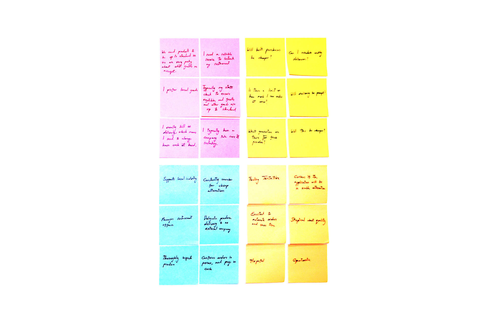
Sahar is a mother of four and lives in a high-end neighbourhood in Beirut. She only cooks healthy food and does not allow junk or snack food in her house. Sahar enjoys shopping and hunting for good deals and bargains. She is prone to purchasing luxury goods for bragging rights.
Economic Crisis Behaviour
Sahaar's family has not been affected by the economic crisis. In contrast to most families, her family's spending power increased due to primarily earning dollars.
Needs
- Prompt delivery.
- Product variety.
- Special promotions and deals.
- Health and nutritional information.
- Refuse products at will.
Frustrations
- Easily distracted.
- Unsure if products will be fresh.
- Not tech-savvy.
- Will she find everything she wants?
Empathy Map

User Journey

- person27 Years Old
- schoolAUB
- business_centerCommunications Engineer
- account_balance_wallet$1,800/mo
- location_onBeirut, Lebanon
- homeLives Alone
Personality
- Introverted
- Adventurous
- Carefree
- Extravagant
- Workaholic
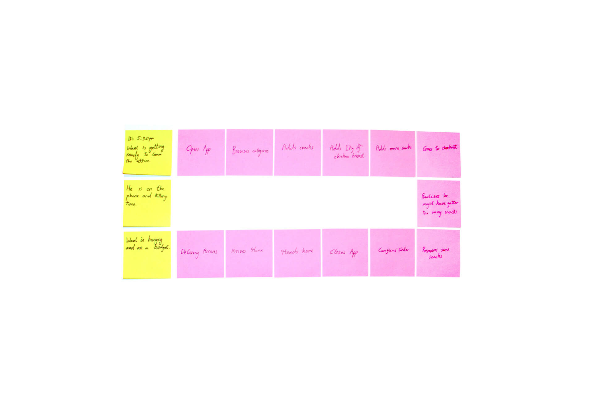
About Wael
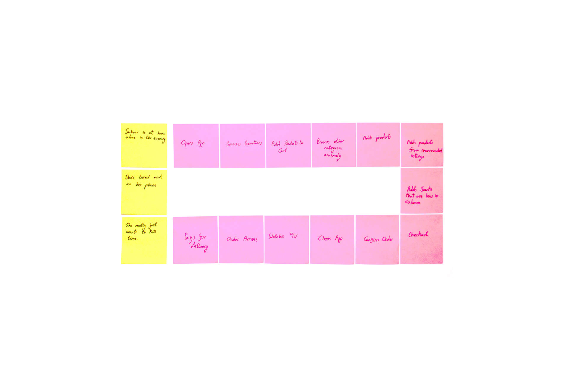
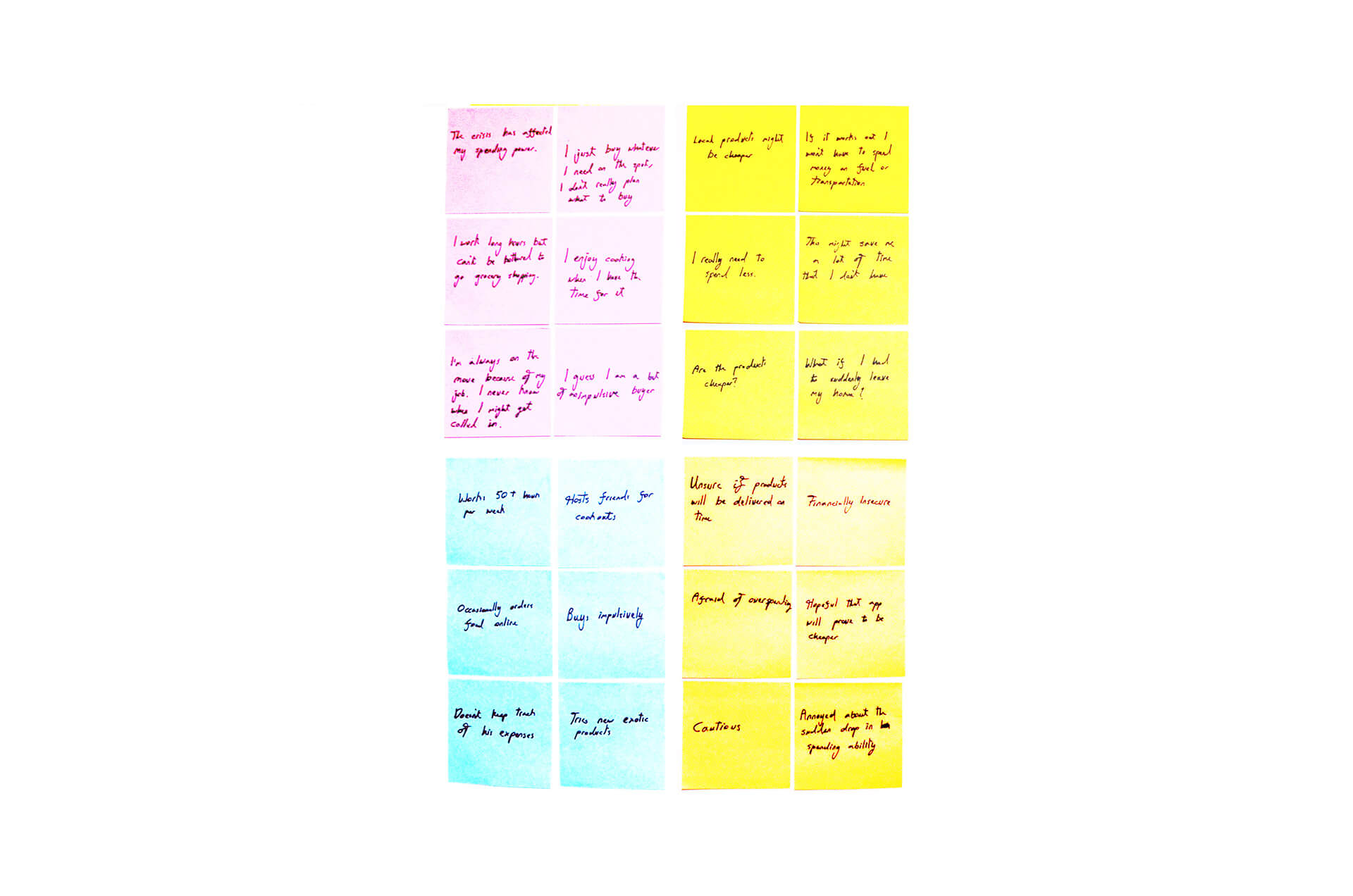
Wael is a single man, lives alone, and spends most of his time at work. He enjoys trying new things, and cooking when he has the time. He buys groceries at nearby markets and isn't picky about produce since he doesn't know how to judge produce quality. Wael is likely to shop over his budget.
Economic Crisis Behaviour
Wael's spending power took a hit after the economy started to tank. Before the crisis, his monthly salary was worth $1,800 but is now the equivalent to $340. Wael is looking for a way to be more conscious over his spending habits.
Needs
- Track expenses.
- Cheap prices.
- Ready-made meals.
- Prompt delivery.
- Support local products.
Frustrations
- Can't afford previous lifestyle.
- Limited budget.
- Not always available to receive order.
- Does not know what he needs.
Empathy Map

User Journey

- person33 Years Old
- schoolALBA
- business_centerEntrepreneur
- account_balance_wallet$1,500+/mo
- location_onBeirut, Lebanon
- homeLives with Spouse
Personality
- Extrovert
- Ambitious
- Tech-savvy
- Pragmatic
- Diligent
About Daniella
Daniella owns an up and coming restaurant. She's a tech-savvy entrepreneur that is looking for different ways to grow her business. Daniella has a contract with a local company that supplies her with produce and ingredients. She would prefer to automate the ordering process.
Economic Crisis Behaviour
Daniella has been looking for ways to incorporate more local goods to her business, in hopes of savings costs, and acquiring more local support for her restaurant. She is at risk of closing down if prices continue to sky-rocket.
Needs
- Scheduled delivery.
- Bulk delivery.
- Monthly payment.
- Quality assurance.
- Prompt delivery.
Frustrations
- Needs to cut costs.
- Can't afford late deliveries.
- Will products be high quality?
- What if order items are missing?
Empathy Map
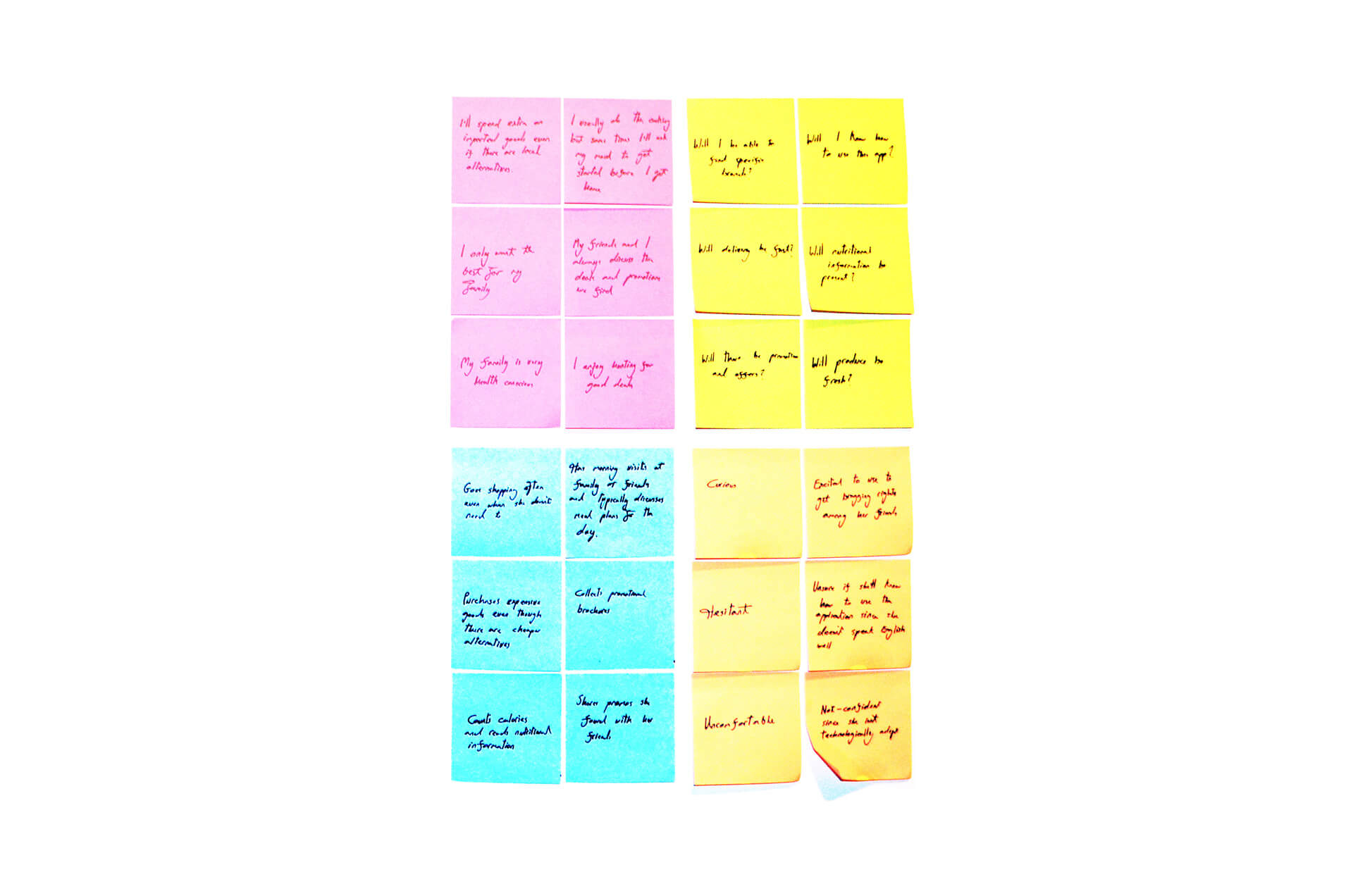

User Journey
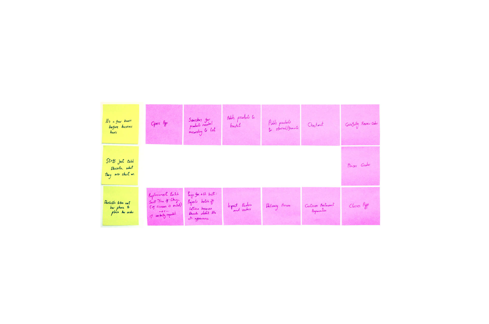

Minimal Viable Product
We have a clear picture of who our primary users are, and it's now time to understand what features we will need to create a minimum viable product. For this specific project, I used the "MoSCoW" method to create a clearer image of the MVP.
Must-Have
The features listed under "Must Haves" are required or else the project is going to fail. The presence of these features is non-negotiable.
- Home Delivery
- Item Description
- Offers and Deals
- Order History
- Cash on delivery
- Product Search
Should-Have
The features listed under "Must Haves" are required or else the project is going to fail. The presence of these features is non-negotiable.
- One-Hour Delivery Time
- Order Cancellation
- Online payment
- Recommended Products
- Set Up Delivery Time
- Order Tracking
Could-Have
"Could Haves" are desirable features that aren't crucial for the product launch. These can be removed from the project scope if the time frame is limited for the current build.
- Loyalty Points
- Item Detail
- Clarification
- Nutrition Details
- Card Machine on Delivery
- Product Search by Barcode
- Recurring Orders
- Referral Points
Won't-Have
"Won't Haves" are the least critical features at the current time but may be considered for future releases.
- Alternative payment methods - ApplePay or Cryptocurrency
- Recipes
- Recipe shopping lists
The Design Process
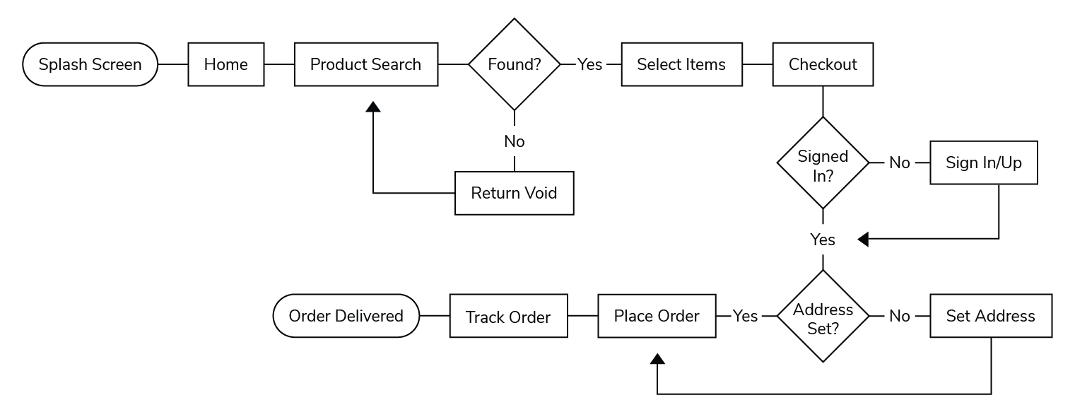
Establishing User Flow
We need to understand what the typical user flow would look like, and optimise it to create a smooth user experience through the checkout process.
It's important to note that customers that purchase meats and produce will have the ability to reject orders and either request a replacement or a refund. Giving customers the ability to refuse orders will help generate trust and promote stricter quality control on meats and produce.
Wireframes
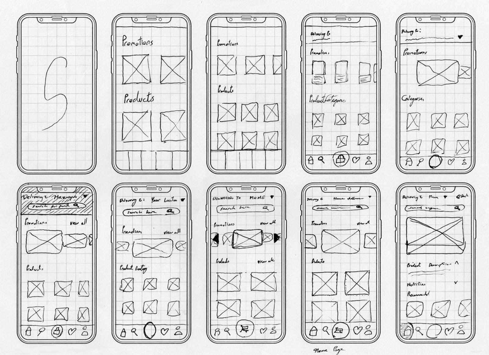
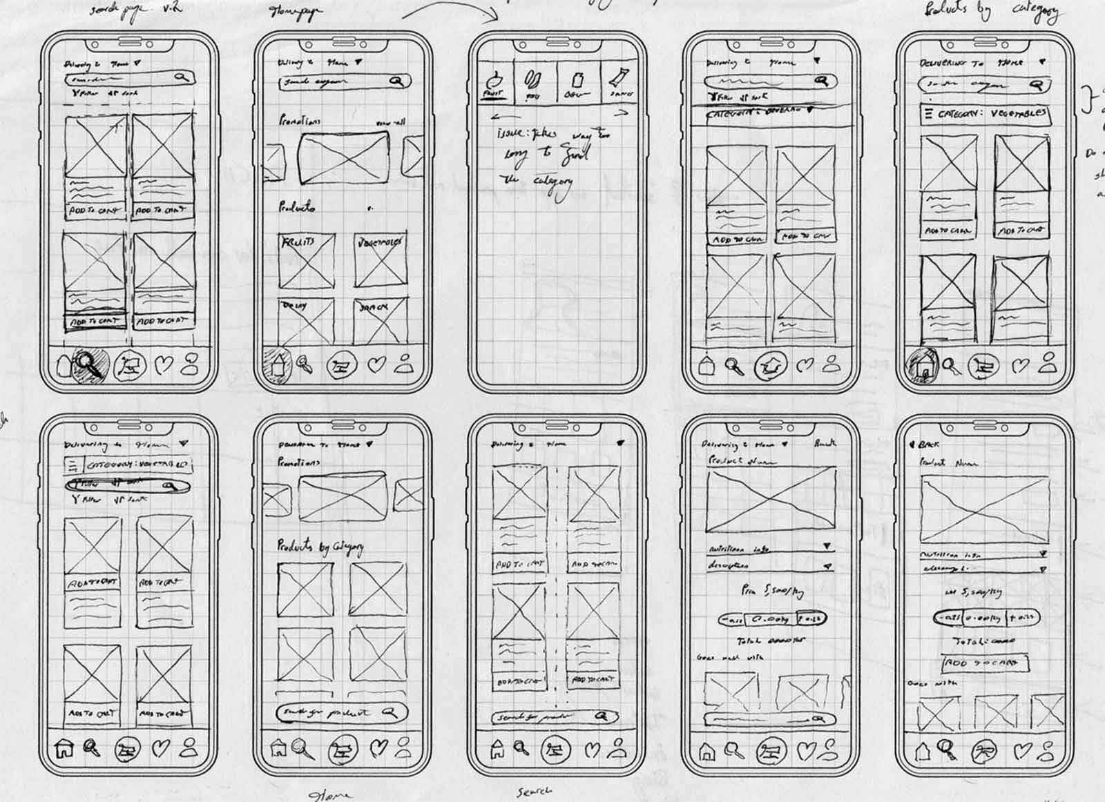
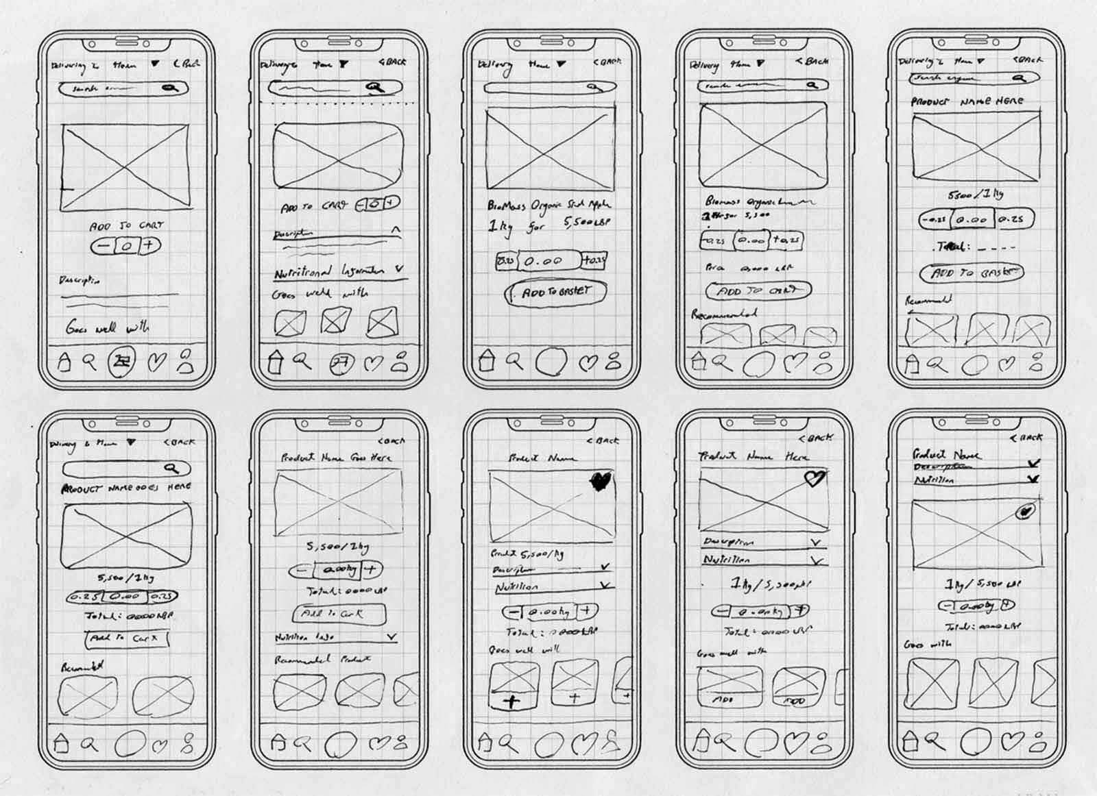
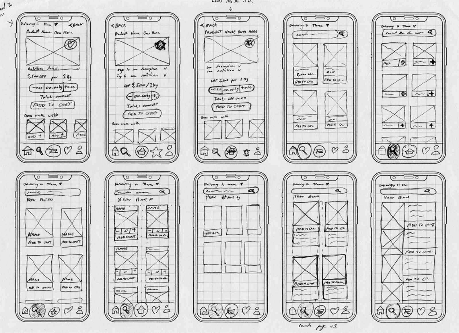
I have a strict rule before I begin implementing any digital work: Use my hands and sketch out the idea in mind. If the logic behind the wireframes makes sense, I'll move on to digital media. If the logic doesn't make any sense or is a bit rough, then it's back to the drawing board. Of course, the design process never leaves pen and paper as a medium up until the very end of the project. I find it very crucial for designers to be comfortable to work with their hands because each medium taps into a different mental framework than the other. In a way, you could say all my works are a hybrid made from a collaboration between the digital and the analogue.
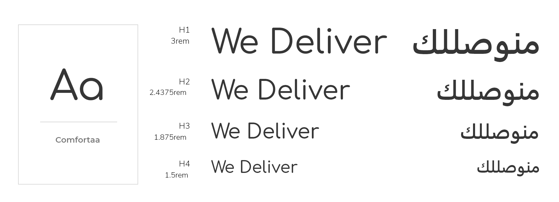
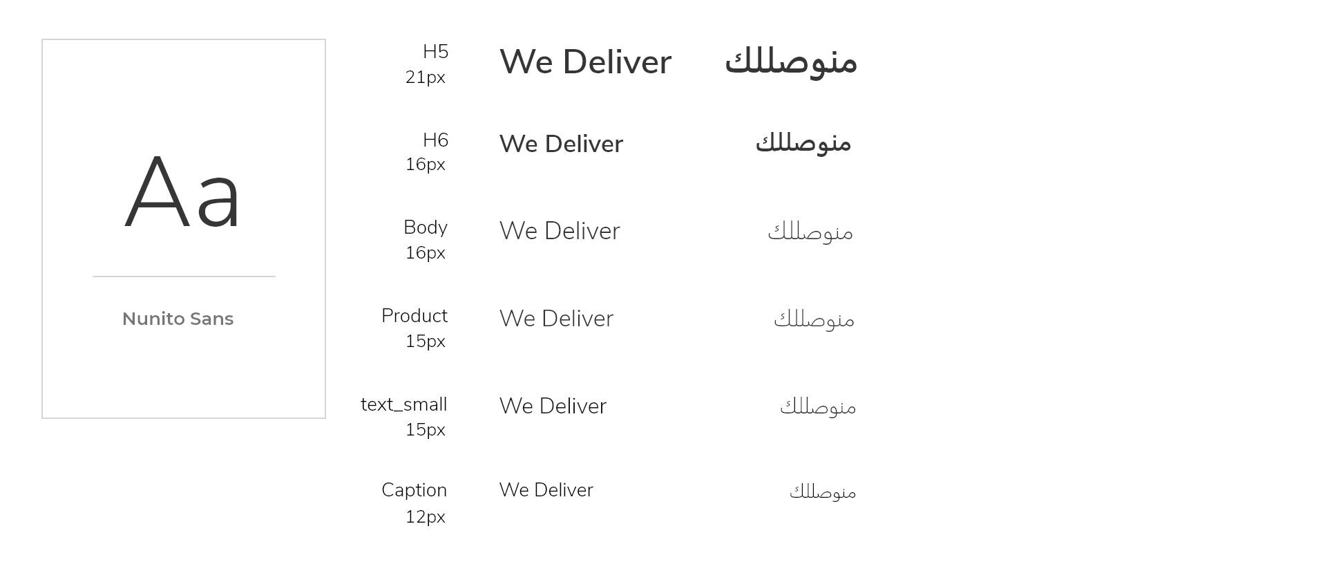
Typography
The idea here is to use green, blue, and brown to bring in an earthly and natural feel to the application. Our background colour will always be set in white to promote a heightened sense of hygiene and cleanliness. You can't see the butcher in action, but you can at least get a sense of comfort when the app presents itself hygienically.
Colours
The idea here is to use green, blue, and brown to bring in an earthly and natural feel to the application. Our background colour will always be set in white to promote a heightened sense of hygiene and cleanliness. You can't see the butcher in action, but you can at least get a sense of comfort when the app presents itself hygienically.
Navigation Elements
Top Navigation
Bottom Navigation Tabs
I ended up going with tab navigation because I didn't want to complicate the navigation process. I wanted you to be able to go in and out without thinking about what you're doing, and for most parts, there was no need to create deep navigation.
Search Bar
The star of the application isn't the tab navigation but the search bar element. You can instantly reach the search bar and use it to find the exact product you're looking for regardless of what page you're on. The search bar also has a barcode search function that allows users to search the product against our database.
The barcode search will allow users to compare our prices against another seller while in a supermarket. Our plan here is quite simple: We want to be able to steal the lollipop right out of the big chain supermarket's hand.
The search bar is placed at the bottom intentionally to keep it within thumb's reach to encourage users to use the bar as the primary navigation method.
The barcode search will allow users to compare our prices against another seller while in a supermarket. Our plan here is quite simple: We want to be able to steal the lollipop right out of the big chain supermarket's hand.
Sizing
All interactive elements have a minimum dimension of 44 x 44 pixels to ensure they're incredibly easy to access and leave no room for error because of small target hit areas.
Architecture
You're never far from the options that matter. If you're setting up the app, you can quickly go back to continue your shopping experience and vice versa.
Libraries
Button Library
Icon Library
Listed Product
Product Recommendations
Cart Items
Prototype
Registration Process
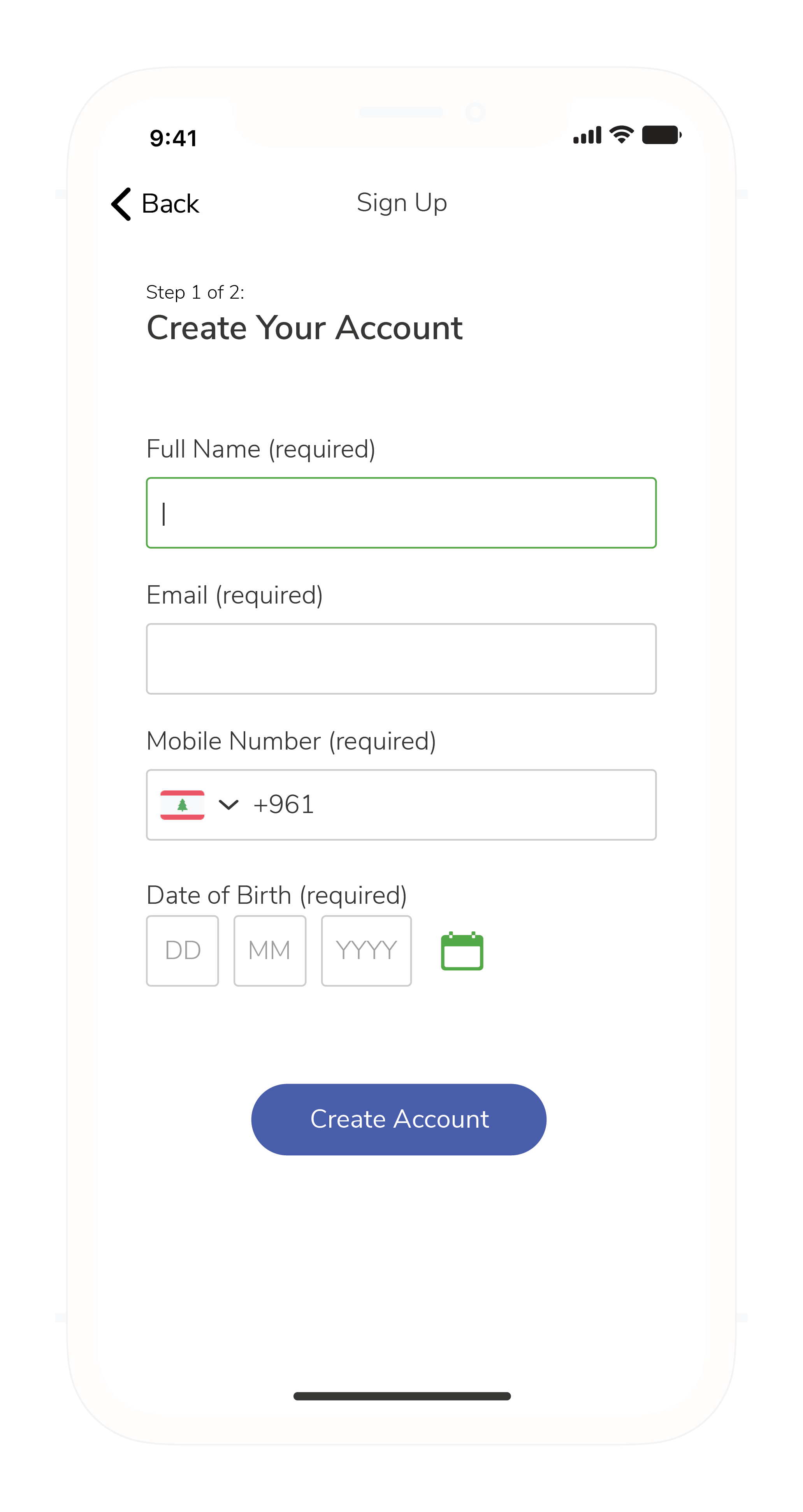
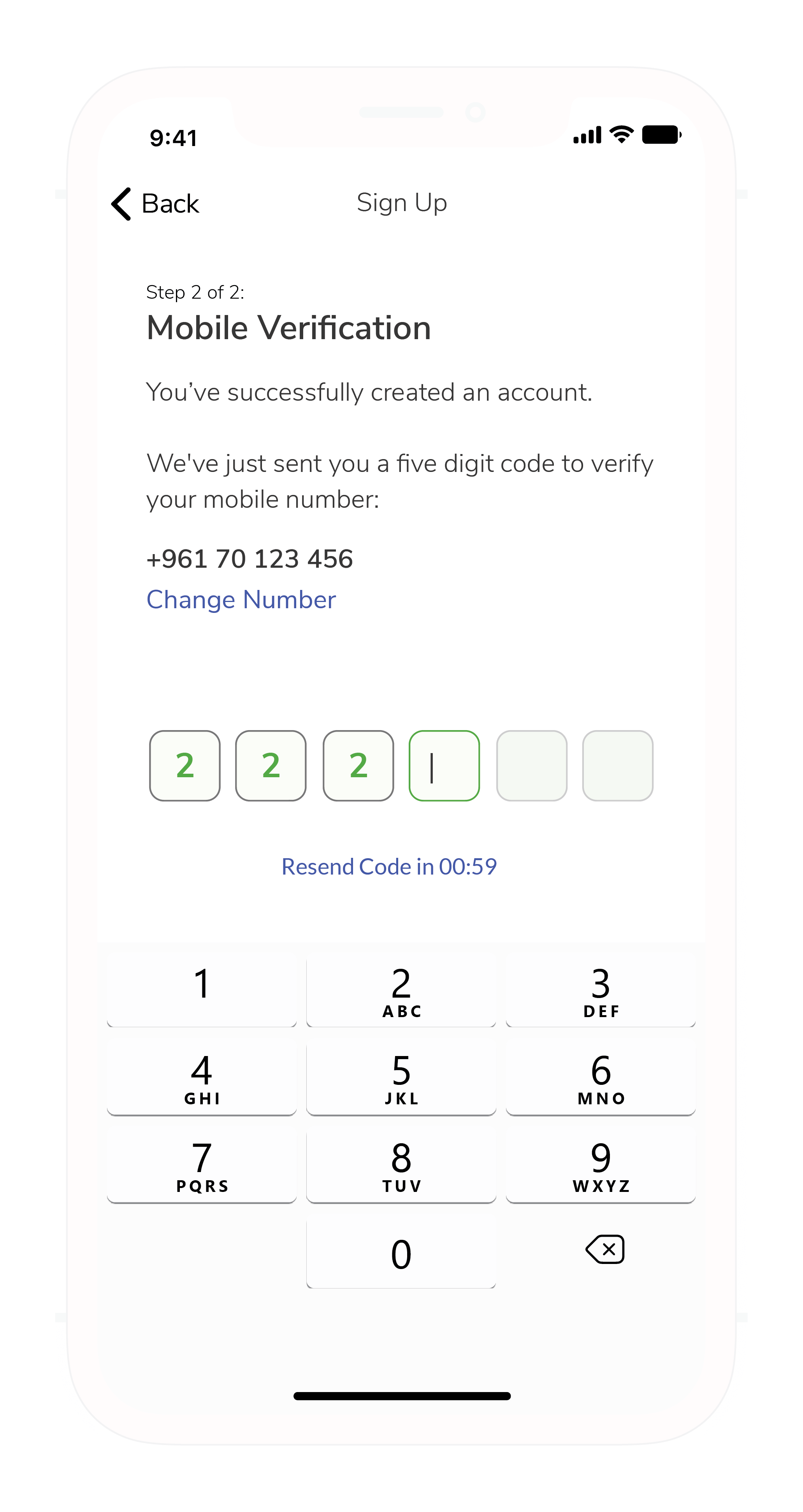
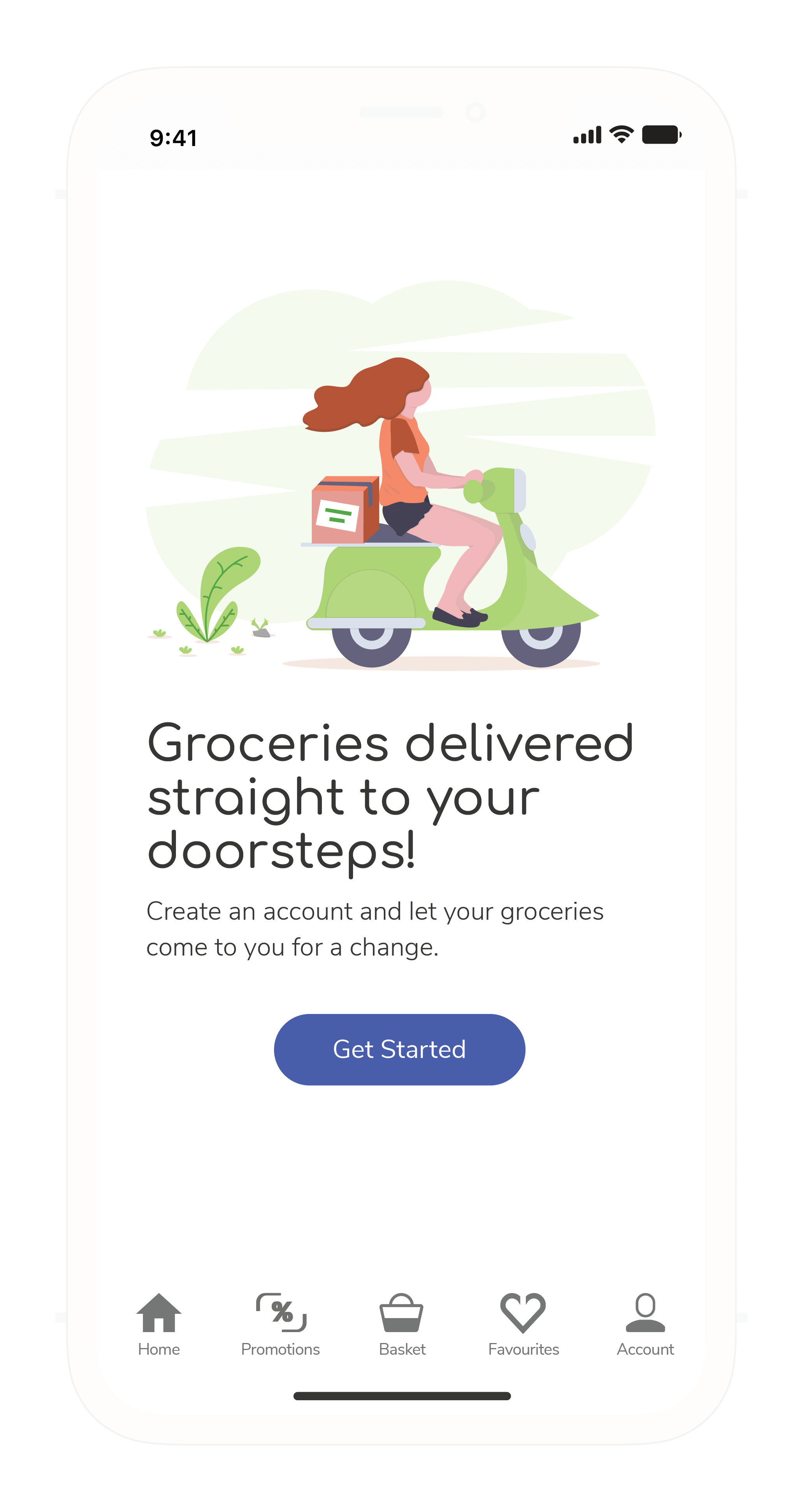
The registration process gives users two different flows. Users can either register through OTP or via social media.
Home
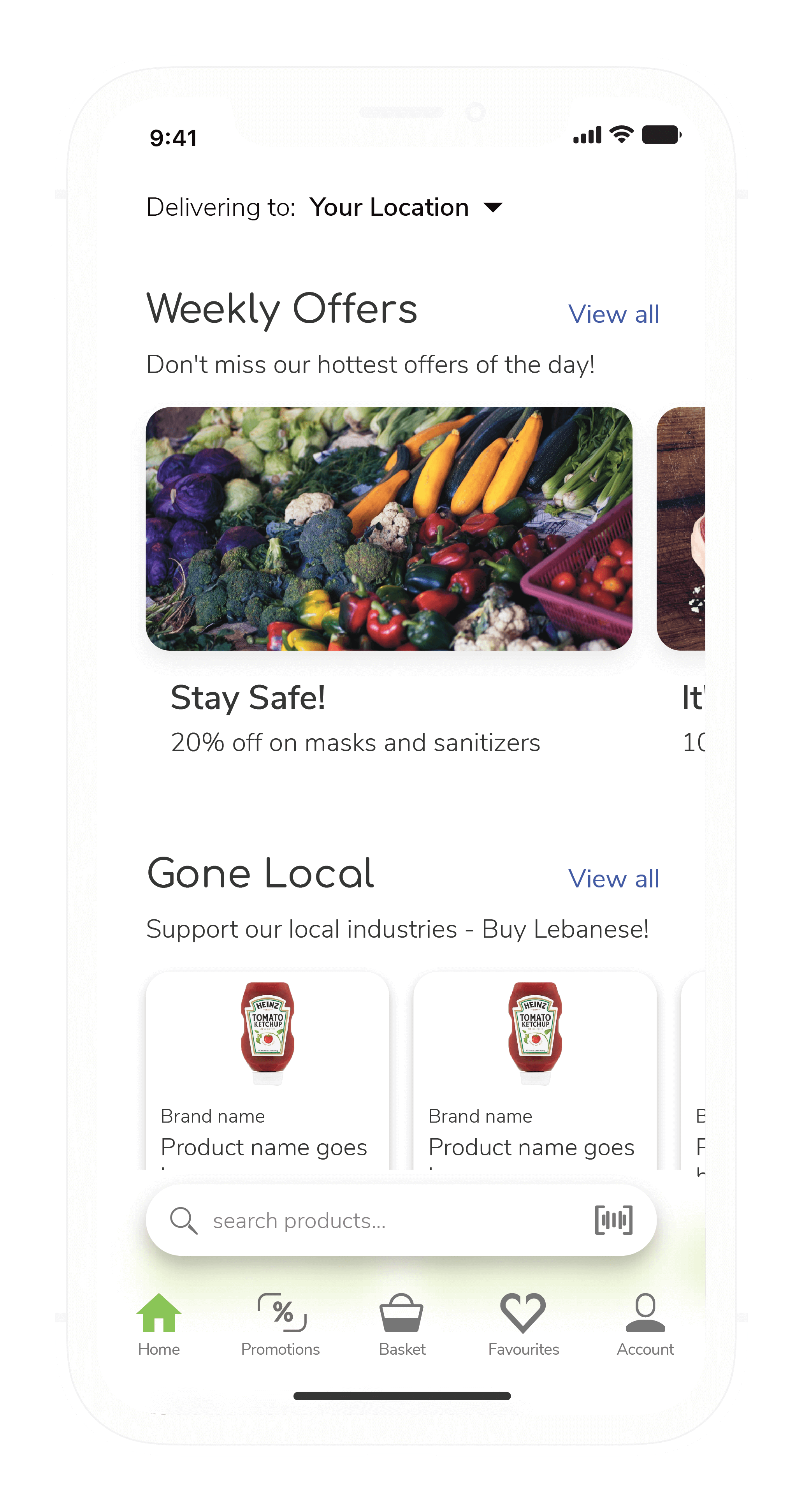
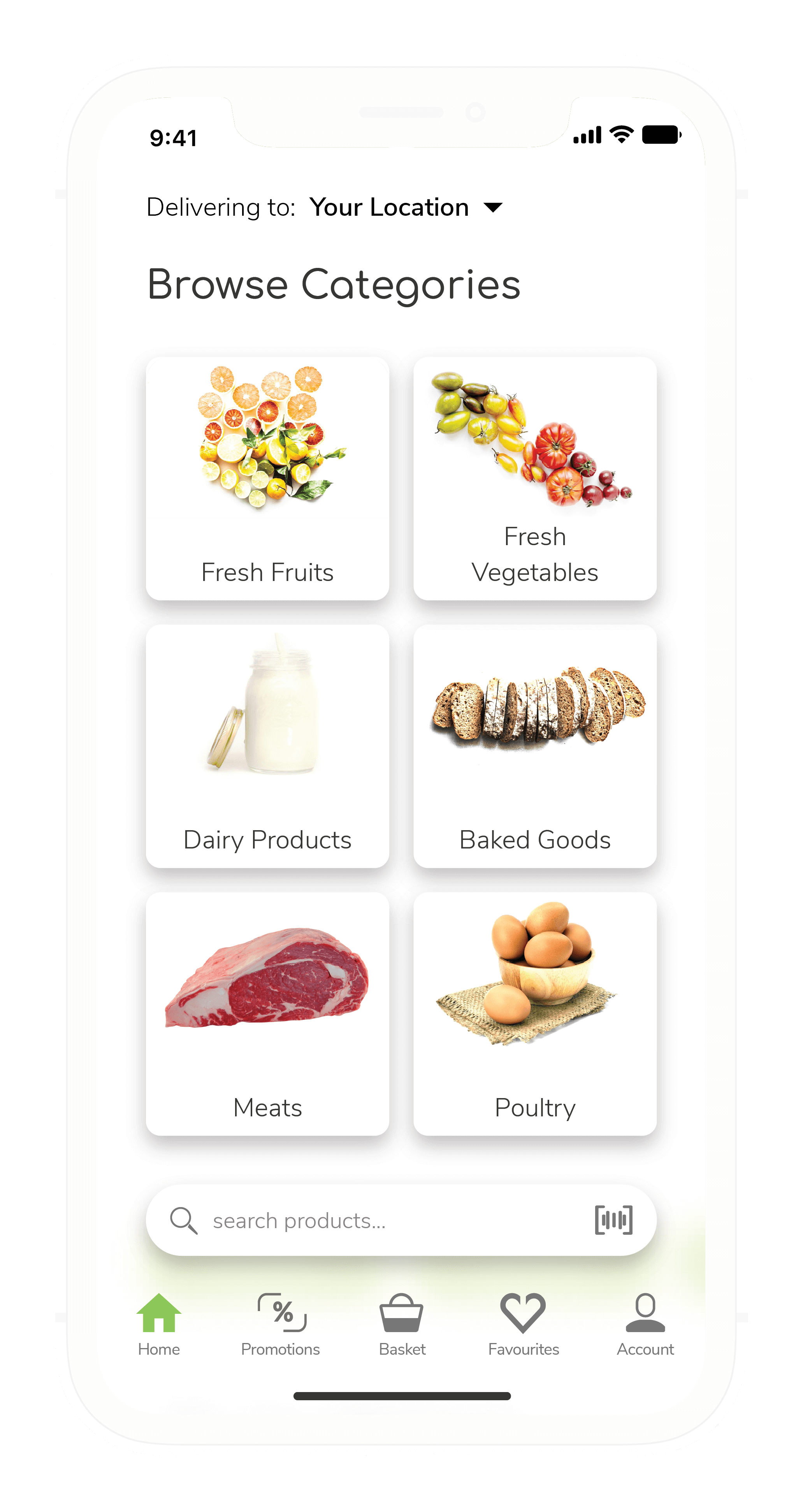
The Home screen serves as the central hub that allows users to navigate through the app's features between the promotional pages, categories, and any featured or new products.
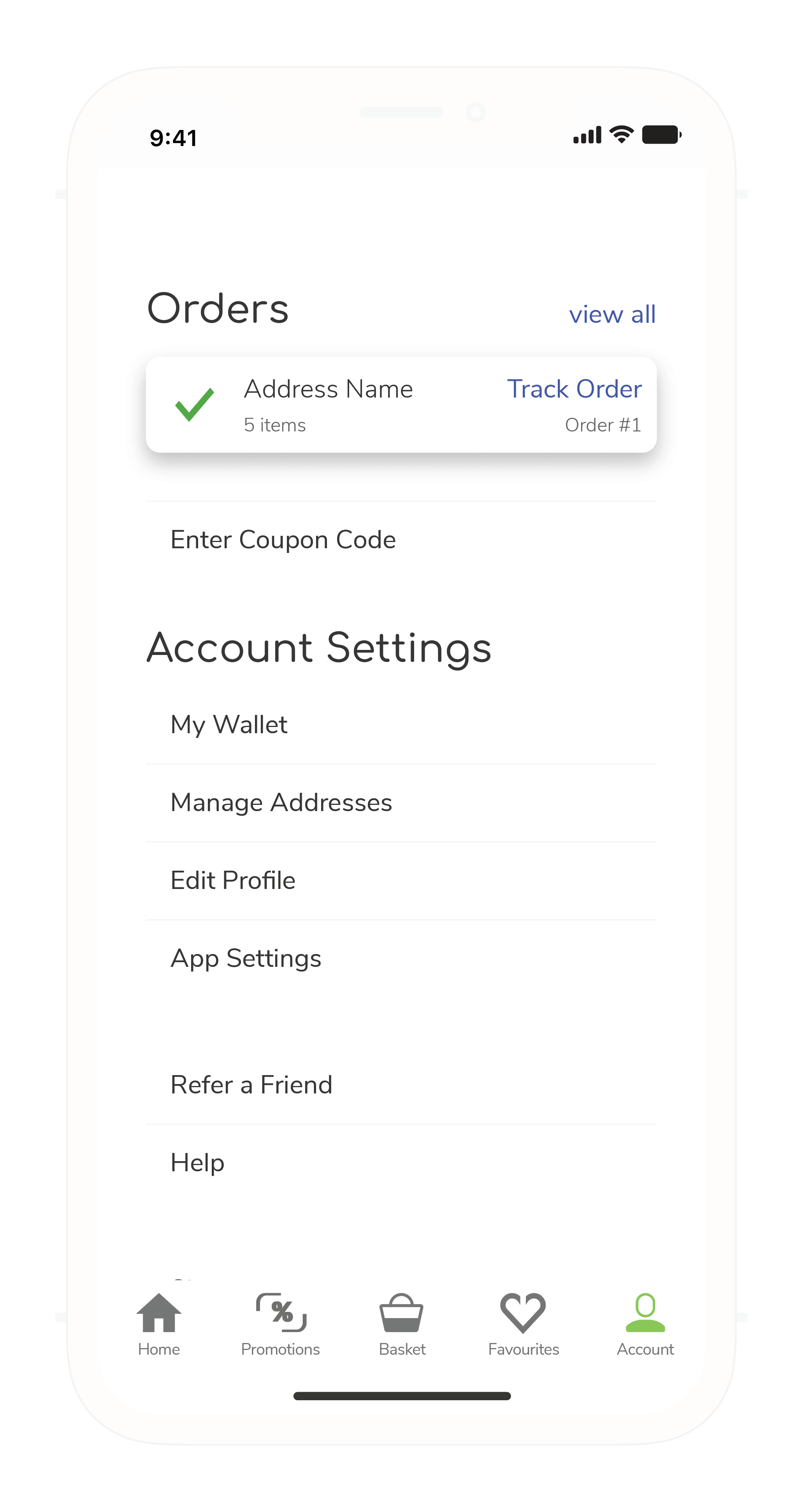
Account Settings
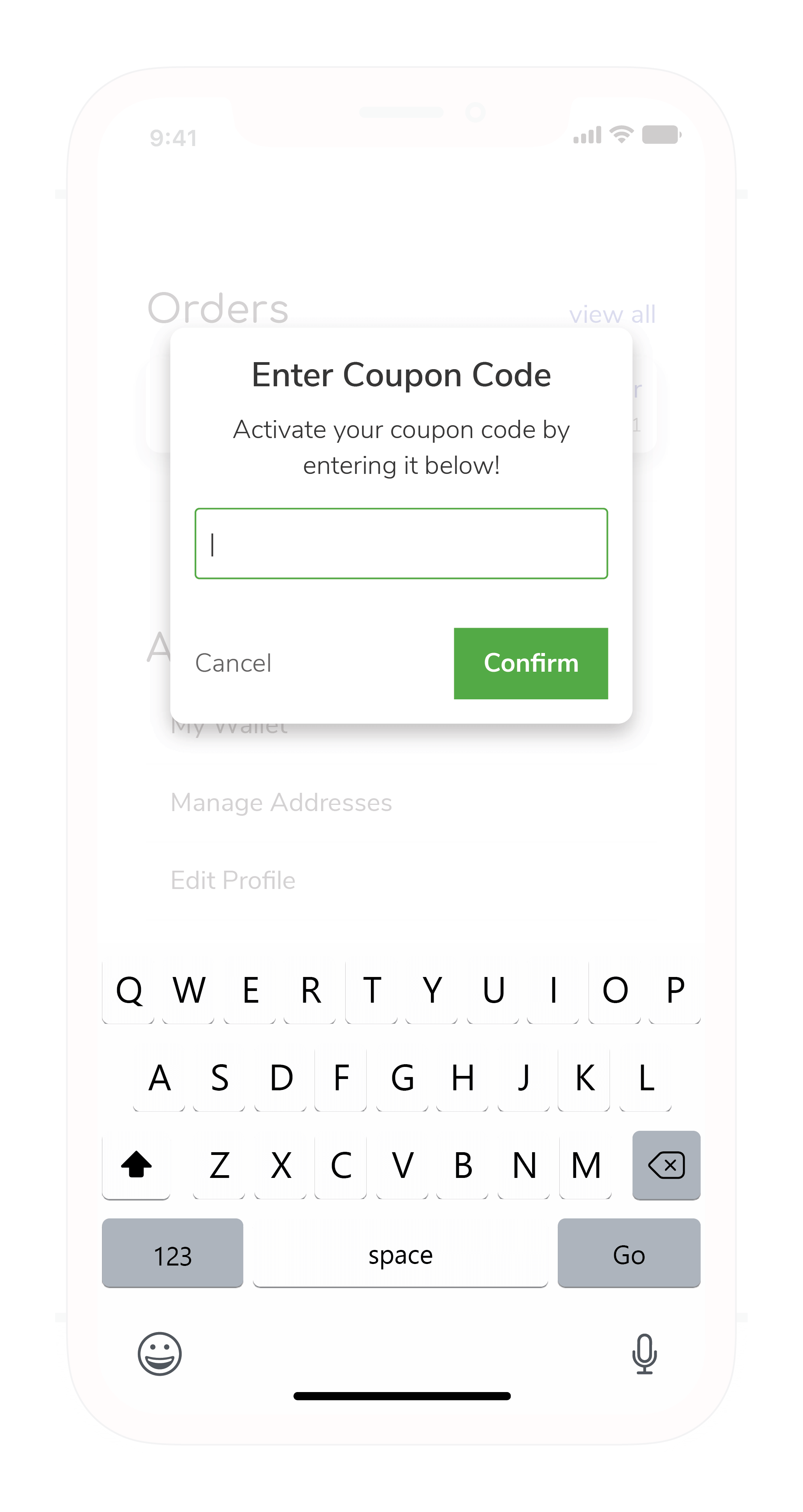
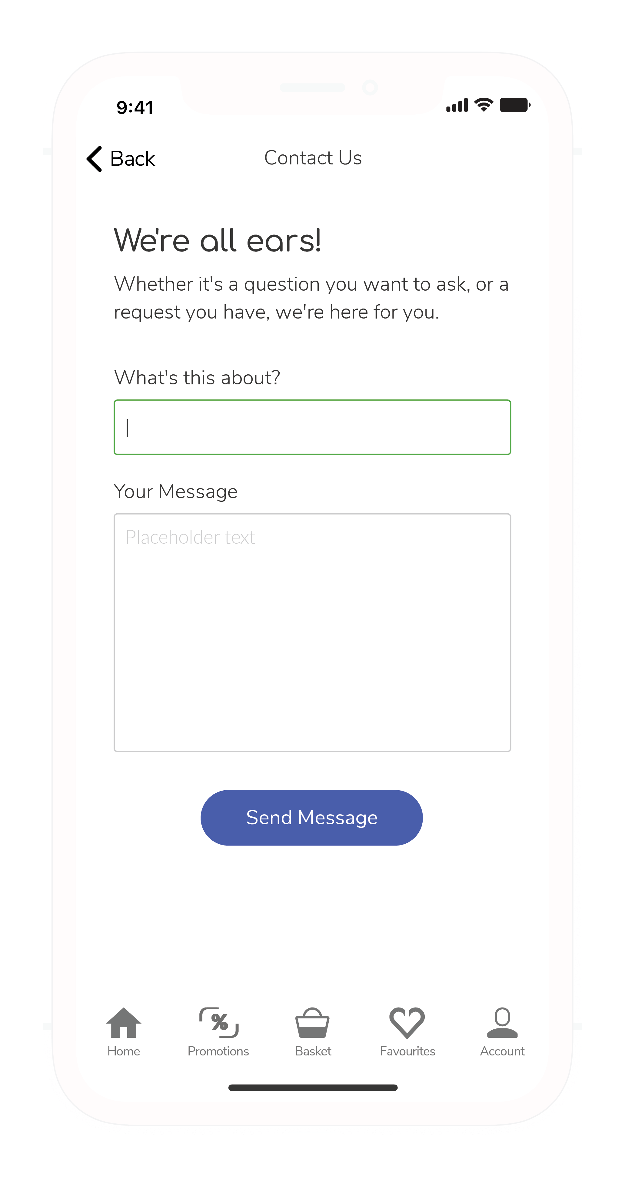
The account settings give users all the tools that they will need to fine-tune their shopping experience.
Manage Address
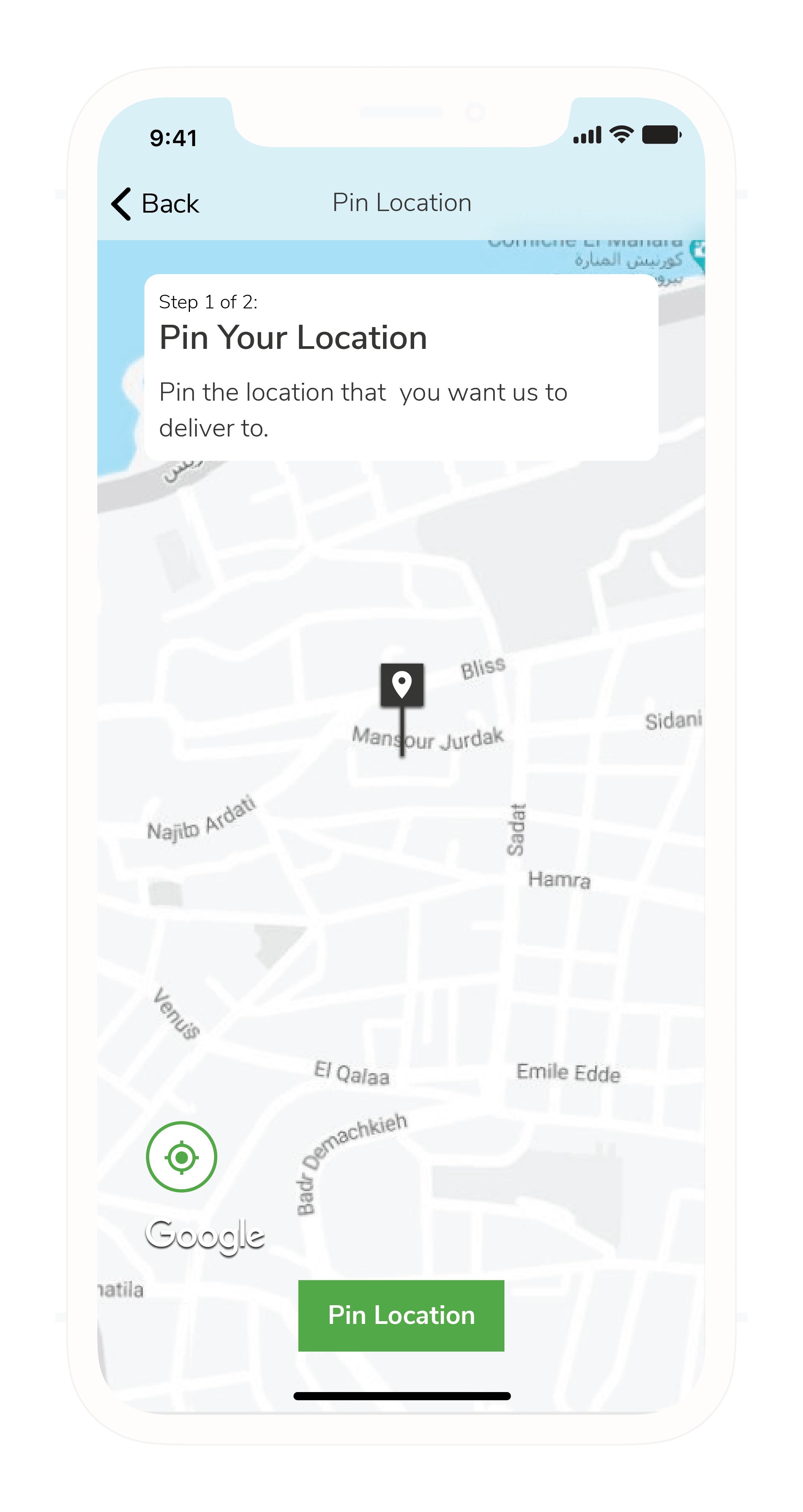
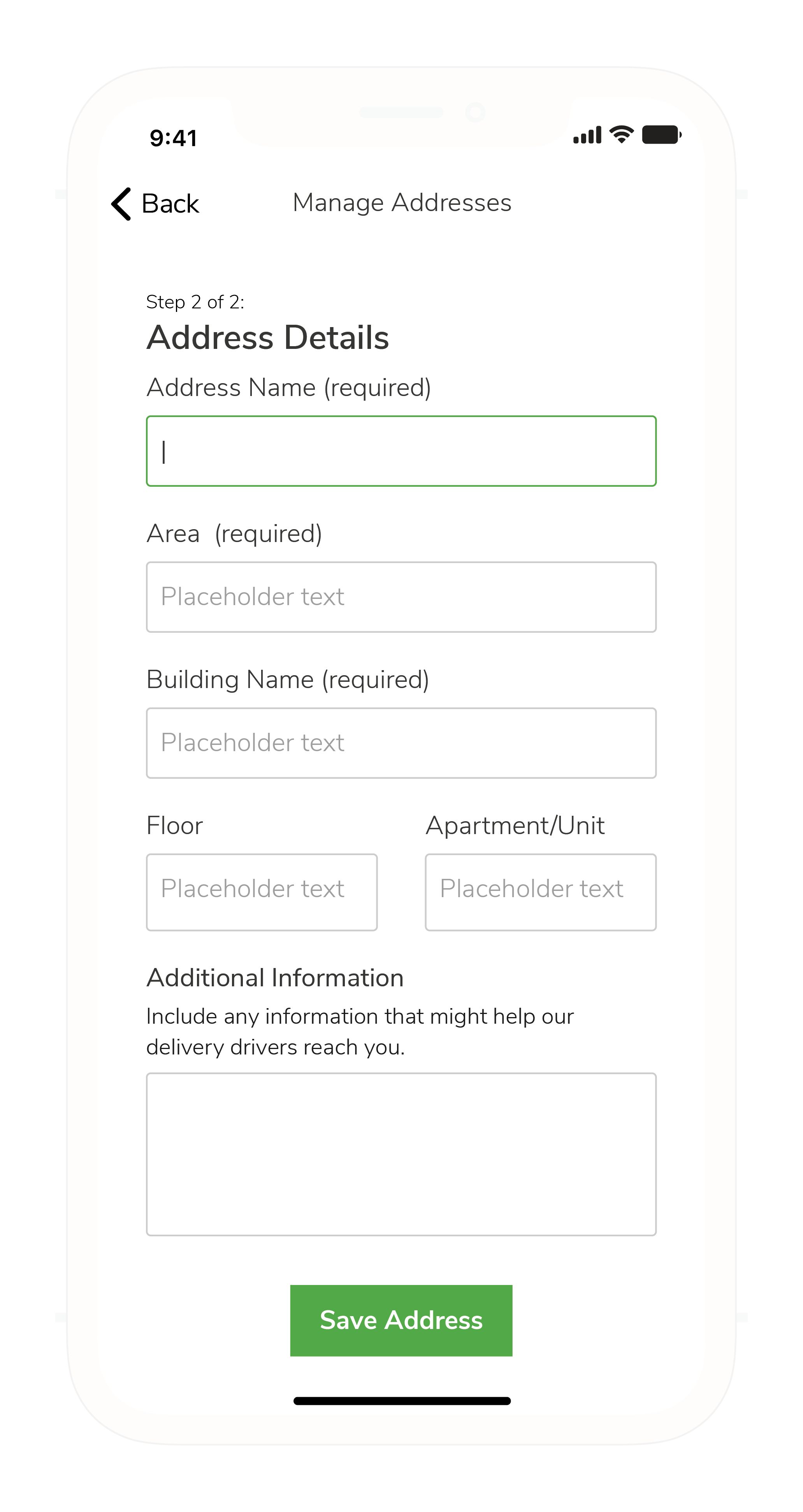
Adding an address is simple. Pin your location, and type down the fine details. Delivery drivers will be able to find customer locations through Google Maps, but will also be able to refer to written instructions to help them find the exact building. What we did here is crucial for countries like Lebanon, where there are no formal street addresses.
App Settings
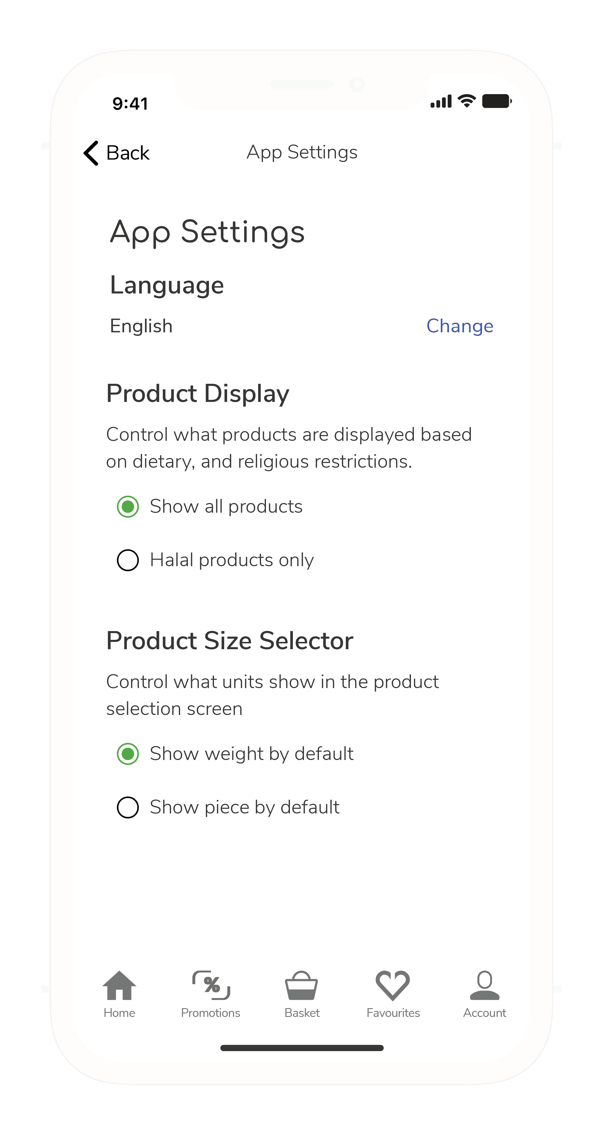
The "App Settings" allows customers to customize their experience. In a country as diverse as Lebanon, there are many different dietary restrictions based on religious and lifestyle preferences. The plans for this section is to eventually expand and include app-wide filters such as Kosher, vegan, gluten-free, and more. This feature will allow users to shop without having to worry about their dietary requirements.
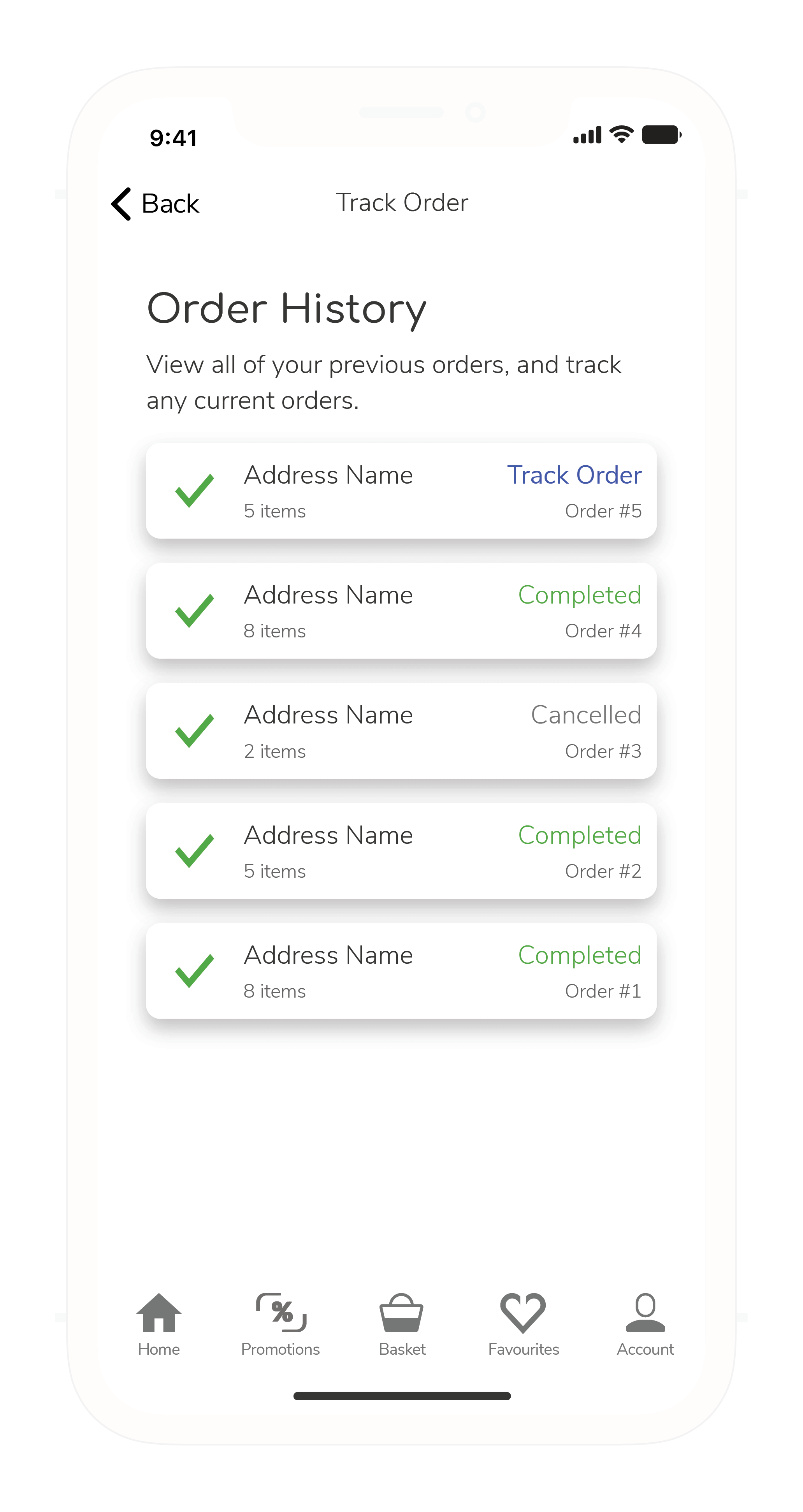
The Order History section allows users to track orders, view order history, or re-order a previous order. I've never used the word 'order' this many times in a sentence before.
Payment methods
Security Features
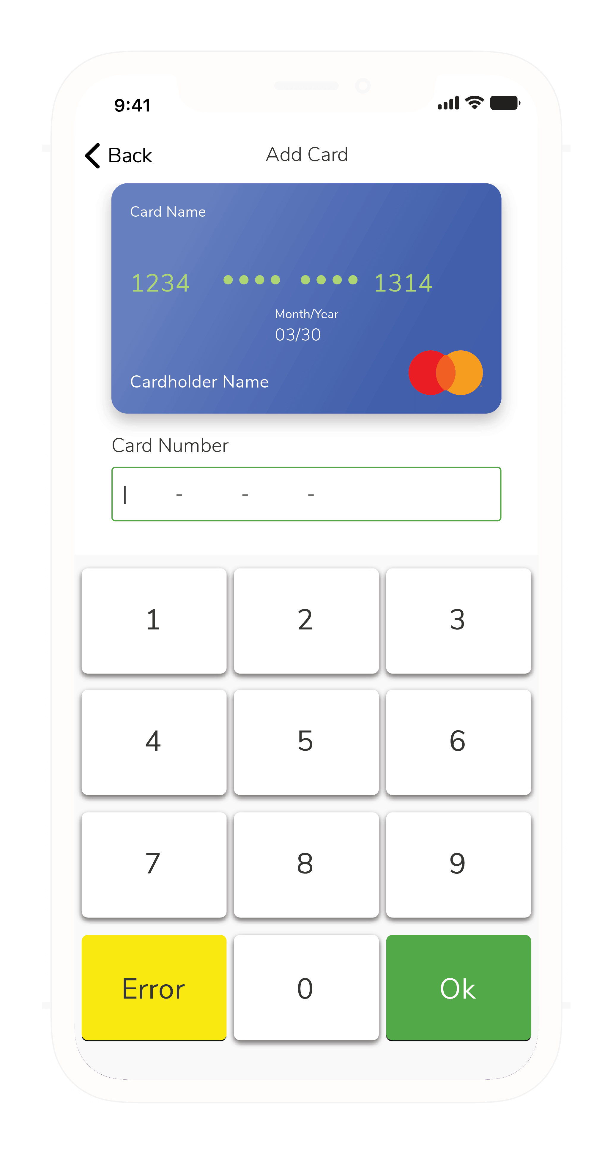
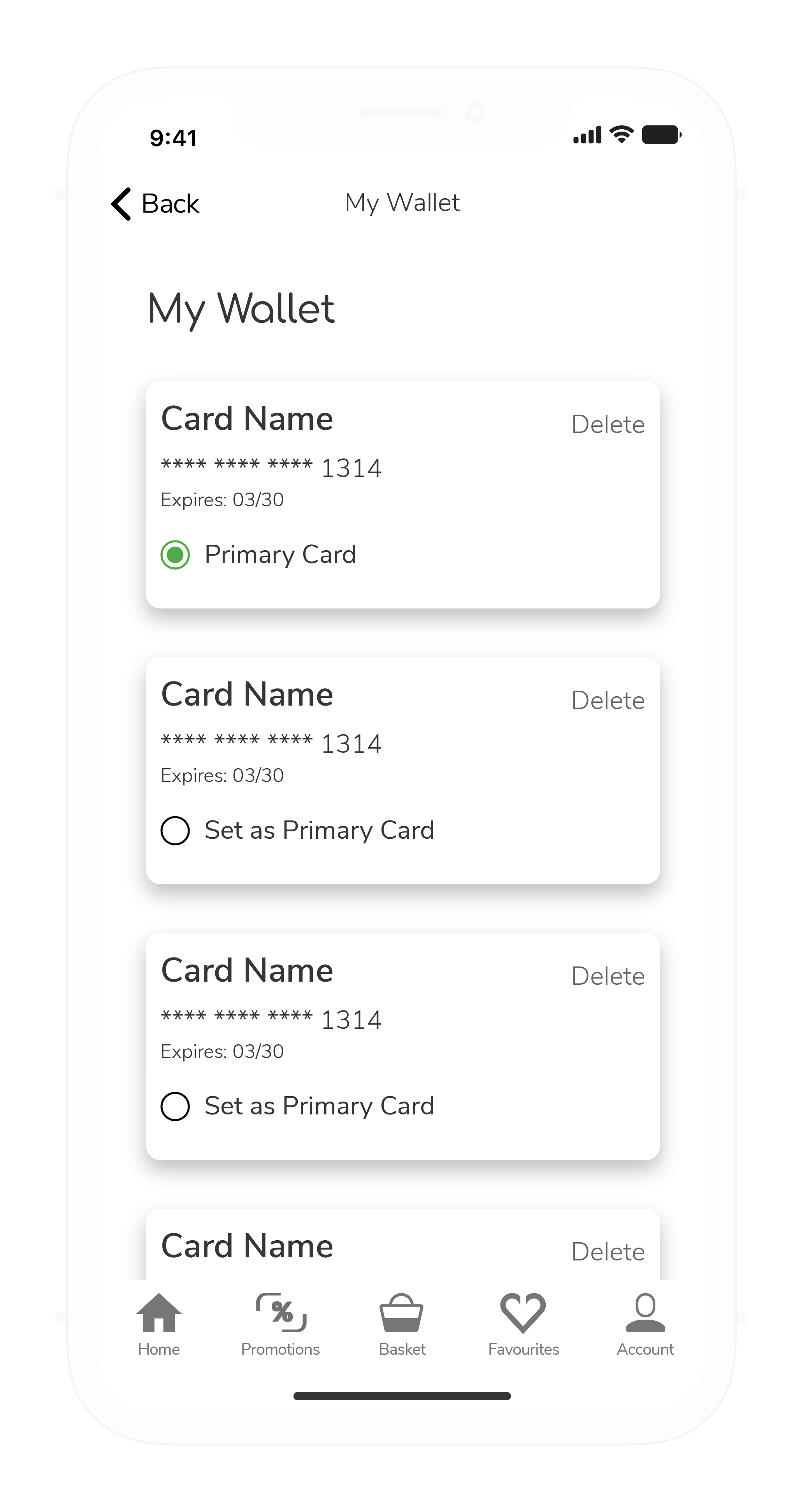
If you've seen the NFC Payment project, you know what's happening here: we're implementing all the methods that we can to create a safe experience for users that are looking to pay by card. With the help of a security expert, I was able to ensure optimised safety from the design right down to the code level.
Product Detail Page
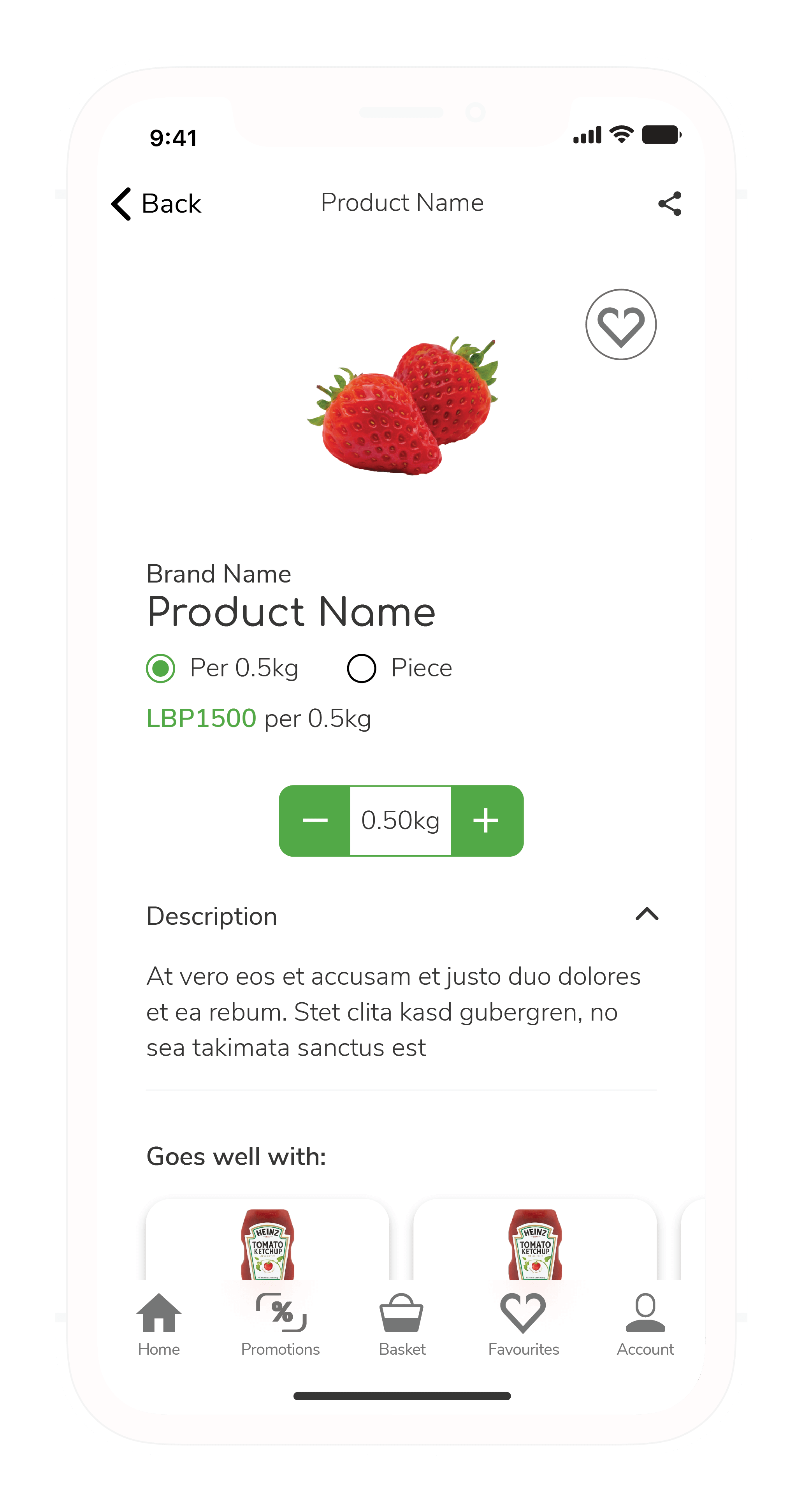
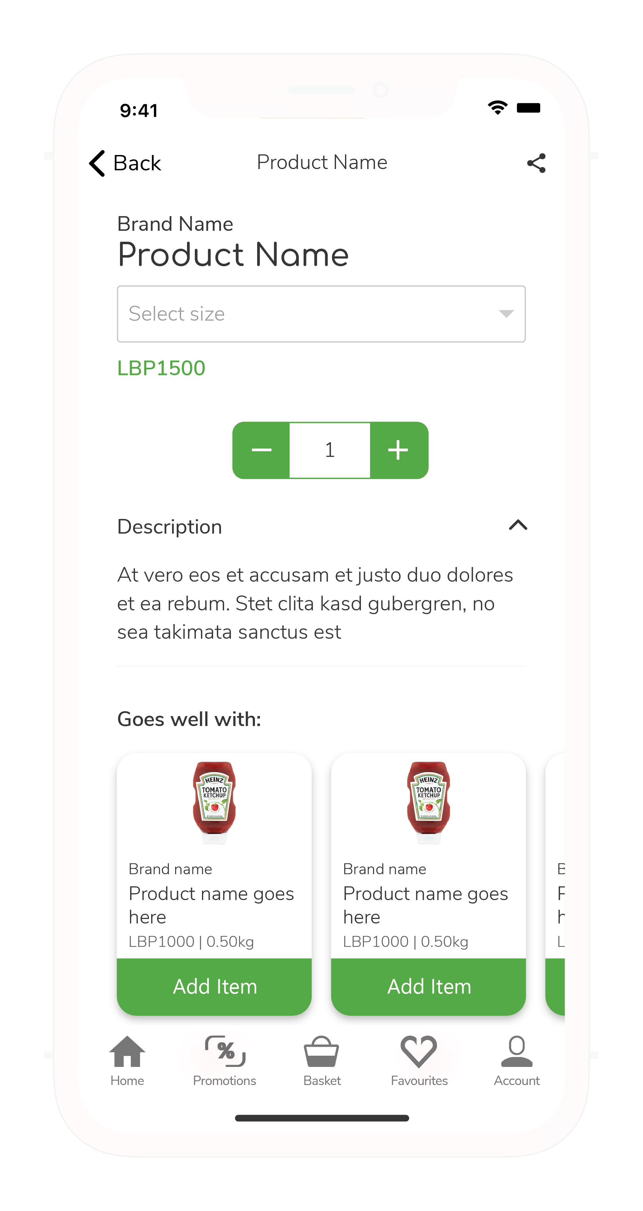
On select products such as vegetables, users will be able to purchase based on unit quantity, or weight quantity. When a product has a size variant, the product detail page will have a dropdown menu that will allow users to choose between the different available sizes. One of the plans for this page is to include nutritional details for users that require them.
There is also a product recommendation section that gives users recommendation based on the product they are currently viewing.
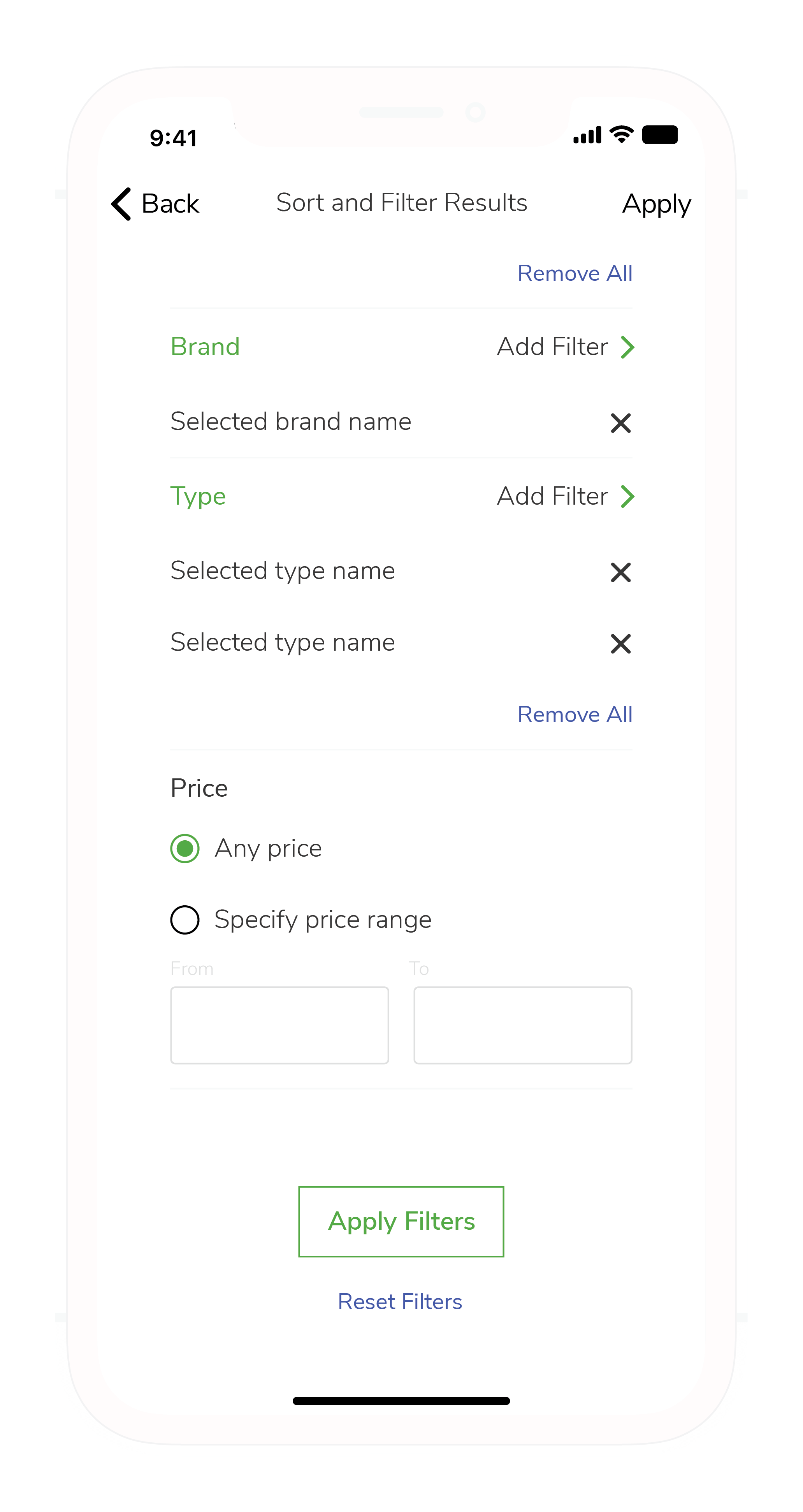
Search Filter
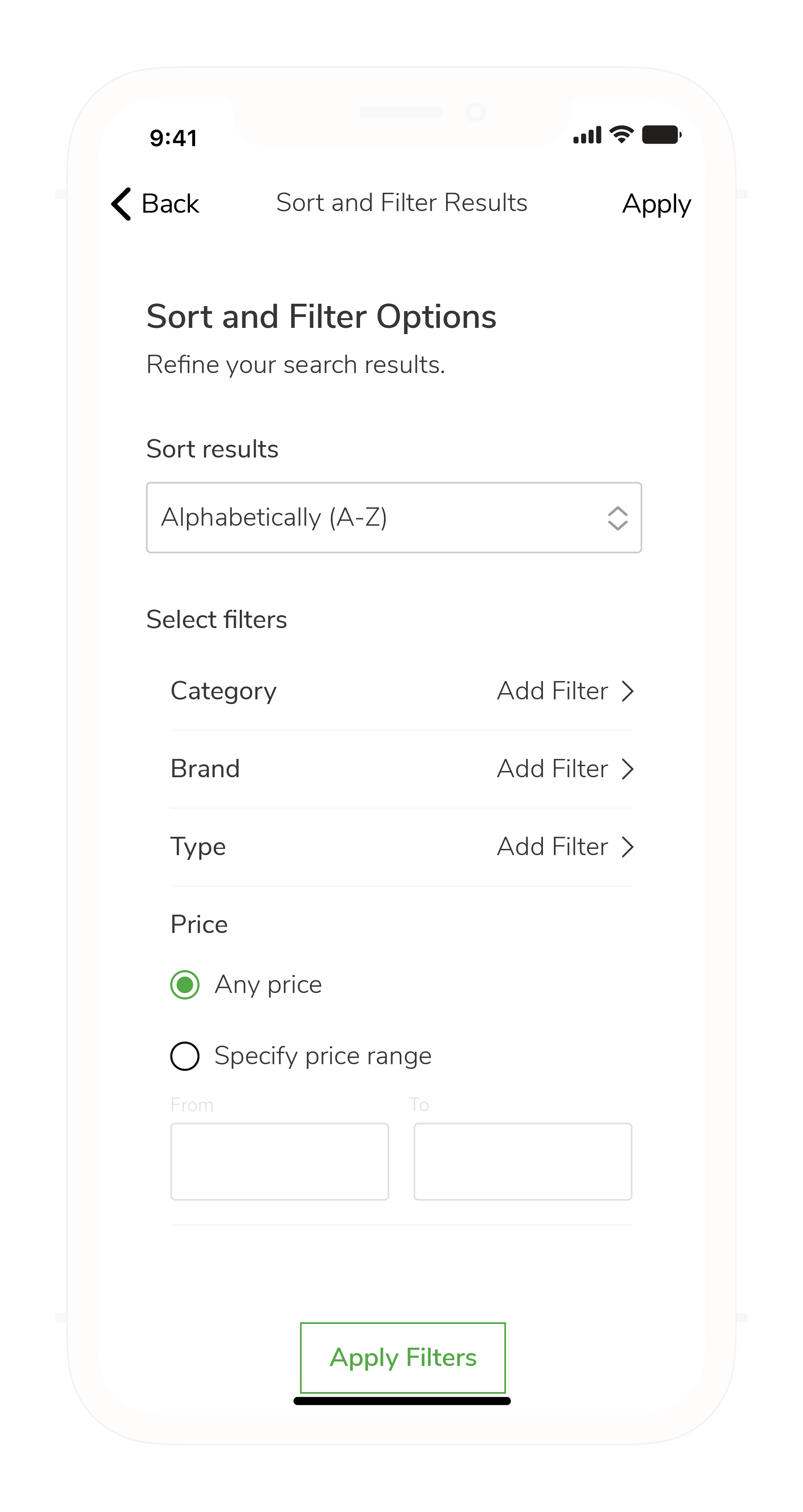
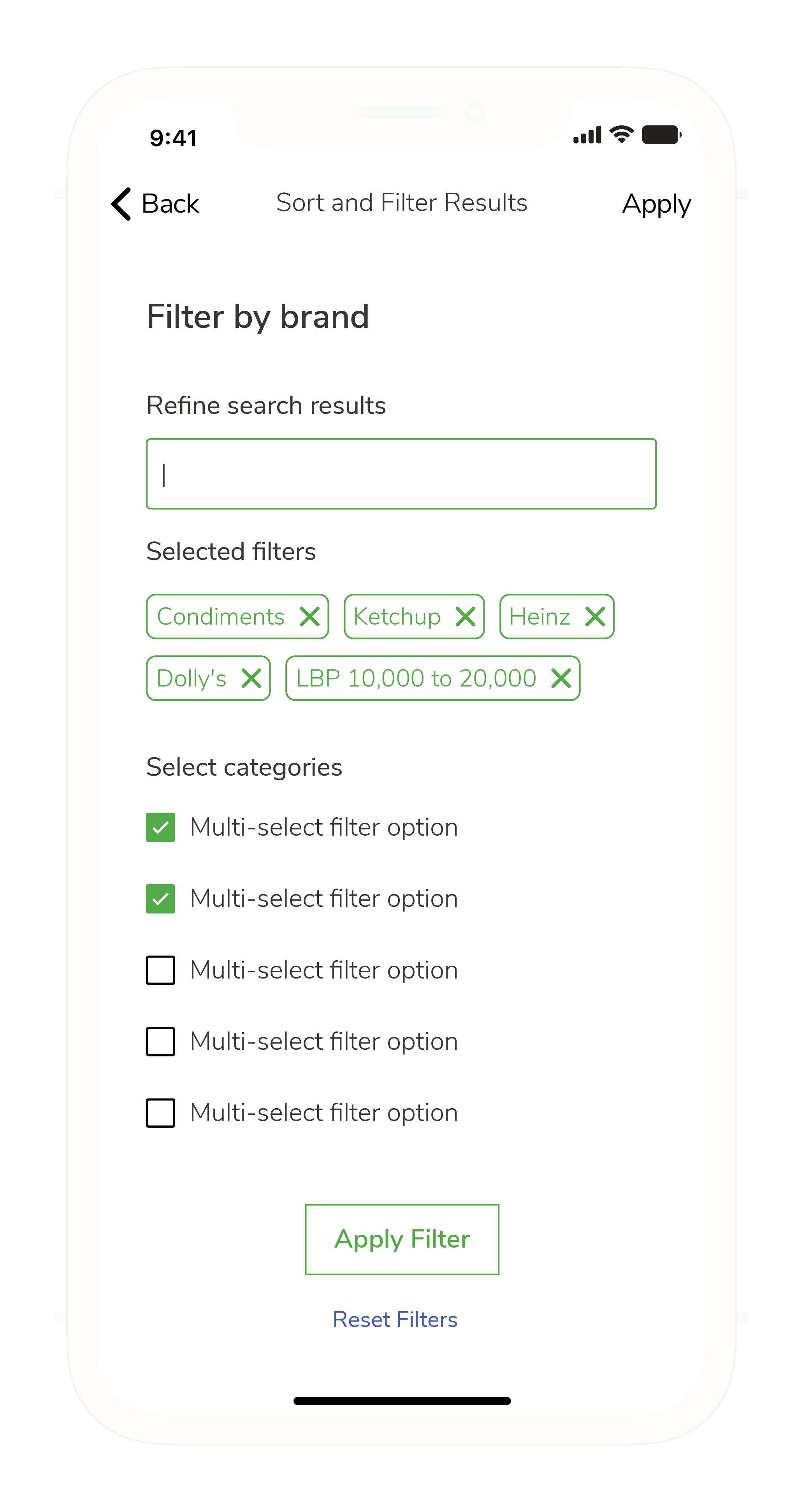
Searching has never been this easy. You can easily filter your search results precisely and activate multiple filters at the same time. Through a rigorous research process, I managed to find what should be the most suitable search filter behaviour solution for this specific app. You can also access quick filters by tapping on tags to filter by categories, brands, and subcategories (product type) instantly.
Checkout Process
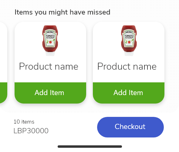
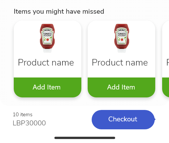
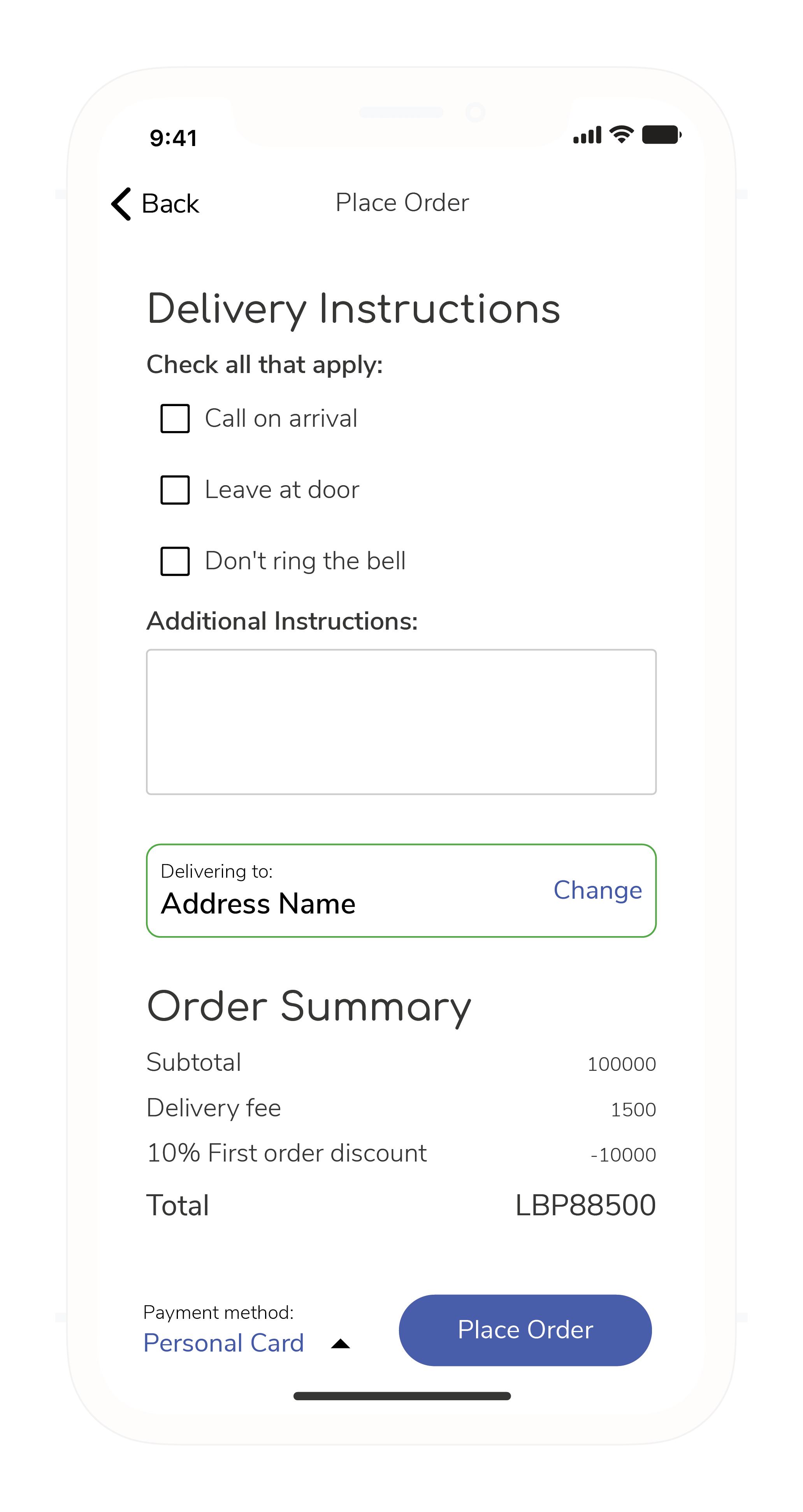
Before checking out, the cart page recommends a few products that are related to the items present in the cart. The idea is not to create impulse purchases, but rather to make sure the user doesn't forget products they might need. For example, if a user bought pasta but didn't have tomato sauce, then one of the suggestions would be tomato sauce.
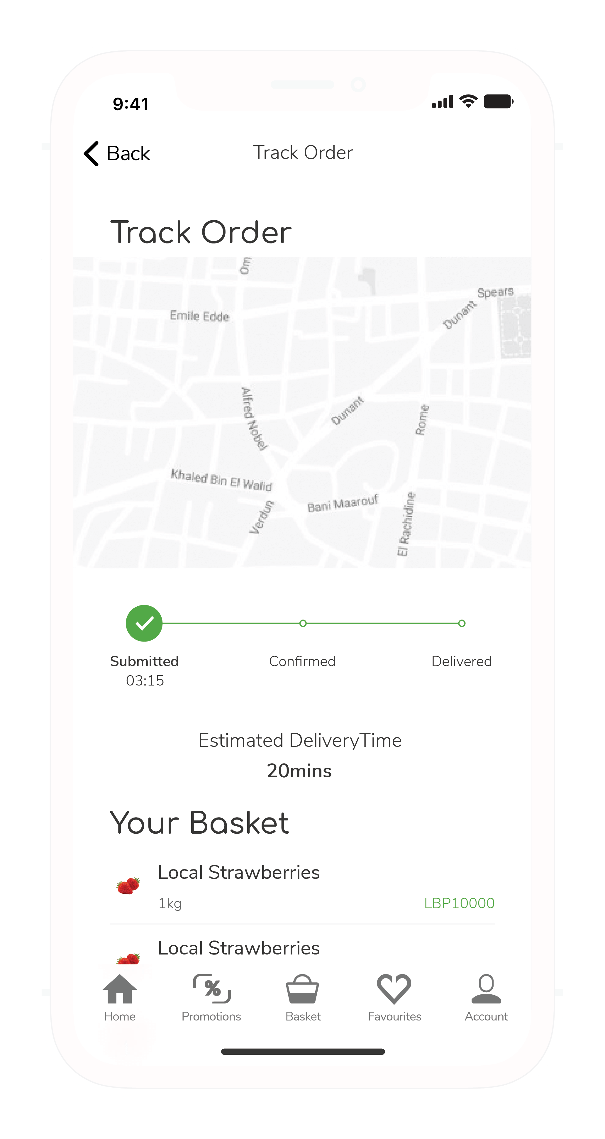
Users can leave quick delivery instructions if they have any special instructions. Customers will also be able to track every single step in the delivery process. We are making sure our customer experience includes the customer in every single step along the way.
Final Thoughts
Good experience design is not the same as designing a beautiful interface. We forget all too often that the experience is happening not on the phone but rather in our minds. Our mind is on a constant lookout for our well-being, even when all that we are doing is seemingly risk-free.
Making an interface easy to use, easy to understand, and easy to navigate will help set the user at ease. It tells them that you aren't trying to hide something from them.
Experience design is about setting the mind at ease and answering the questions a customer might have. You might answer these questions textually, visually, or psychologically, but what's most important is that you answer these questions honestly because a user will ultimately always know the truth sooner or later. Treating your users with respect and honesty will allow you to create a long-lasting relationship with them. Trying to cheat your users through dark UX patterns might work the first time, but they will quickly learn from that experience to never trust your platform again.
Good experience design, just like good design, is innovative, functional, clean, and most importantly: honest.
