myBank

Preface

MyBank was a part of an ideation workshop that lasted three days. A banking client asked me to conceptualize and create an MVP for a fully digital banking solution. The project ultimately didn't launch due to internal considerations on the client's side, but it's a project I enjoyed.

You'll find that this project bridges UX and product management. I loved the blurred boundaries because they allowed me to take ownership of the entire product's (albeit short) lifecycle.

This project also itches my love for all things fintech, securities, crypto, and digital assets. Why FinTech? Long story short: I've been very interested in financial inclusion and its implications on people's lives.

The need for financial inclusion and open and transparent frameworks becomes painfully apparent when dealing with banks. Most of us probably never had any pleasant experience with a bank, let alone simply opening an account. I wanted to tackle that and change the entire process of setting up an account and managing your finances while adhering to international and local regulatory frameworks.

Due Diligence

Brief Requirements

As part of the brief, the bank wants to be fully digital, meaning there won't be any physical branch past a dedicated call centre. Anything a user needs to be should be accessible through the application itself.

The following are assumptions we've made about the bank and how it will operate:

  1. The bank is fully digital and will have no physical presence.
  2. Anyone can open a digital account with MyBank, as long as they provide the required documentation.
  3. MyBank will strictly conform to KYC (Know Your Customer) and FATF (Financial Action Task Force) requirements.

The Challenge

There are strict international and local regulatory frameworks governing banking institutions. These frameworks are in place to monitor and limit any criminal or illicit financial activities such as money laundering. As a result, banks have to do their due diligence to ensure the integrity of their customers lest the banks face sanctions.

The process of providing these documents can be tedious in the real world. You, as a client, have to go to the bank with the required documents, typically an ID, proof of address, and proof of income. You then have to sit there awkwardly while your account manager tries to verify your identity and documents while you sit there smiling awkwardly.

Any time a client tries to open an account, we must ensure that the process, although fully digital, is also fully compliant with regulations.

One advantage digital banks offer is the elimination of human bias and prejudice. I'll explain why and how that's the case in the "Meeting KYC Requirements" section.

Client Expectations

I can't share the specific research, but I can share the following key points to summarize our findings:

Effortless account authorization

Utilize biometrics to allow quick account access.

Due to privacy and security concerns, we will use multi-factor security solutions for large transactions and specific actions.

All financial insights at a glance

We should deliver spending insights that provide real value to empower users. After opening the application, the user should be able to answer the question:

How am I doing financially?

Overview

Studies indicate users expect to see their balance when they initially open their applications. The data presented should be simple, easy to understand, and actionable.

Make transaction history more valuable.

Allows users to see their spending habits, search through their transactions, categorize, and filter them.

Monitor wealth

Users should have instant visibility. If you have multiple accounts, securities, or financial assets, you should be able to gather insight into your overall wealth without bringing out a calculator.

Guiding principles

Clear

We're only going to deliver data that matters to the average person.

Simple

The interface cannot steal the show - The user's financial situation is the star.

Functional

Easy to use without creating overarching or complex flows. If an element is on-screen, then it must serve a purpose.

Minimal Viable Product

Positioning Statement

A positioning statement is an expression of how a product or service differentiates itself and fulfils a specific user need in a way competitors do not. It's the hypothesis we are basing this design and product conception exercise on that we can later prove or disprove through research.

For MyBank, my positioning statement is as follows:

For [the millennials] who [are looking to open a bank account to manage their finances and meet their banking needs], [MyBank] is a [Redacted] that [allows you to create a bank account remotely and manage your finances, portfolio, and monitor your spending habits]. Unlike our [Competitor Name redacted], our product [allows you to open a free account from anywhere in the world].

Defining the MVP

Typically I'd start a section on personas here, but I can't share the exact persona. I can say that this persona is a specific set of millennials. In this section, we want to specify what features we need to create the MVP. I used the MoSCoW method to sort features into different categories.

Must-Have

The features listed under "Must Haves" are required or else the project is going to fail. The presence of these features is non-negotiable.

  • Account Overview
  • Transaction History
  • Card Management
  • User Account settings
  • Money Transfer
  • Seamless account opening
  • Clear and transparent KYC procedures

Should-Have

The features listed under "Must Haves" are required or else the project is going to fail. The presence of these features is non-negotiable.

  • Currency exchange
  • Credit cards
  • Analytics
  • Budgeting
  • Physical cards
  • Multi-lingual support

Could-Have

"Could Haves" are desirable features that aren't crucial for the product launch. These can be removed from the project scope if the time frame is limited for the current build.

  • Cyrptocurrency support
  • Add/send money through NBFIs
  • Access cross-border money transfer services
  • Top up account via ApplePay, Bitcoin
  • Closely manage accounts for children
  • Single use cards (disposable)
  • Stocks and securities (e.g; ETFs, indices)
  • Non-security financial instruments (e.g; Insurance)
  • Personal Loans
  • Referral Points

Won't-Have

"Won't Haves" are the least critical features at the current time but may be considered for future releases.

  • Account ownership transfer
  • Anonymous bank transfers
  • Any feature that could potentially conflict with FATF AML/CFT requirements.

The Design Process

Sign up flow

The most crucial part of a digital banking app isn't the app features as much as it's the sign-up flow that's typically the barrier to entry. If the sign-up flow isn't easy to follow, we will be churning and losing users left and right.

We also need the flow to be light-hearted while ensuring users provide the necessary information a bank needs to meet KYC requirements.

User sign up flow and the KYC pathways needed to verify a user's identity
Sign-up flow
User sign up flow and the KYC pathways needed to verify a user's identity

Meeting KYC Requirements

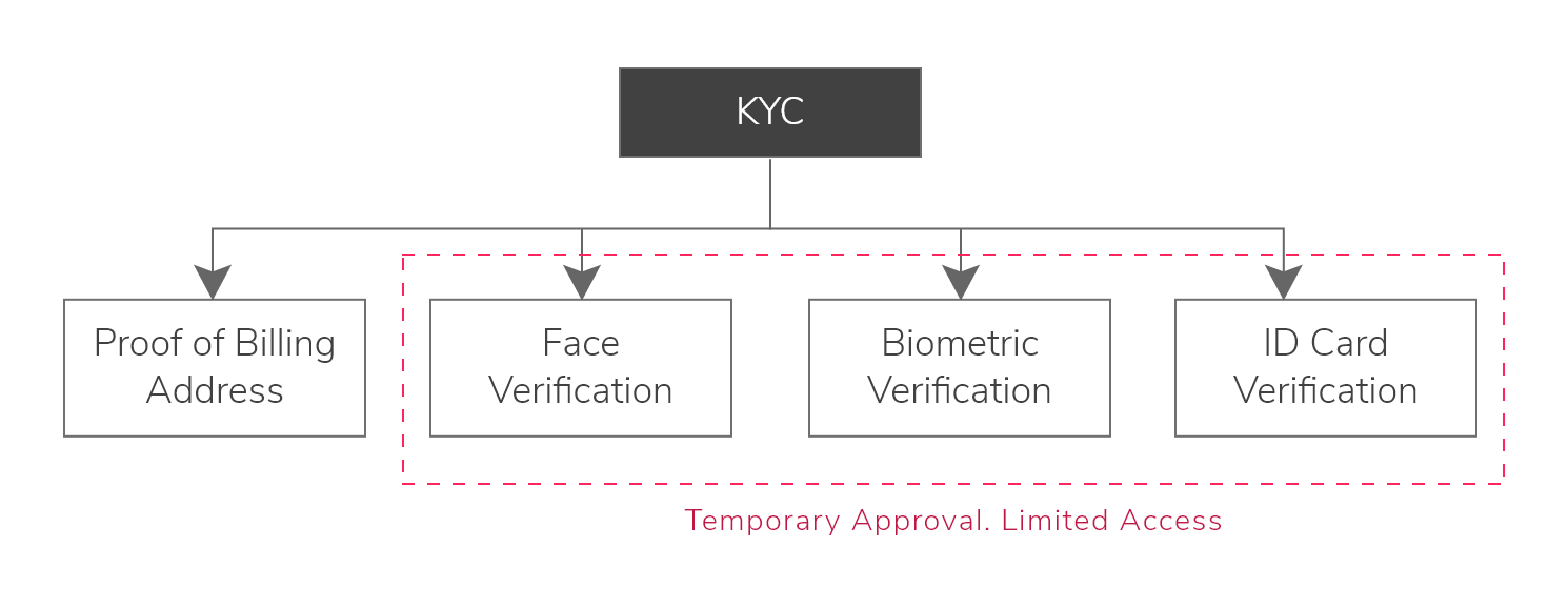
To make KYC compliance smoother, I suggest using a machine learning algorithm to teach the computer how to verify and check data rather than depend on the human eye.

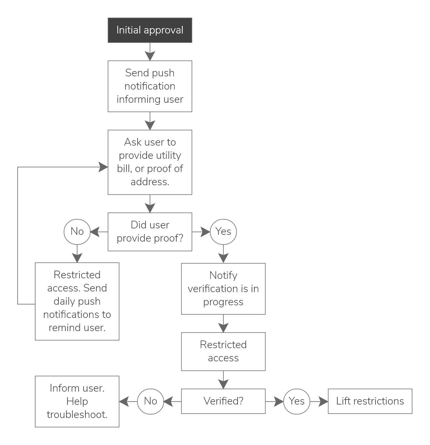
If the algorithm flags an image as false, faulty, or otherwise unacceptable, the system will prompt users to re-submit their documents or provide additional information. If the user fails to pass the check a second time, a human is alerted for manual verification to ensure everything is in order.

When it comes to facial recognition algorithms, computers can outperform humans right now when it comes to accuracy. Leveraging this technology will allow us to create a banking app available 24/7 for account openings.

The bonus is that with careful programming, we can discount human bias and prejudice by leveraging machine learning and AI to take care of that task. It might sound like an odd thing to worry about, but those from non-US/EU countries can attest to how human prejudice (in all its forms) determines how smooth or pleasant the account opening process can be.

KYC requirements diagram highlight three factors we can verify during sign up which are face, biometric, and ID card verification
KYC Requirements.
KYC requirements diagram highlight three factors we can verify during sign up which are face, biometric, and ID card verification
KYC approval and account activation flow demonstrating how the system checks that all required documents are submitted and valid.
KYC Verification Flow.
KYC approval and account activation flow demonstrating how the system checks that all required documents are submitted and valid.

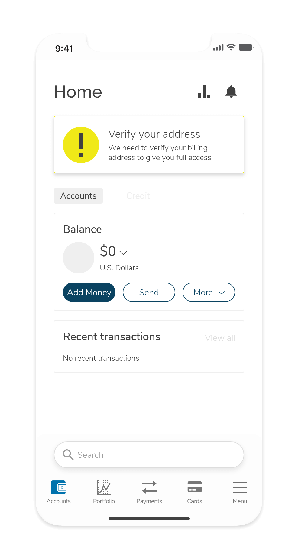
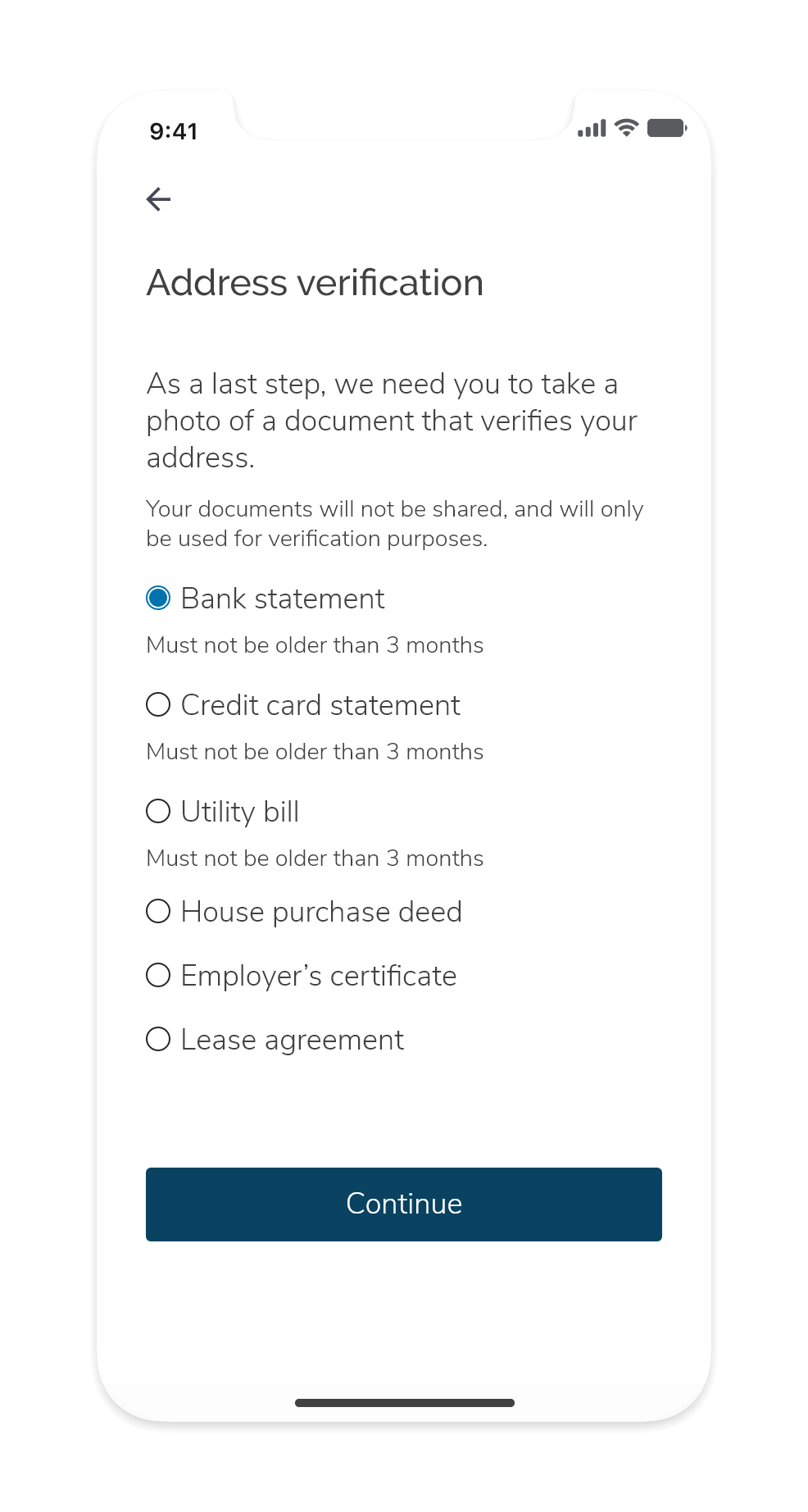
My understanding of rules and regulations suggests we can give customers temporary approval while pending identity verification. We could allow users limited access to the app to explore it. Users can also deposit no more than $1,000 to their account, with strict limitations on money transfers until their account is fully activated.

Information Architecture

The application will have five main menus or tabs: Account, Portfolio, Payments, Cards, and Account Dashboard/Settings.

Each menu will have different features associated with them. Below are a series of diagrams demonstrating the features and options located inside each menu.

Base Level

A diagram showing the main navigational menus to be used, which are: Account, Portfolio, Payments, Cards, and Dashboard
Base Menus
A diagram showing the main navigational menus to be used, which are: Account, Portfolio, Payments, Cards, and Dashboard

Account Overview

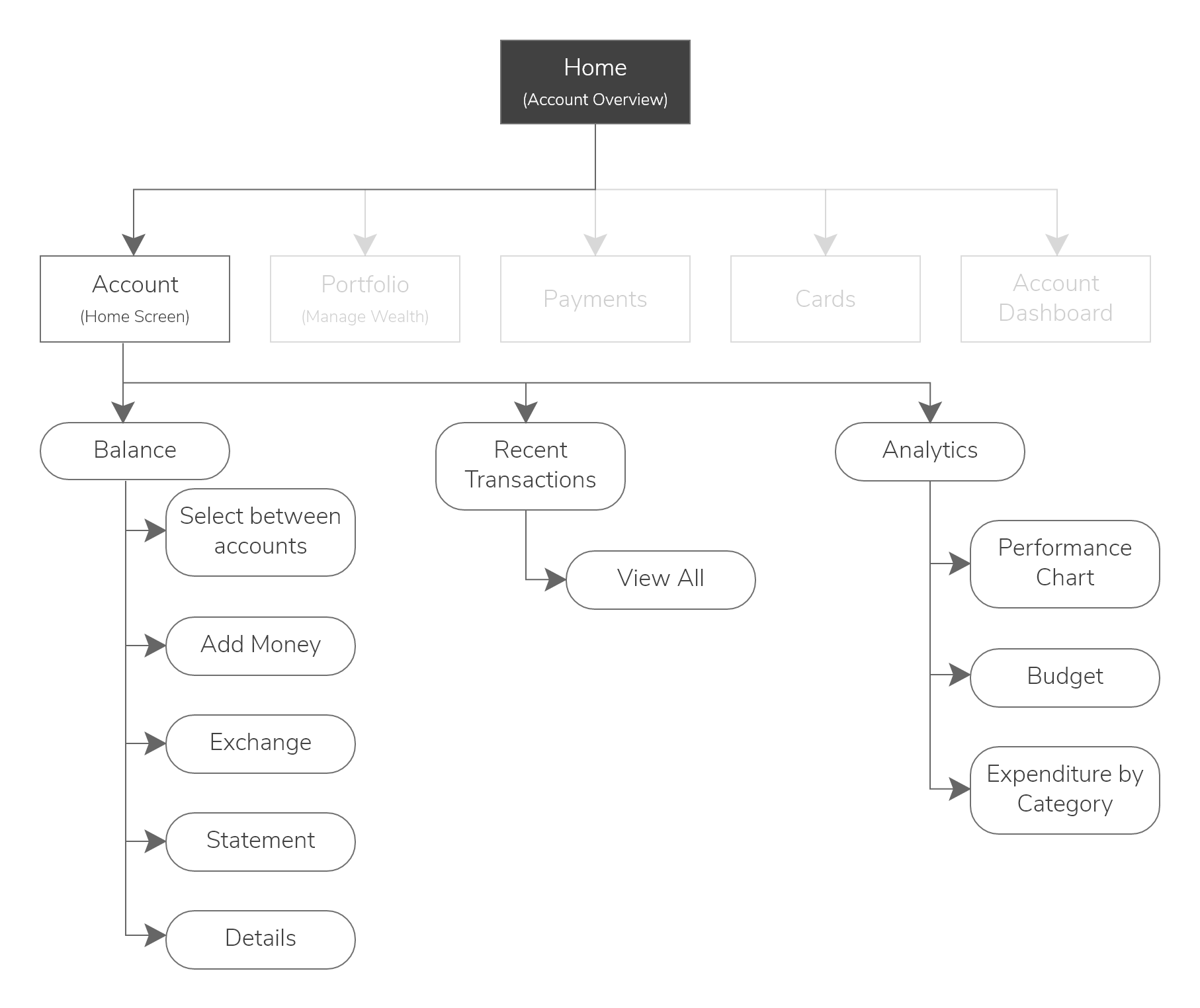
The different submenus under the account, such as Account Balance, Recent Transactions, and Analytics, and the different actions associated with them.
Account Submenus and Actions
The different submenus under the account, such as Account Balance, Recent Transactions, and Analytics, and the different actions associated with them.

On a base level, users can select five different overviews:

  1. Account Overview
  2. Overall portfolio or wealth
  3. Payments and transactions
  4. Cards
  5. Account/setting dashboard

In the account overview, users can check their balance, top-up their accounts, and access analytics to track their spending habits and set a budget.

Portfolio

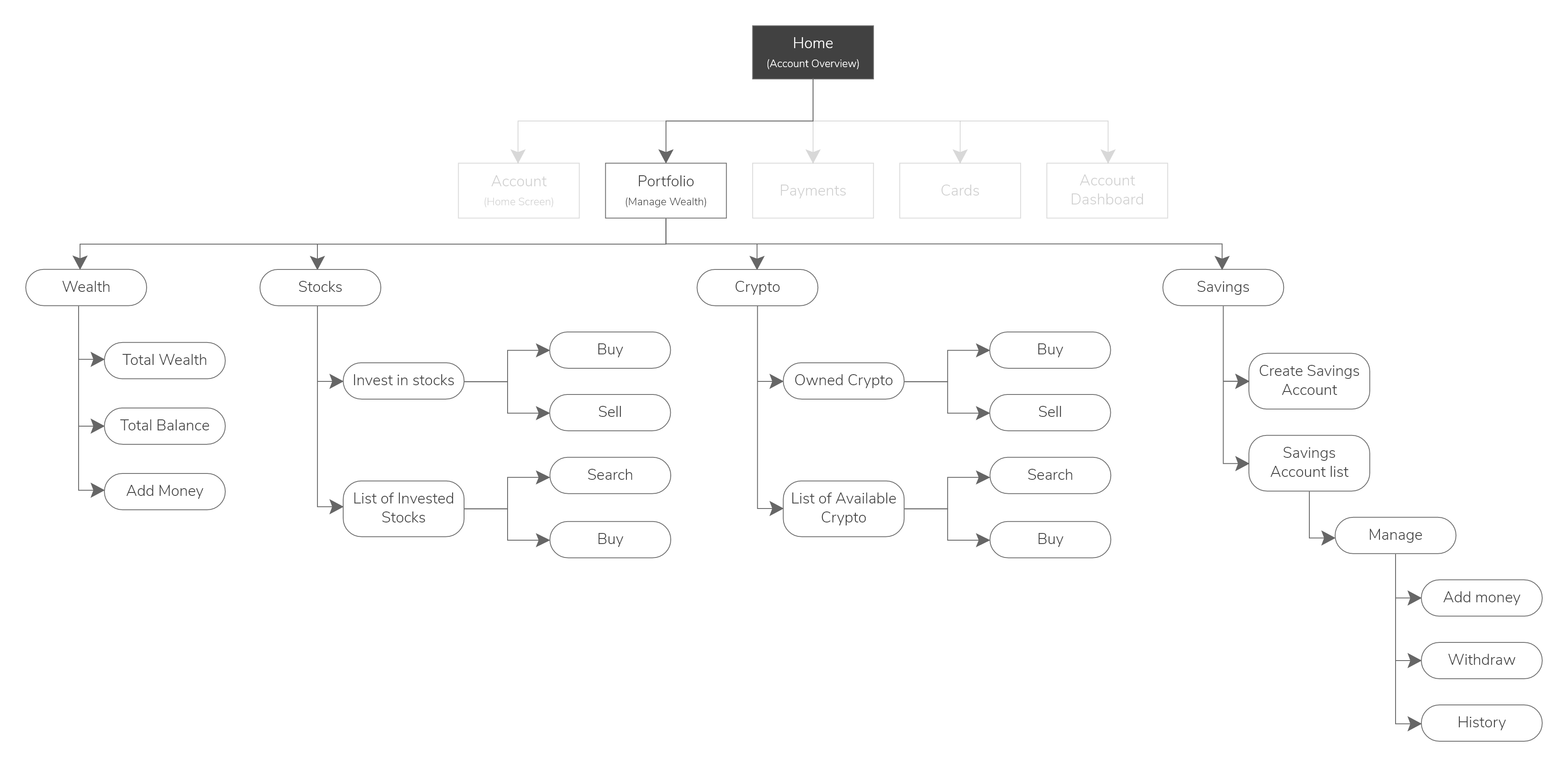
The different submenus under the portfolio  tab, such as Wealth management, stocks and securities, crypto, and savings, and the different actions associated with them
Portfolio Submenus and Actions.
The different submenus under the portfolio  tab, such as Wealth management, stocks and securities, crypto, and savings, and the different actions associated with them

Payments

The different submenus under the Payments, such as Transfers and Scheduled Payments
Payments Submenus and Actions.
The different submenus and actions under the Payments, such as Transfers and Scheduled Payments

Inside the Portfolio tab, users can track their total wealth and purchase securities such as stocks or bonds, cryptocurrencies, or even open a savings account that returns interest per annum.

Admittedly I did this project long before I improved my levels of financial literacy and became a Boglehead. In retrospect, I would have wanted to introduce the option to invest in bonds and exchange-traded funds (ETFs) rather than individual stocks. I would have also proposed an integration with a low-cost robo-adviser to help users get started with an easy-to-set-up and low-maintenance portfolio while educating them about securities. It's important to emphasize that this intervention is not to introduce securities trading but rather an investment tool - and there's a BIG difference between trading and investing.

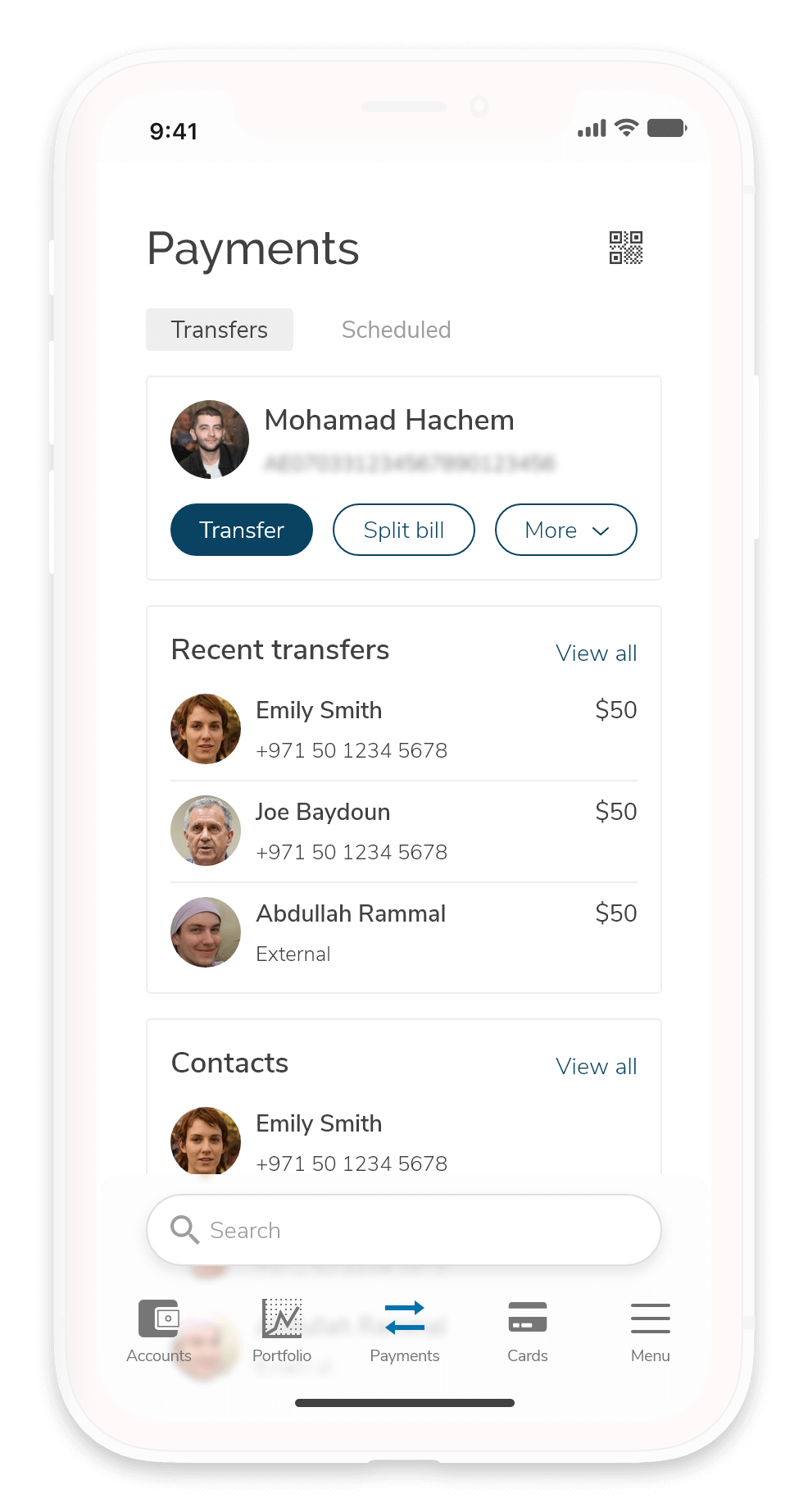
Back on track - Users can also make or schedule recurring payments to their contacts (as long as they are clients of myBank) or directly to an IBAN.

Cards

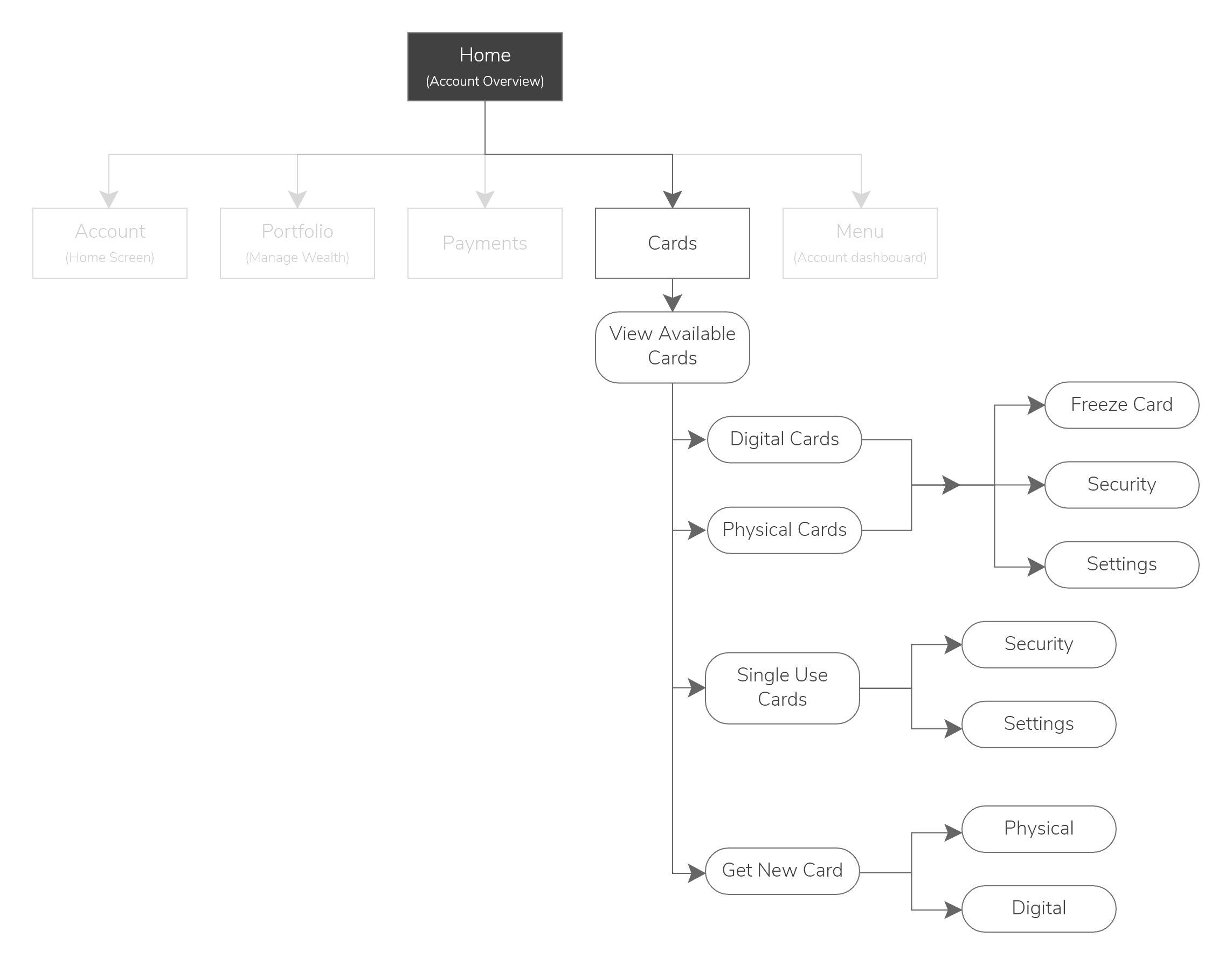
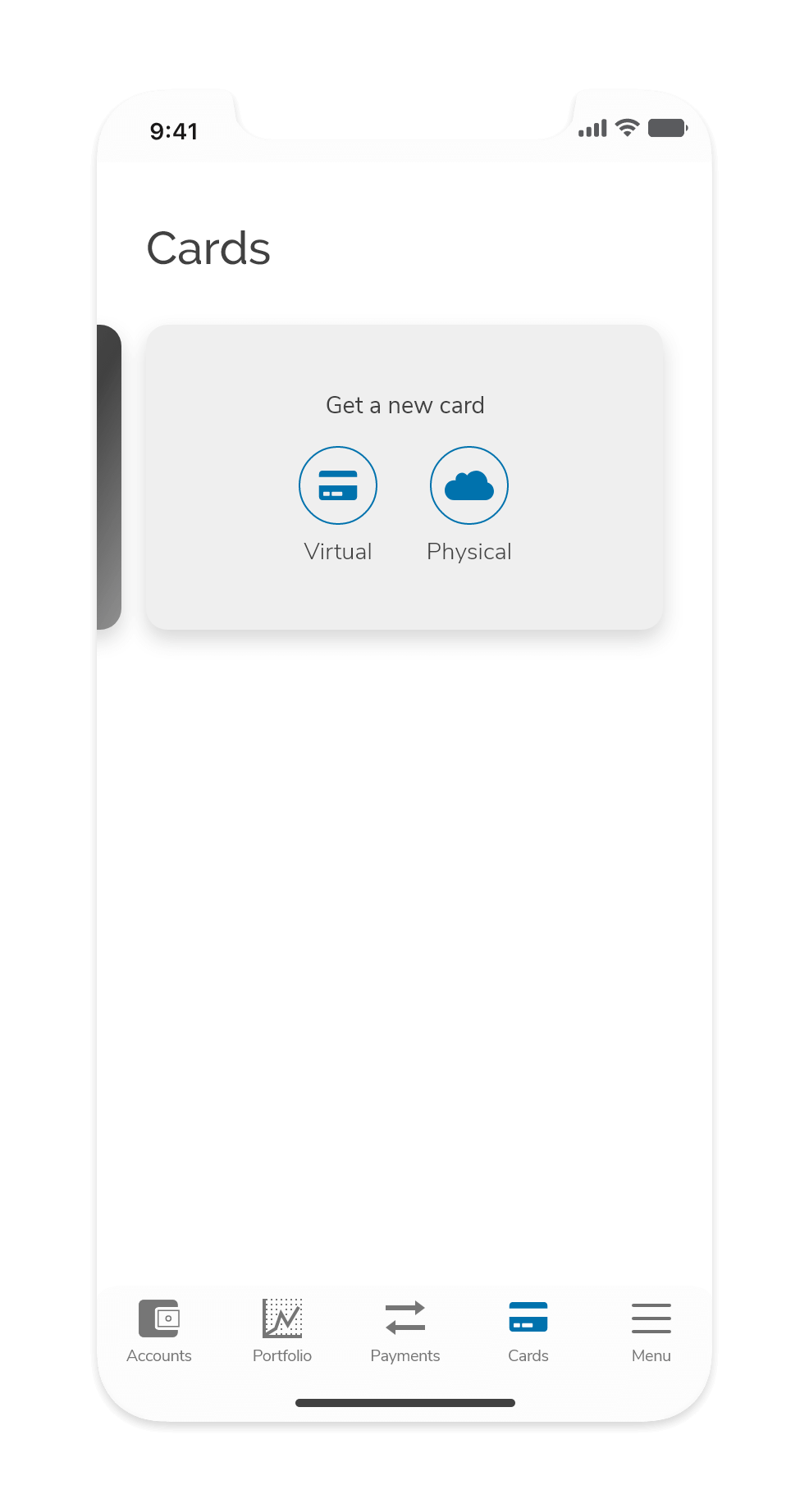
The different submenus and actions under Cards, such as Issue a digital or physical card, freeze card, and other security settings
Cards submenu and actions.
The different submenus and actions under Cards, such as Issue a digital or physical card, freeze card, and other security settings

Dashboard/Menu

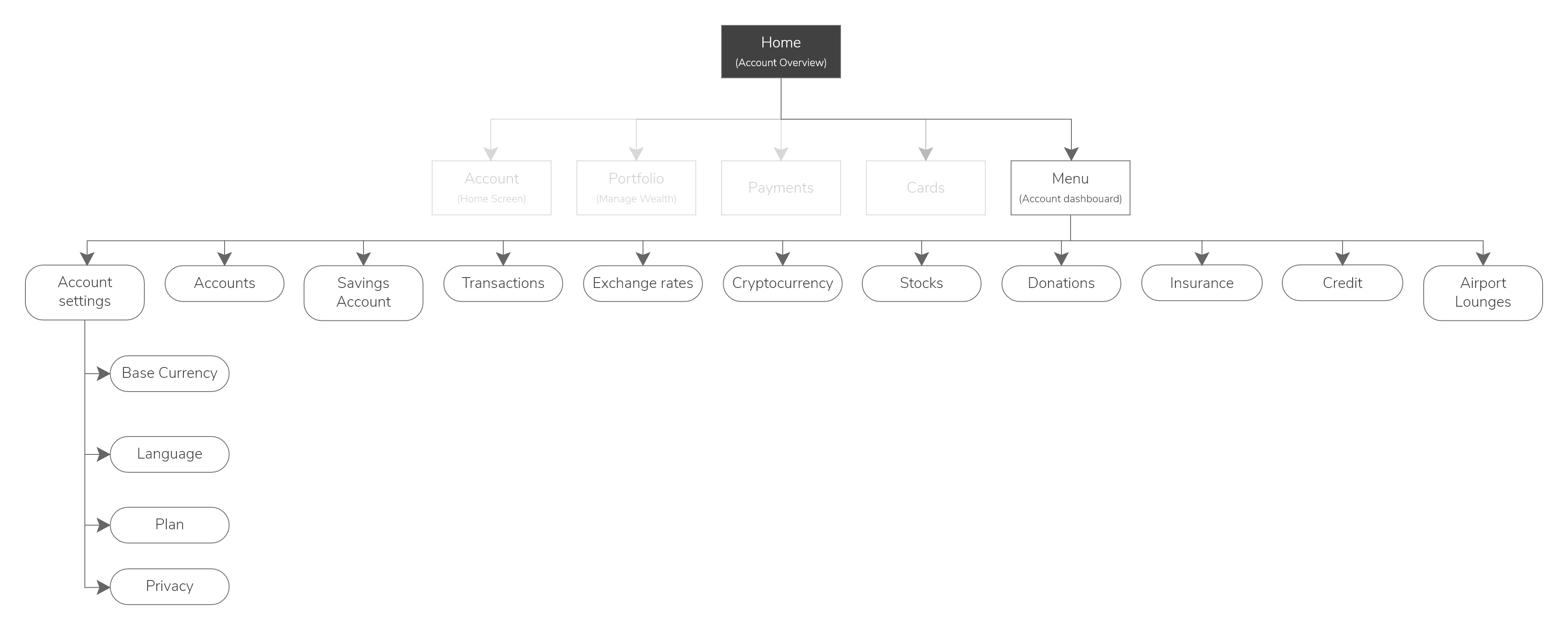
The different menus under the account dashboard including a variety of different menus and features that can be added under the dashboard.
Dashboard submenu and actions.
The different menus under the account dashboard including a variety of different menus and features that can be added under the dashboard.

Users can manage their cards and issue or freeze single-use or physical/digital cards.

In the account dashboard, users can access different settings and the different financial instruments available within the platform. The dashboard includes additional features and products MyBank might offer in the future.

Wireframes

Now that we've set up the first stage of the information architecture, it's time to create wireframes.

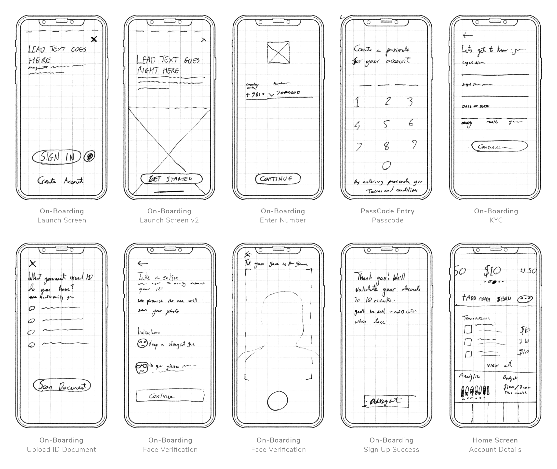
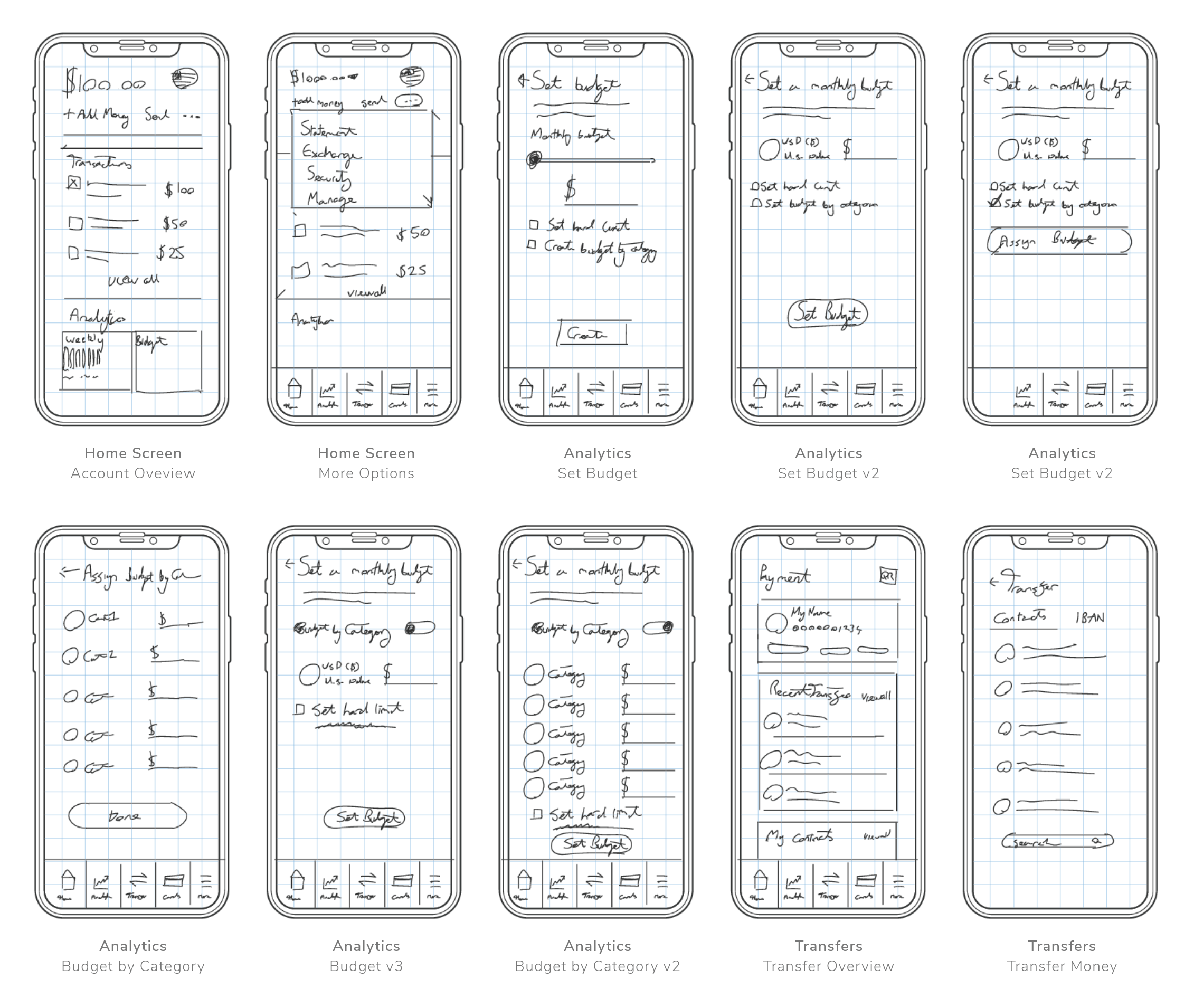
Initial UX wireframes ideating the concept design process of the app Initial UX wireframes ideating the concept design process of the app

You'll notice that these wireframes specifically are a bit more refined, and that's because they are since these aren't the very first set of wireframes.

Initial UX wireframes experimenting with the navigation elements Initial UX wireframes experimenting with the navigation elements

Prototype

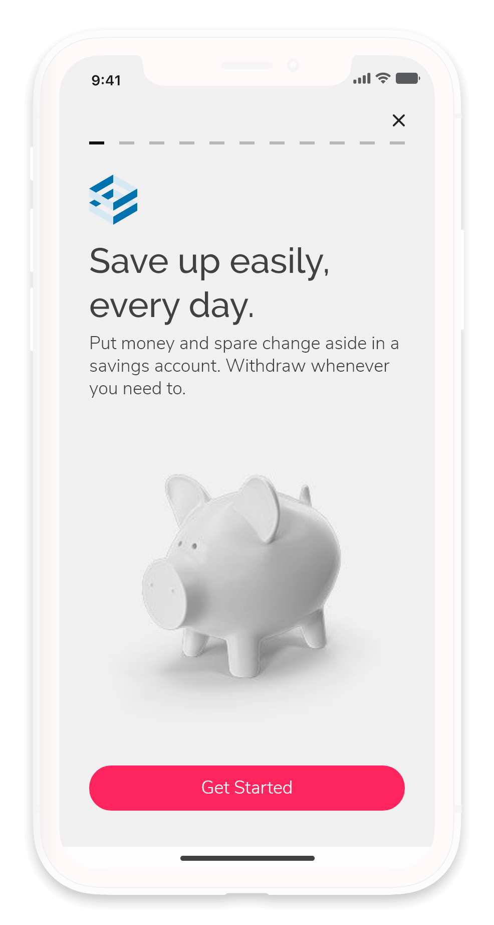
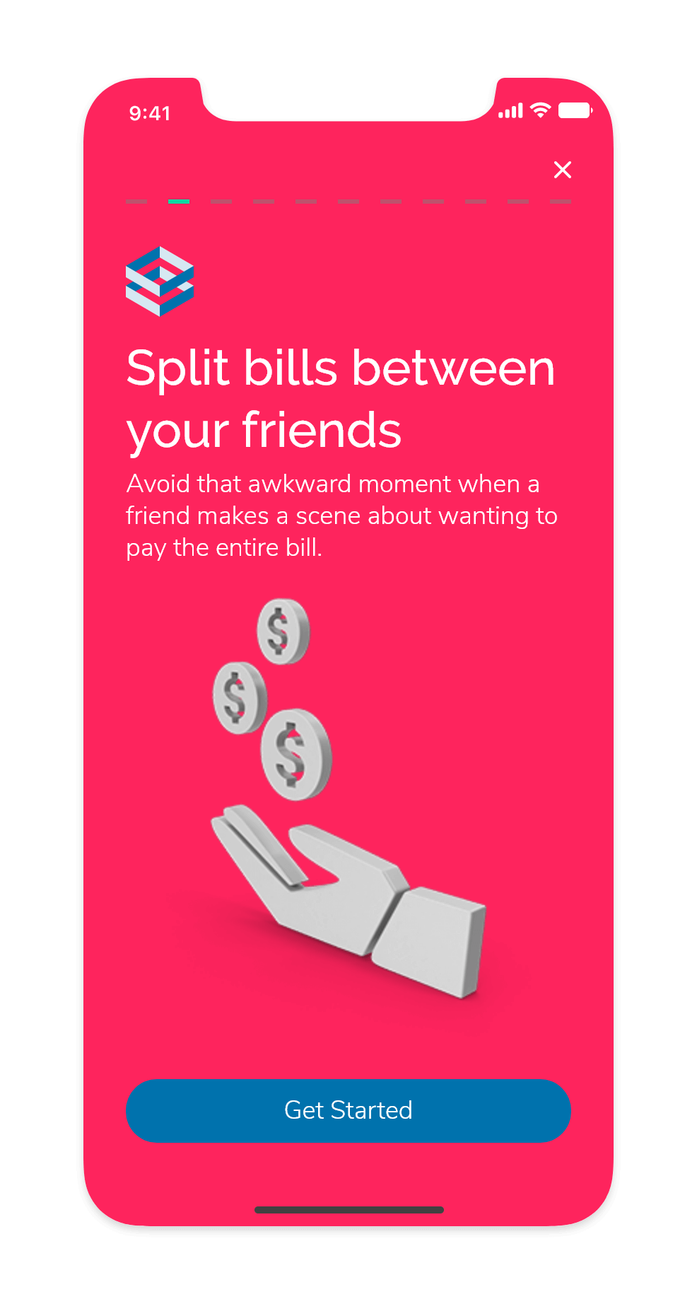
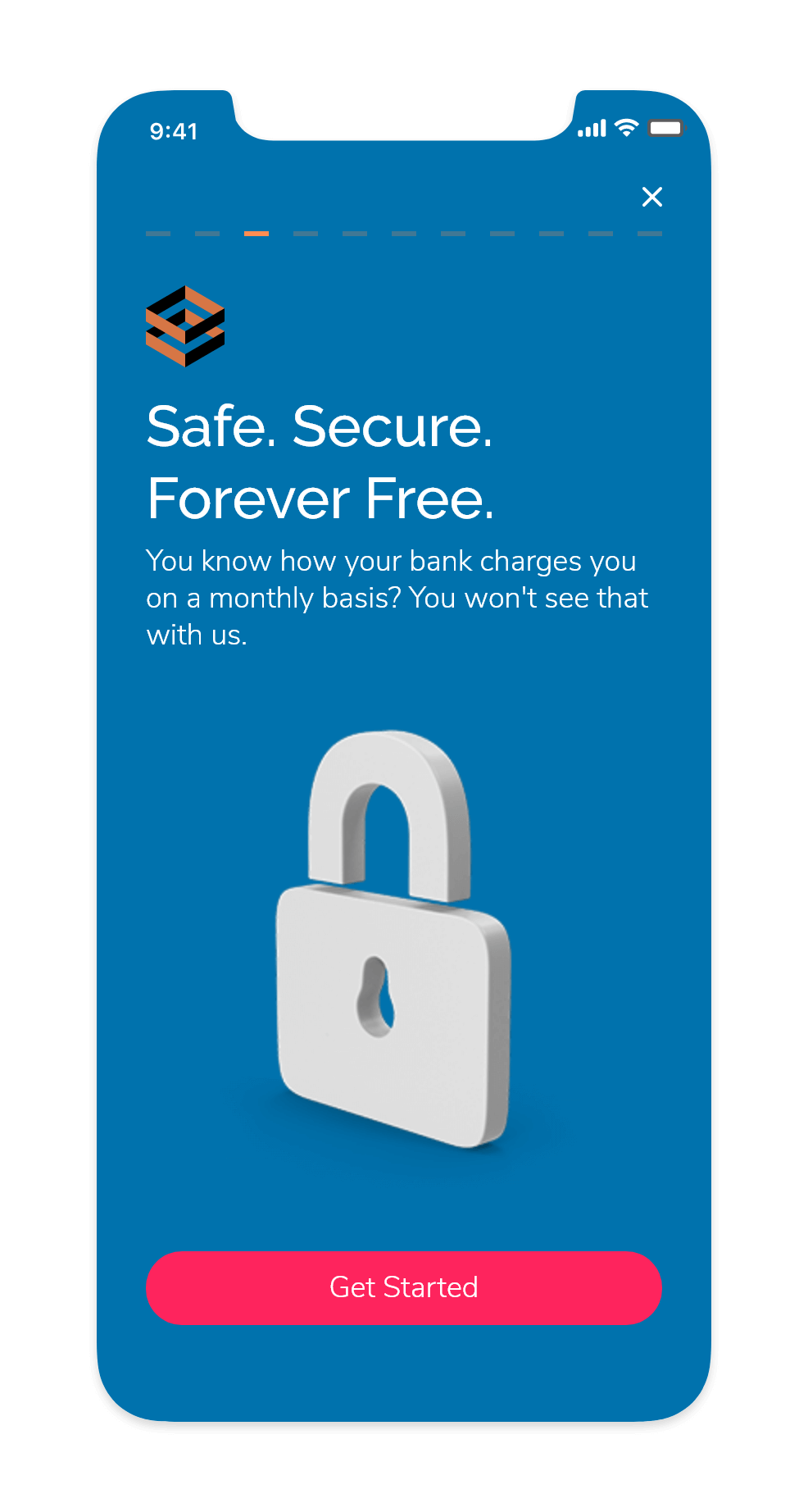
Onboarding

This screen will only appear on the launch.

It's important to emphasize that the onboarding screen must contain well-written copywriting to instil a sense of trust and security in prospective users.

We'll avoid using usage instructions since, according to many UX research centres (NNGroup primarily), onboarding instructions counterintuitively make interfaces appear harder to understand.

Why do instructional onboarding screens make interfaces appear hard?

On a psychological level: If something needs instructions, it must be hard. Users might end up second-guessing themselves even when the action they need to take is simple.

Sign up flow

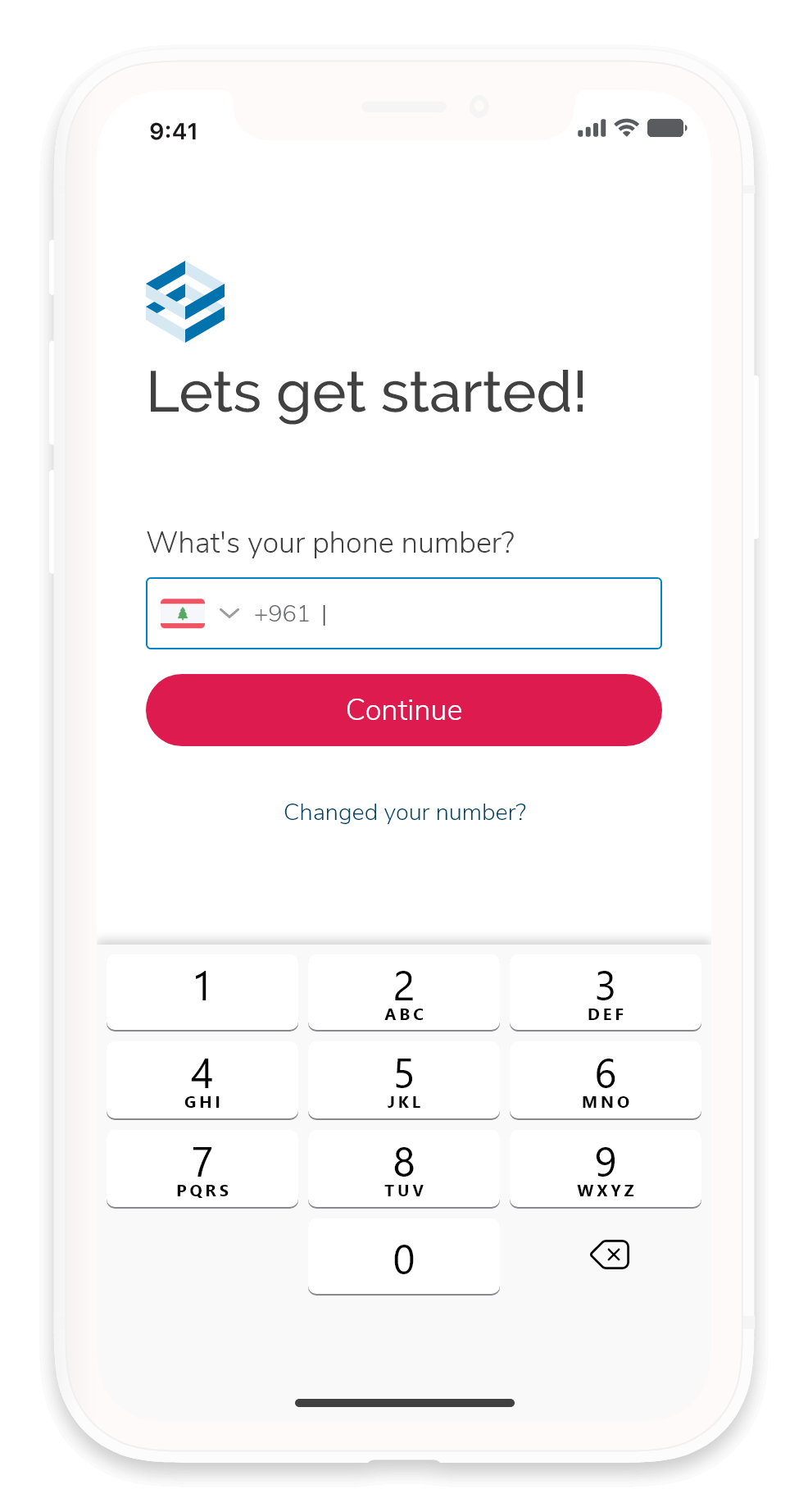
When a user starts the sign-up process, the system will prompt the user to enter their phone number. We will link accounts to phone numbers for 2FA purposes.

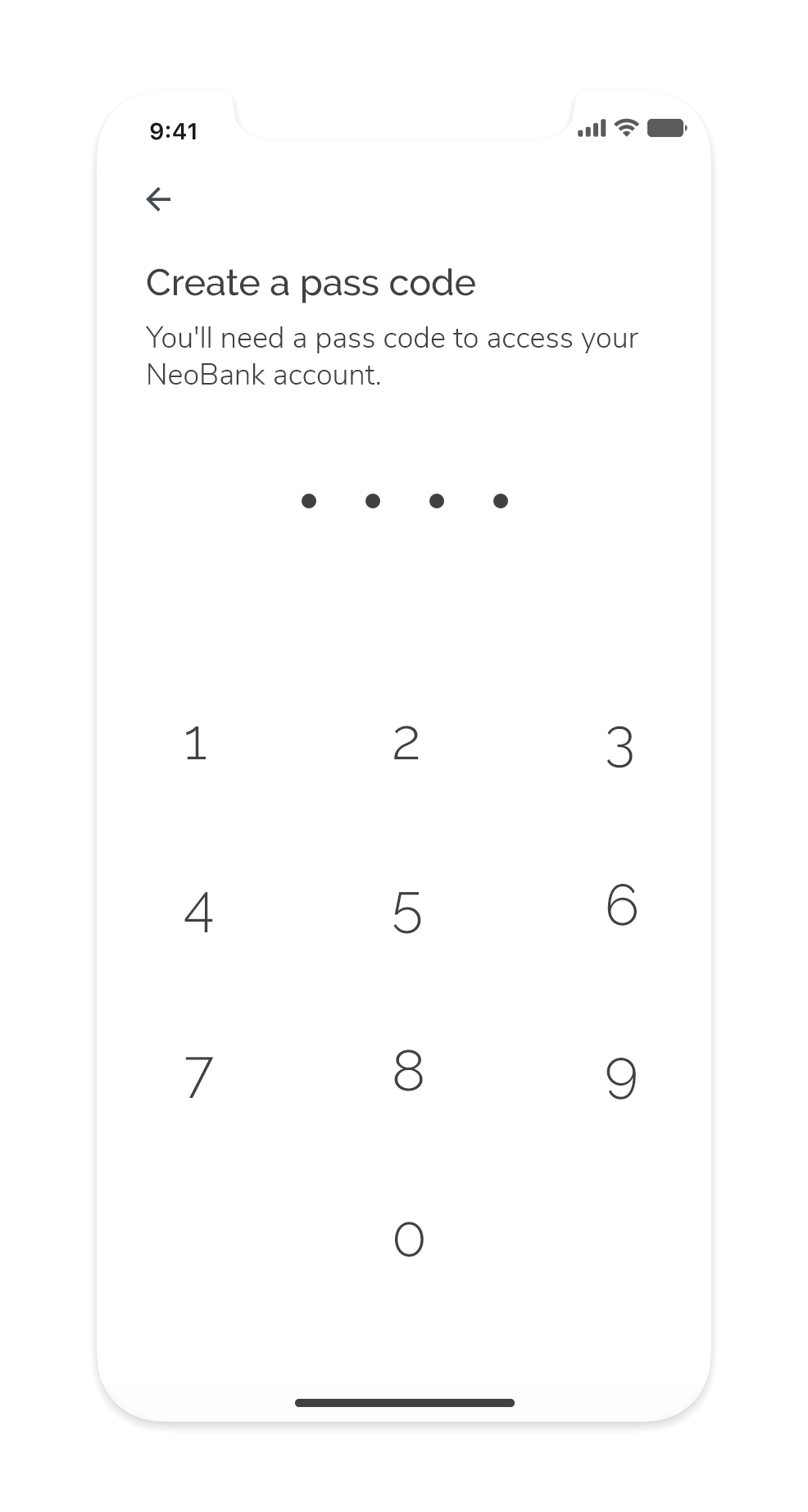
If a user enters a previously entered phone number, then s/he is directed to enter their passcode to access their account. Otherwise, if a user is registering a new account, we will ask the user to assign a passcode that will authenticate them when trying to sign up.

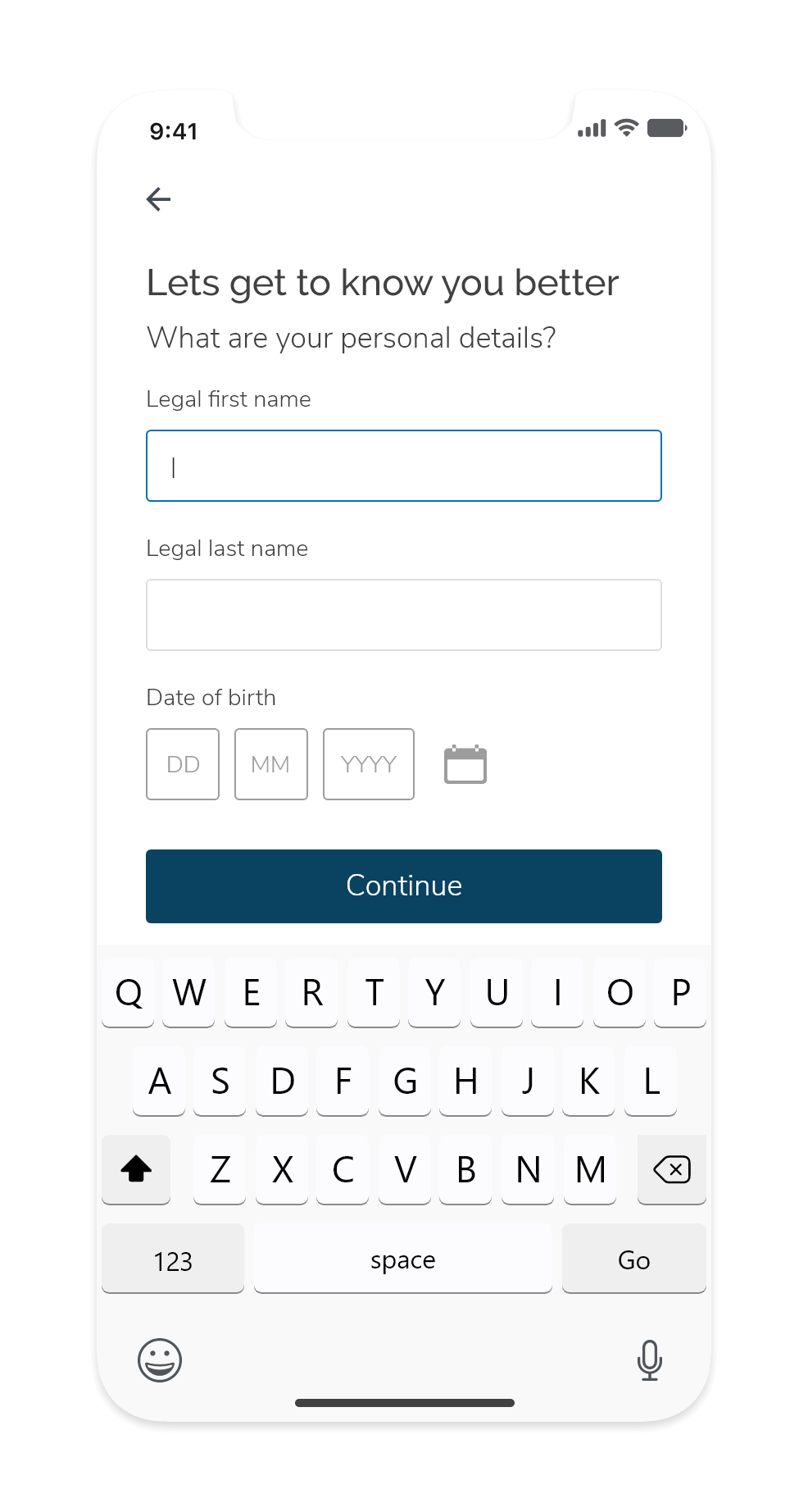
Whenever a screen appears with a field, we will auto-focus that field and trigger the on-screen keyboard to get things going.

We will require users to provide us with the documents we need to meet KYC requirements during the sign-up process.

The app will prompt users to take a photo of a government ID and a selfie. These requirements will allow us to satisfy the ID, biometric, and face verification parts of KYC.

It's important to reassure users at this stage that their documents and photos are safe, secure, and kept away from prying eyes.

Initial access

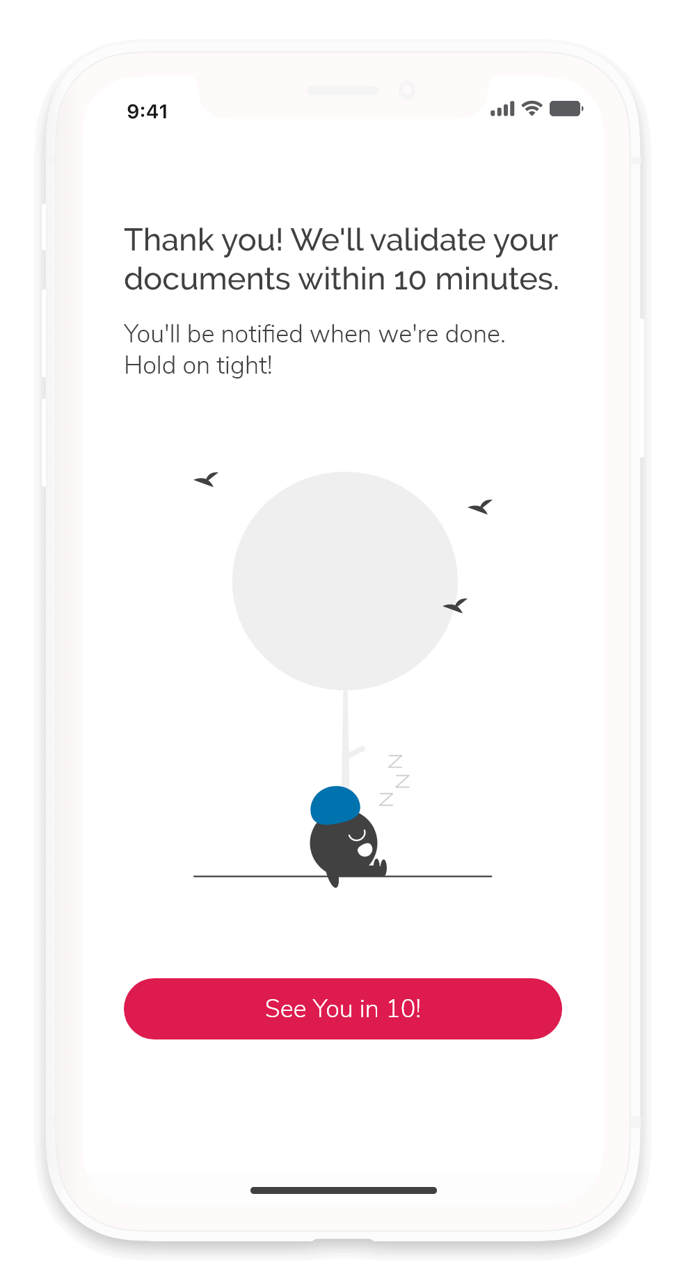
When we send users initial approval, they'll have restricted access to explore the application.

The system will notify and inform users to provide proof of address to fulfil the last bit of KYC compliance.

Users will have unrestricted access to the application after we've validated all their user documents.

Home Screen

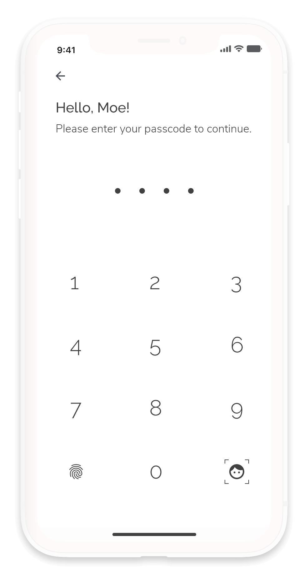
When a signed-in user launches the app, the system will require users to verify their identity by using their fingerprints or entering a passcode.

We will always require passcodes as a part of a multi-factor verification for specific actions (such as applying for credit or purchasing insurance) and large transactions.

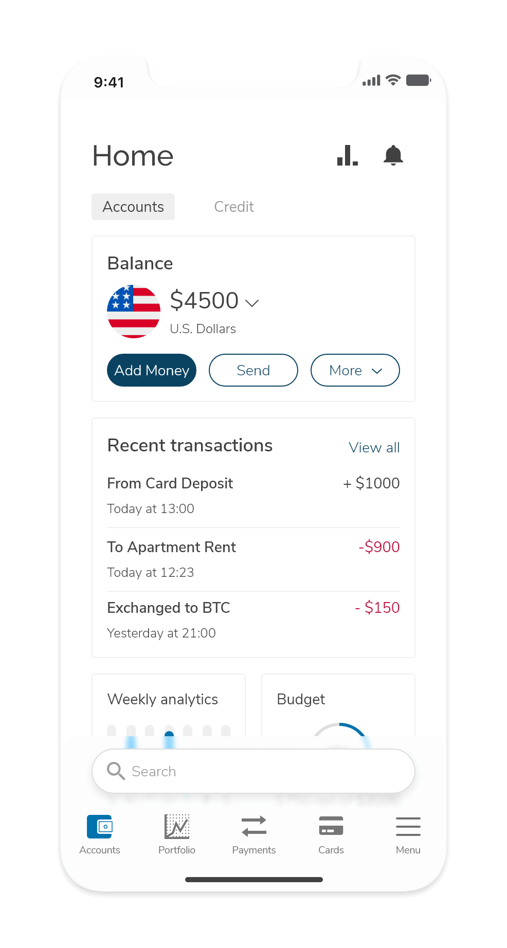
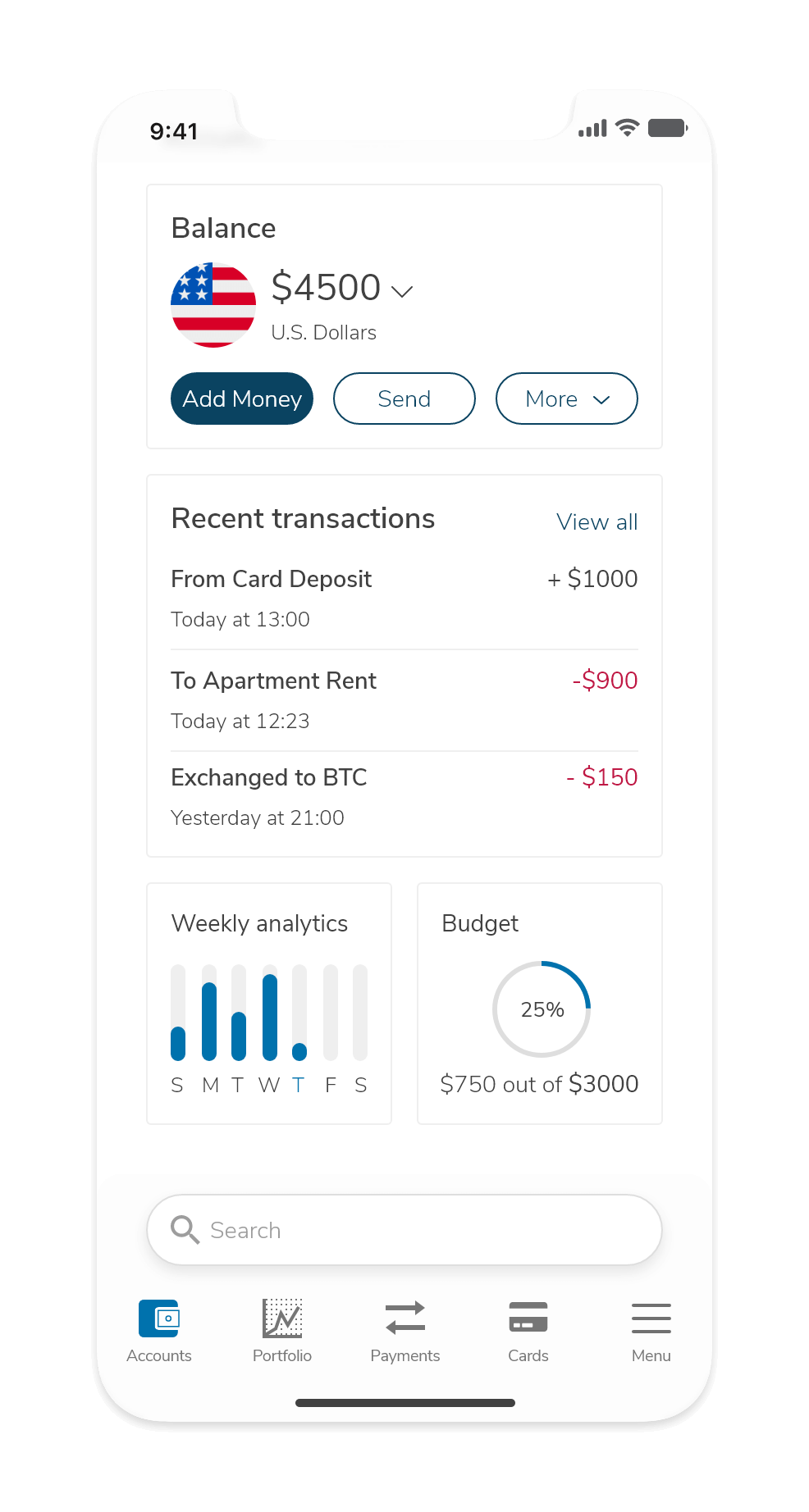
The account overview screen gets straight to the point:

You see your balance, recent transactions, and a quick analytic preview of your weekly performance.

Analytics and Budgeting

Tracking

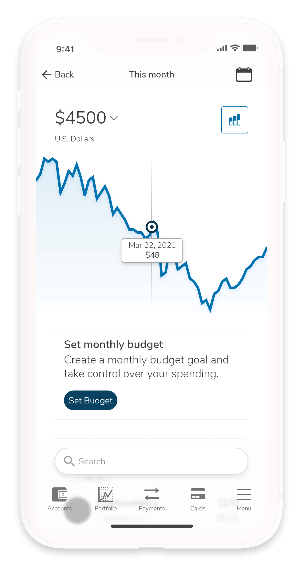
Users can access their account analytics from their account overview. Users can switch between different accounts within this screen by tapping on the balance. If users aren't too happy with their analytics and want to see their financial health improving, they can set a budget to help them take control of their spending habits.

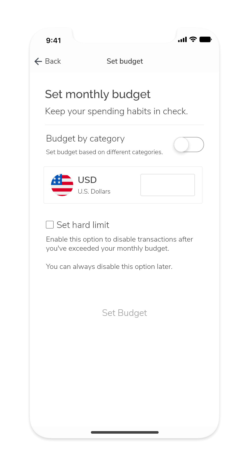
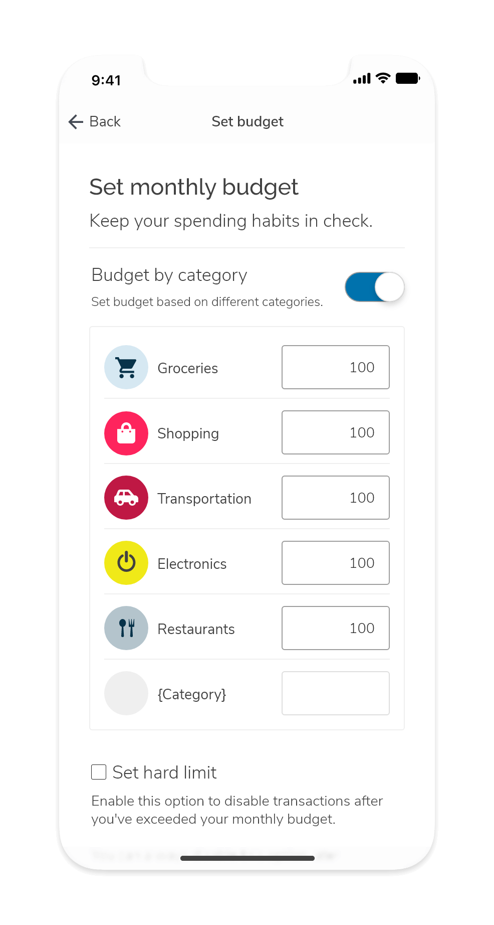
A possible feature for budgeting could be offering different methods to control it by introducing hard limits. This option could allow users to disable transactions temporarily if they go over their budget.

Budgeting

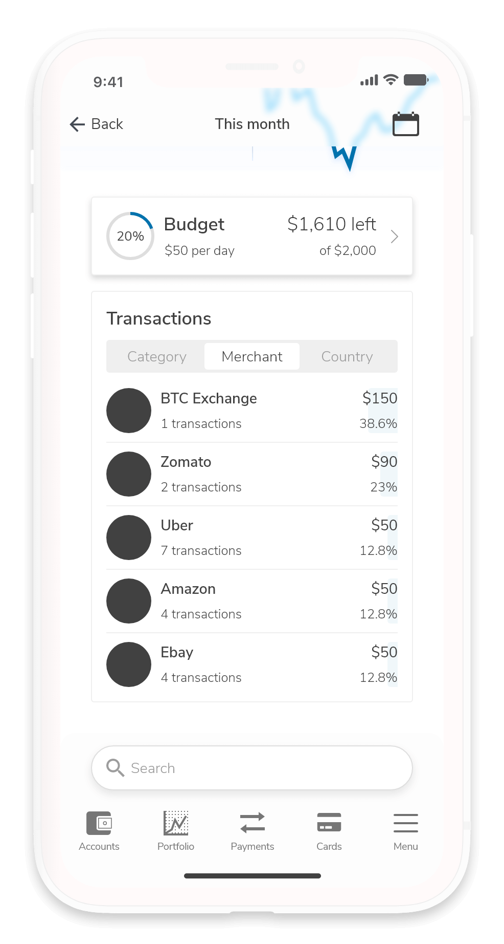
Users can track their progress against a budget they've set to measure how close they are to reaching their limit.

In retrospect, I think we can take advantage of push notifications. We can send carefully worded notifications to help keep users accountable and shepherd them into staying on budget. Copywriting and notification frequency are crucial here. We can't send too many notifications to avoid overwhelming the user. We also can't be stand-offish because money and spending habits are sensitive matters (when was the last time you had a positive reaction when someone told you were being frivolous?).

Transactions

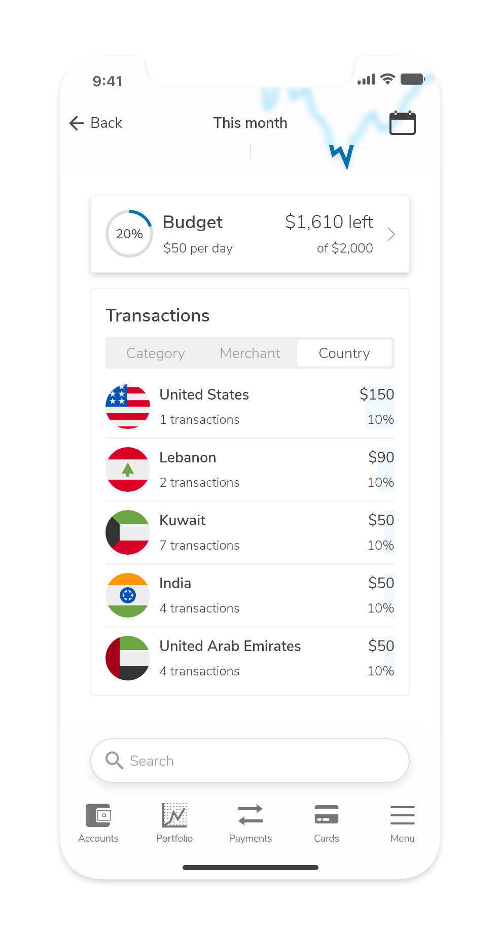
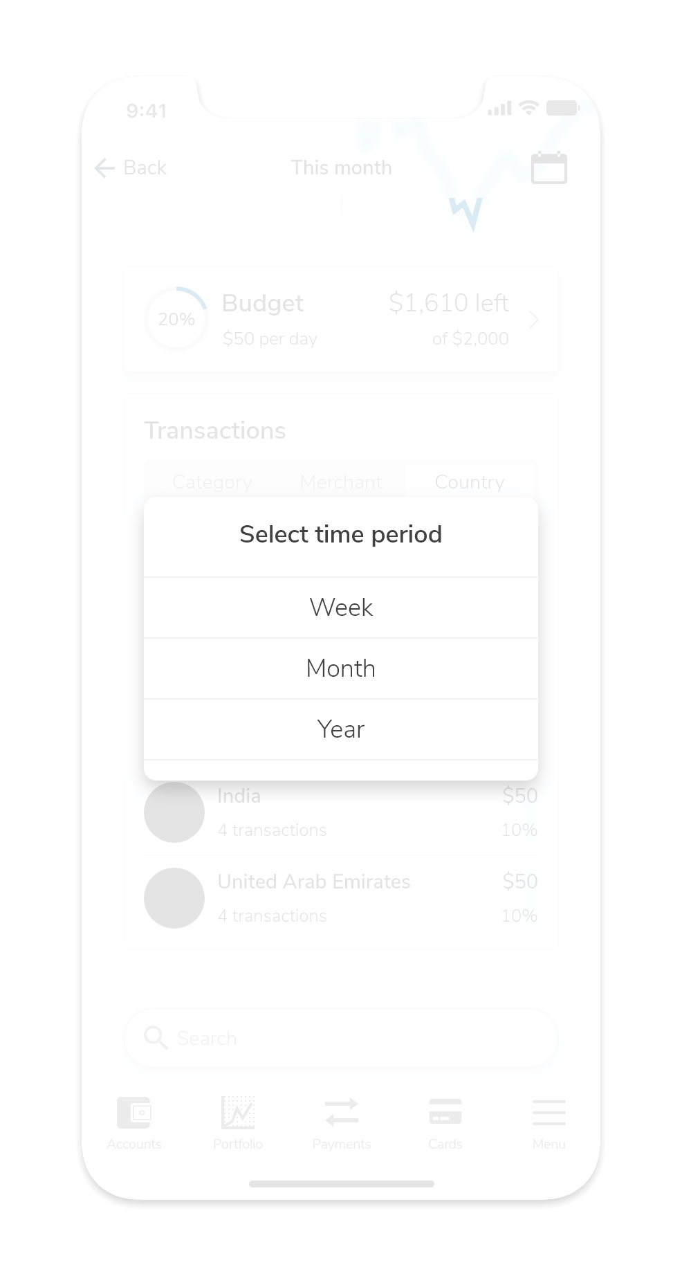
Users can change the time scale of their analytics report and choose between a weekly, monthly, or yearly report. The transactions section allows users to sort their transactions by categories, merchants/vendors, and countries. Each transaction record has a small bar that visually represents the weight of each transaction record on a user's expenses.

Transfers and Payment

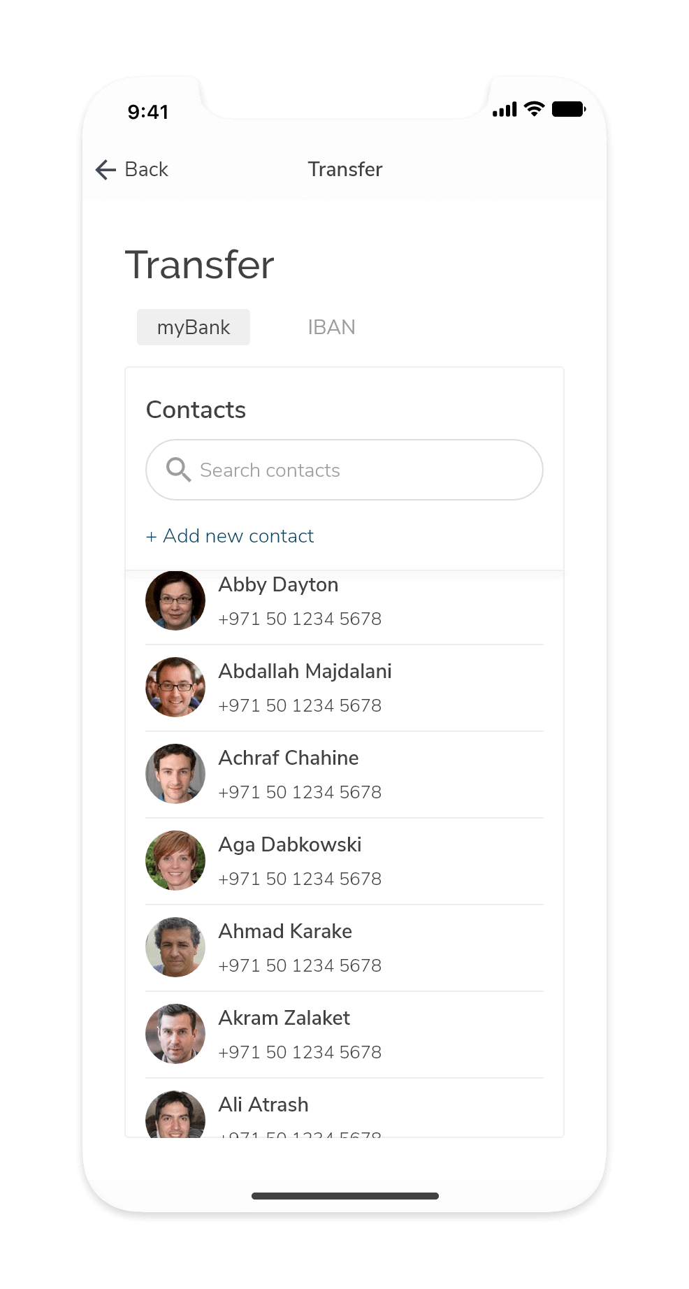
Users can add funds to their accounts and send money to different individuals if the recipient has a registered account with MyBank, or an IBAN to receive the money.

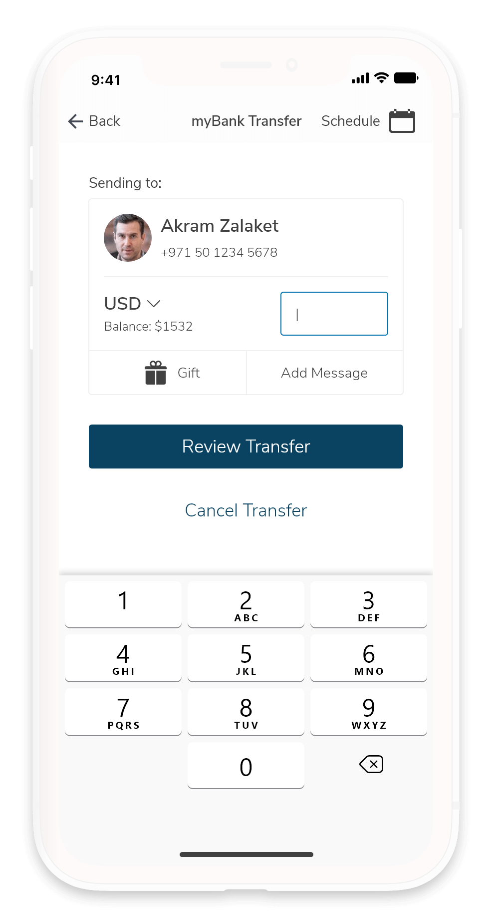
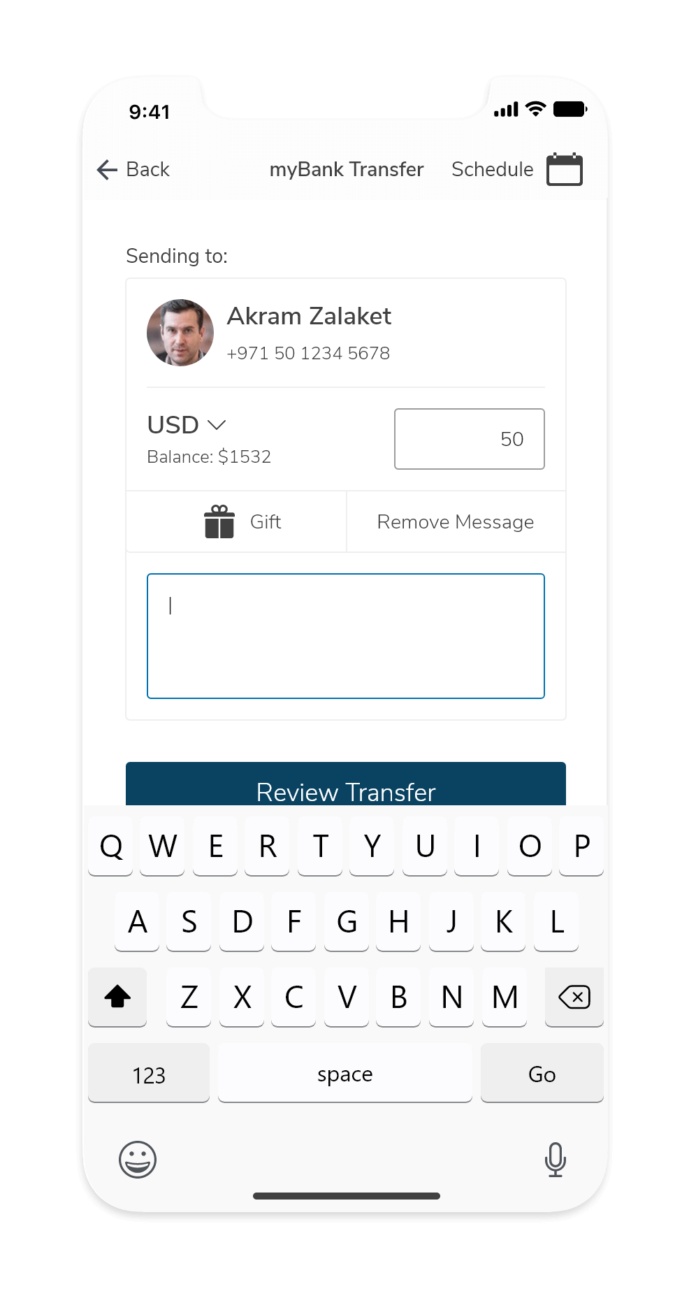
When a recipient is selected, the user can specify which account s/he wants to use and the amount they or intend to send. Users can indicate the kind of payment they're making (is it a gift? or a utility bill payment?) and leave a note for the recipient.

If you've seen some of my previous projects, you'll find that I'm fond of the swipe-to-pay method over simply pressing a button to confirm payment. The reasoning is that we mimic the act of swiping a card. It's also harder to accidentally swipe-confirm than to press a button.

Card Management

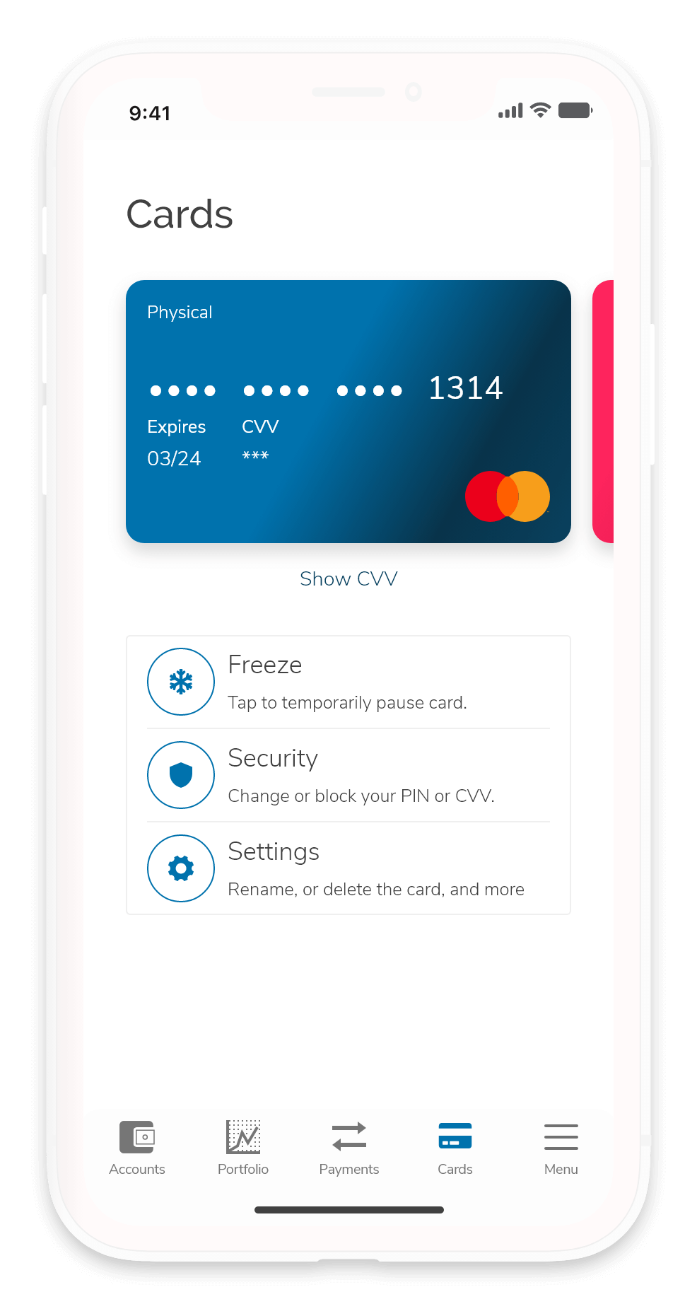
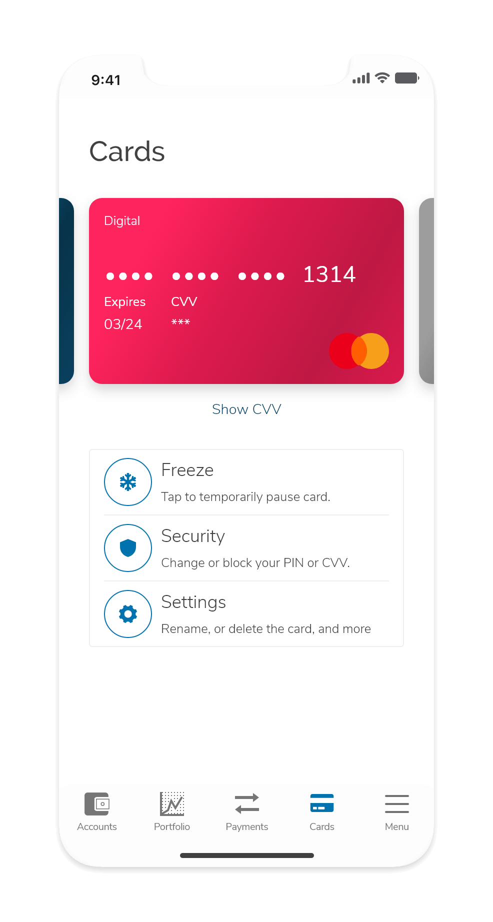
Users can manage their cards in the cards tab. Users can freeze their cards temporarily, edit or request to delete the card, change their pin, or set a transaction limit.

Final Thoughts

Looking back at this workshop, I'm happy with the result. I created a product concept and an MVP within a few days and was very efficient with how I used my time during this workshop.

In retrospect, when I look at what I know now about financial literacy and the bit of freedom that comes with it, I'd have wanted to introduce interventions focused on investing capital, growing wealth, and teaching good financial habits. I would have cut out more features to focus on one goal: Building healthy habits.

One of the project requirements was to generate a high-fidelity prototype. In practice:

I wouldn't want to design and develop a banking app in three days and create high-fidelity prototypes. It's doable, but it's not UX. Three days is not enough time to conduct thorough qualitative and quantitative research, create an affinity map, extract overarching themes, create a hypothesis, and validate findings against real users.

I categorize this project as a bit of exercise to keep myself able to act under pressure, but at the same time, I'm all too aware that for many UX specialists out there, this is their reality and not a design exercise.

A valuable lesson that this project has taught me is the importance of understanding the framework and ecosystem your product will inhabit. I'm sure there were times when something in an app was unnecessarily hard to execute. You might have thought UX and UI designers should have done better. You might be right to think that, but it could also be a result of regulatory frameworks tying them up and forcing them to do things the inefficient way.

Understanding where your product will live can help you navigate hurdles and innovate as you work within existing constraints. Many teams complain about rules and regulations, but I believe you can only find practical and actionable opportunities for innovation within those constraints.