Calibri
Preface
Visiting a pub, or a restaurant is really the same thing as using an application to order something. If the user, or rather customer experience is poor, then the user is unlikely to enjoy their time in the venue or stay long enough to purchase anything of value.
In this project, we'll be looking at what problems pubs tend to face and apply both design thinking, and user experience parallelisms to showcase exactly how experience design affects our physical world.
My role in this project is a triad between architect, experience designer, and branding designer.
Setting the Stage


This project takes a well-known pub in Beirut, Lebanon called “Calibri”. Just like many other pub or nightlife venues in the country, customer experience is generally harmed by lack of design considerations, and as a result, are not conducive to pleasant experiences.
First of all, let us identify our pain points:
Architectural Pain Points


That column right in the middle of the room.
You don't need to be an architect to see it, it's right in the dead centre of the room. This column creates visual accessibility issues, which means if you're seated in the wrong place then you're out of luck since the will have a hard time noticing you. The column directly creates a poor user/customer experience – unless you enjoy being ignored, then that's something else entirely. This is exactly like trying to tap a button that has too small of a target area, and worse yet is when you do finally get to tap it you're taken to an error 404 page.
Poor Ventilation
Poor ventilation is generally overlooked but is a major factor that subtly makes the customers leave the venue (bounce). Pubs in Lebanon are generally smoke-infused, and if you're not suffocating from the fumes, you're probably feeling unsettled due to lack of fresh air. If you're feeling unsettled you're more likely to leave, and if you leave the pub is losing out on your next round of drinks (reduced conversion, and retention rates). We can think of this like an app that has a poor background to foreground ratio that causes unnecessary stress on the eyes when trying to read the text content.
Stage Area
A band is part of the pub experience, but if half of the customers do not have visual access to the band then we have two very different experiences taking place within the venue. There'll be one half that's actually enjoying the band's music, and another half that won't be able to relate nor interact with the band.
We also need to take into consideration the band's experience. Their space is cramped, and poorly optimised space means poor performance and long set up time. You can think of this like having a website with poor site architecture, and long load times.
Poor Sound Distribution
Sure it's nice to feel the bass, but if the sound isn't distributed properly then the customers are likely to hop off to another venue. Poor sound design creates two major issues: First of all, the customer will have a hard time to communicate and will be forced to shout in order to be heard, and second of all, the excessive noise will eventually induce headaches that will push customers to either leave the venue and go to another or call it a night. This is the equivalent of having a webpage flooded with pop-ups. When was the last time you saw a pop-up and thought "yay a pop-up!"?
Design Pain Points
No established design identity.
A lack of an established brand design guideline means potential customers are either going to undervalue the prices within the institution or choose a competitor instead. Design identity and brand personality are important in establishing user trust and influencing user decisions. We should never undervalue the importance of identity and experience.
Inconsistency between visual design and written language.
A lack of cohesion between design and written language affects trust. If a brand speaks in two dialects at the same time, potential customers will be less likely to try the brand.
Inconsistency between visual design and written language.
CALIBRI (the font) anyone? There's been no attempt to play with words here. Admittedly this might just be a designer's pet peeve, but it definitely does apply to other aspects of a brand's identity. If a place is the hub spot of Liverpool FC fans, then perhaps adding a motto or tagline that hints at it, or colours to signify it.
If you look at the pain points and change the context to an application, you'll very quickly notice that we are basically talking about user experience design principles, as well as basic marketing principles. If the app/pub has a poor user experience, users will leave and put their money on another app.
Now that we've identified our pain points it's time to establish the project scope.
Project Scope
Visual Communication
- Establish Brand Identity
- Print Design
- Menu Design
- Design Unification
Architecture
- Spatial Re-Organisation
- Interior Design
- Lighting, and Sound Design
- Introduce HVAC systems for air filtration
Visual Design
Branding
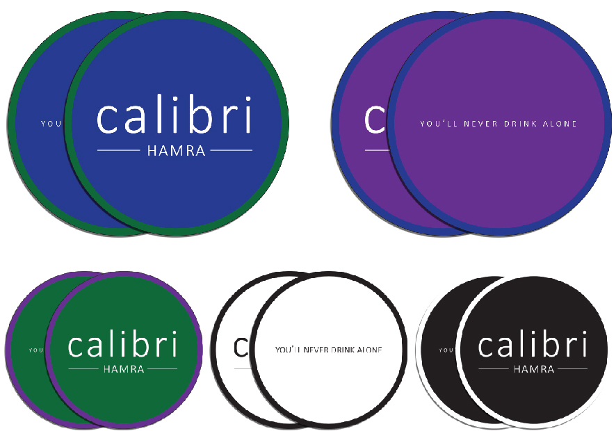
Logo and Brandmark
The temptation was too big to avoid the wordplay between Calibri the pub, and the font. This bit of playfulness managed to amplify that bit of a cheeky spirit both Calibris have. I've added a homage to Liverpool FC by introducing the brand's new tagline - "You'll never drink alone". Now you've got a clear line that explains to potential fans that this is the place for them. A good tagline goes a long way in creating a memorable experience.
Print Media
Poster Template
Poster sizes have been set at 540mm x 900mm, the proportions used by the interior brick wall allowing the joint lines to frame the posters.


Menu Design
The menu design and items served went through a thorough service design research process. The research can be broken down into 3 steps:
- Find out what foods are profitable and generate the most sales.
- Design the menu to encourage impulse purchases.
- Create a menu that has variety but is short enough as to not overwhelm and confuse the customers.
Clarity and legibility of information, and clearly delivering what the user actually wants versus what we assume what the user wants.


Architecture
Architecture meets Experience Design.
Addressing that column
The bar was relocated and integrated with the column, and activating the column as a key feature of the venue in the process. Seating patterns and distribution were optimised while also taking into consideration human factors such as dimensions, and comfort. The pub initially seated 58 patrons, but now allows up to 69 patrons, or a 19% increase in user/customer capacity AND with increased customer comfort (and arguably increased retention and conversion rates as a result).


The stage
The stage area was designed with human-centric design factors in mind. Spacing was carefully considered to ensure that the band received a space that met their needs and at the same time, the stage area used the limited interior space efficiently. The best part? Everyone can now actually see the band regardless of where they're seated in the pub. We've effectively improved both the customer and the employee experience.You'll also notice that the DJ booth also receives a similar treatment making sure the entertainment is always top-notch.

Sections


The music tree
The column is now the “The Music Tree”. The tree has 3 large amplifiers that have been carefully placed to smoothly distribute sound around the pub. Now customers can both enjoy a casual conversation, and music without having to struggle to do either – a design decision that directly improves customer experience.


The Fold-table
The FoldTable's design came out of a necessity to create space on the stage for band nights, and the lack of a storeroom where tables can be stowed away. The best part? You can hang a poster on the underside of the table, which frames the poster when folded up.


HVAC Systems
An HVAC system has been designed to allow for constant air filtration and the introduction of fresh air. This will help customers be less likely to feel stir-crazy or uncomfortable, and as a result, will be more likely to stay longer (and spend more).

Bar Section Details
Two important design details ought to be highlighted:
- The bar section, along with the hidden LED light strip to illuminate the floor allows for increased ground visibility for those pesky times when you drop your keys.
- The store-front bar that allows the pub to capitalize (attract) potential customers looking for a quick drink but aren't necessarily willing to commit to sitting inside (convert). It also allows patrons to stand outside while being visually connected to the pub while also attracting potential customers by acting as social proof.


Storefront Design
An HVAC system has been designed to allow for constant air filtration and the introduction of fresh air. This will help customers be less likely to feel stir-crazy or uncomfortable, and as a result, will be more likely to stay longer (and spend more).


Renders


Final Thoughts
I like to think of this project as a Total Design type of project where I touched base with pretty much every design field to create a unified experience design. Everything in this project was designed and modelled three-dimensionally down to the screws, bolts, and joinery – Sure I could have gotten away with free 3D models but I wanted to leave my fingerprint on this project all over the place.
If I had the chance to pick up this project where I last left off, I'd like to try to design a social media post calendar, and perhaps a website design with a working prototype.