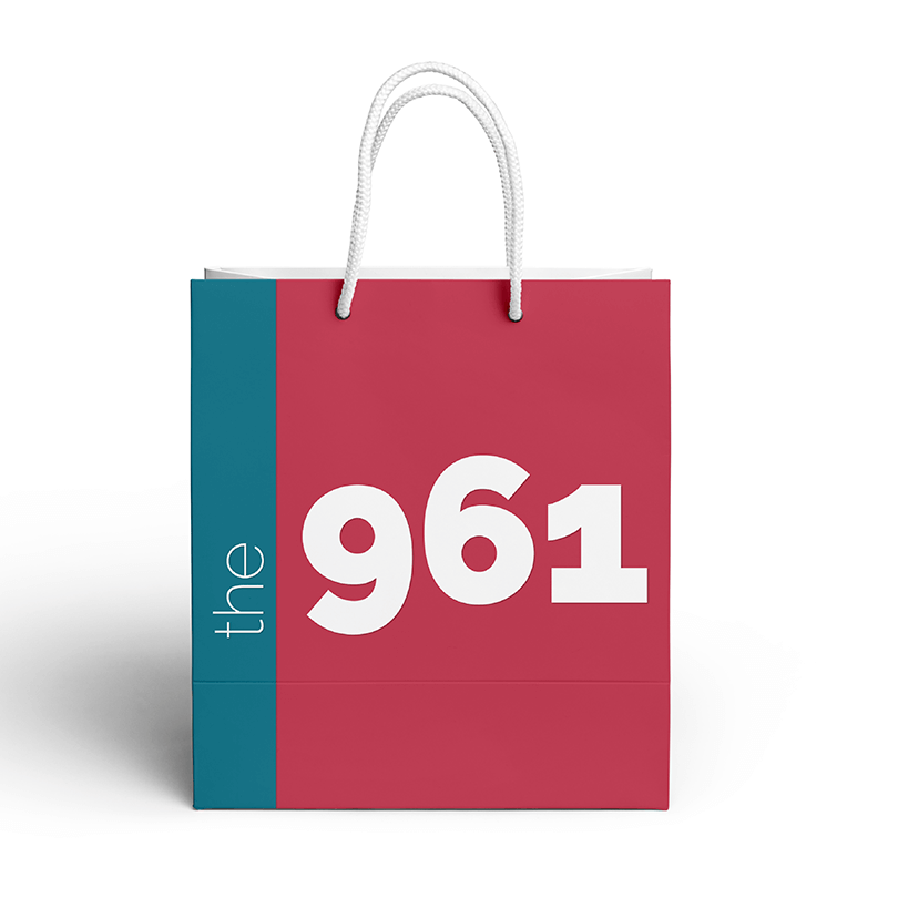
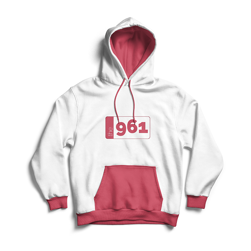
The 961
Preface
The 961 is the leading online English media site that caters to the Lebanese people in Lebanon, and abroad. The 961 features various engaging Lebanese content, news, media, and more.
This collaboration is a re-branding proposal that aims to create a new logo that would evoke a sense of nostalgia while also remaining contemporary in appearance.
Ideation Process
The Brand
When I was initially approached to design a new logo proposal, I didn't have much to go on. All I had to guide my design was that I needed to "modernise" the logo. The goals were fairly vague, but through my ideation process, they were made much clearer. The main goals I had established for the logo were:
- Create a logo consistent with the brand image
- Design a logo that evokes memories of Lebanon
- Create variations for different contexts
- Make a logo that is clean and clear
Brand Traits
The first step in the process was to ask: What is "The 961"?
It's easy to design in a vacuum but a vacuum remains devoid of its context. You might argue this is a purely graphic design endeavour but I'll counterargue and tell you that visual communication is a subset of Experience design. How a brand presents itself to us will affect how we perceive the brand, whether we trust the brand, and whether we'd be willing to be part of that brand's community.
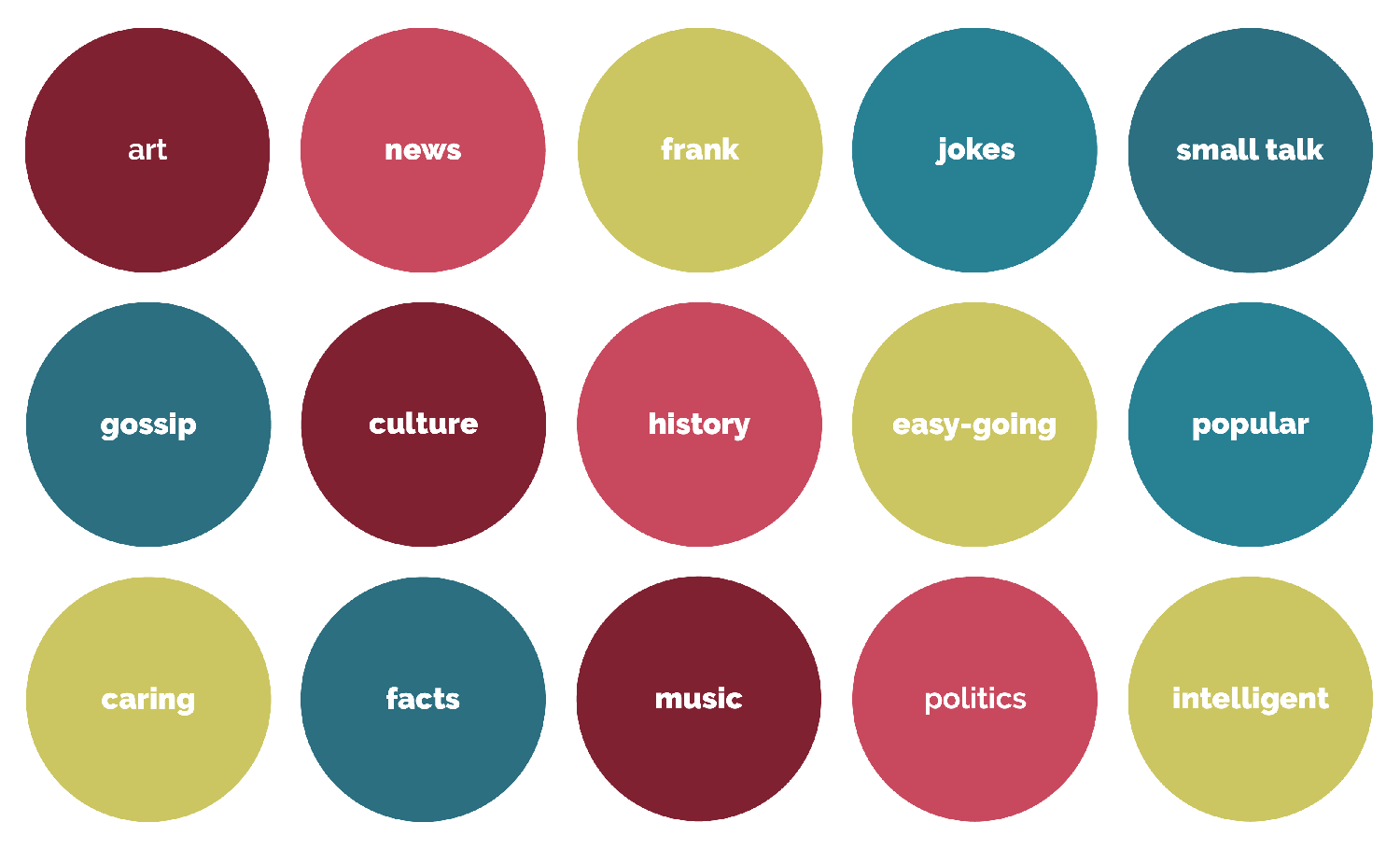
The following are the traits I found to be closely related to the brand after reviewing the content of its website and what it offers.
Mood Board
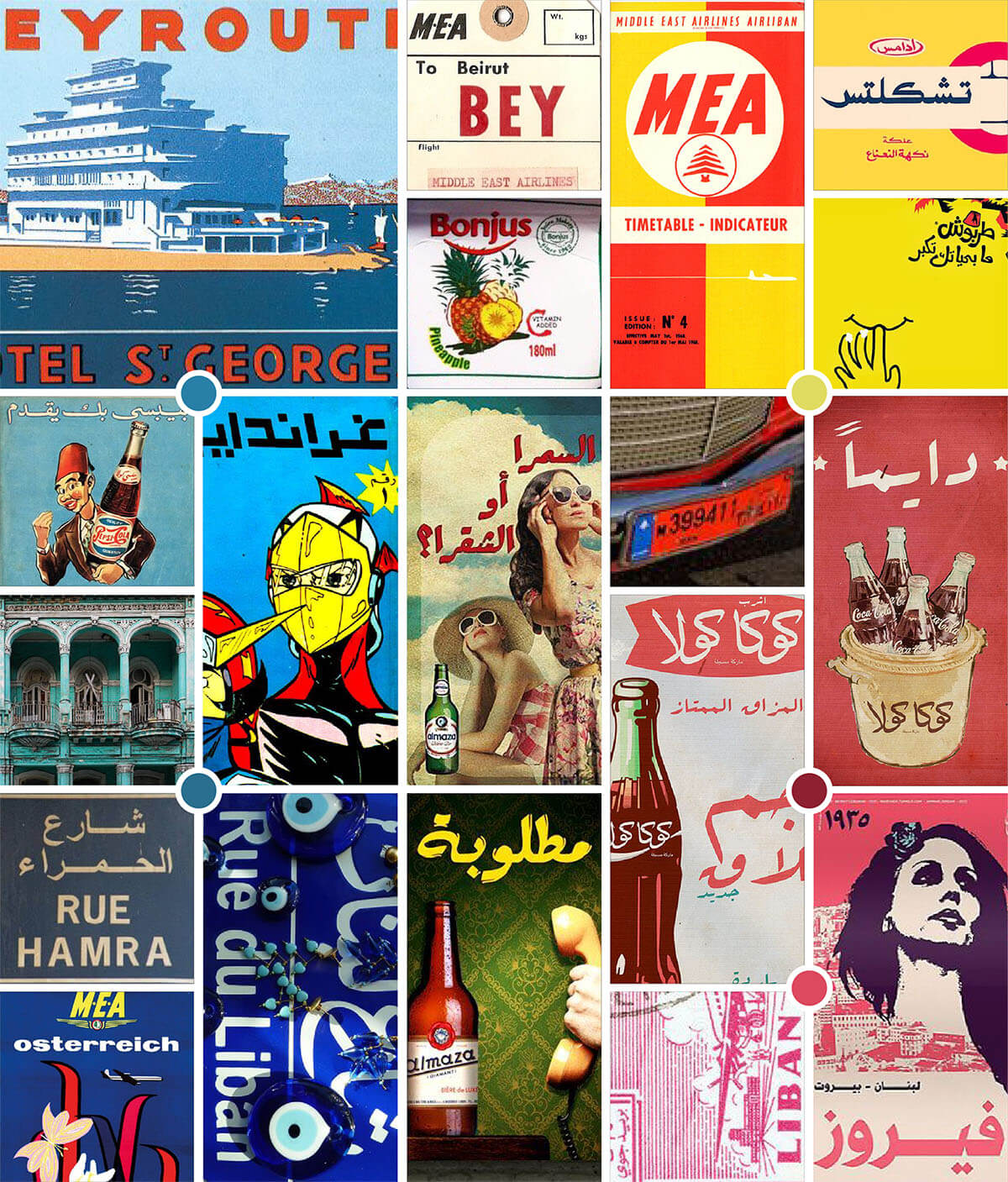
Since nostalgia and evoking images of Lebanon are vital to the re-branding of the platform, a mood board was formed taking inspiration from vintage adverts, posters, products, and signages that are associated with Lebanon.
Design Development
Typography and Colour
Raleway was selected as the main typeface due to the fact that the original logo was presented in Raleway. While this is a re-branding project, I believe that Raleway was a great choice the brand had previously taken, but more importantly, I did not want to create a complete departure from the original logo.
By using the original typeface, I would be able to borrow from the pre-established brand identity and still be able to create a fresher look and feel for the platform. I like to call this non-invasive re-branding - there would still be a sense of familiarity for returning users despite a new look being adopted.
Open Sans was an easy choice to make for body text since it's a typeface that compliments Raleway very well.
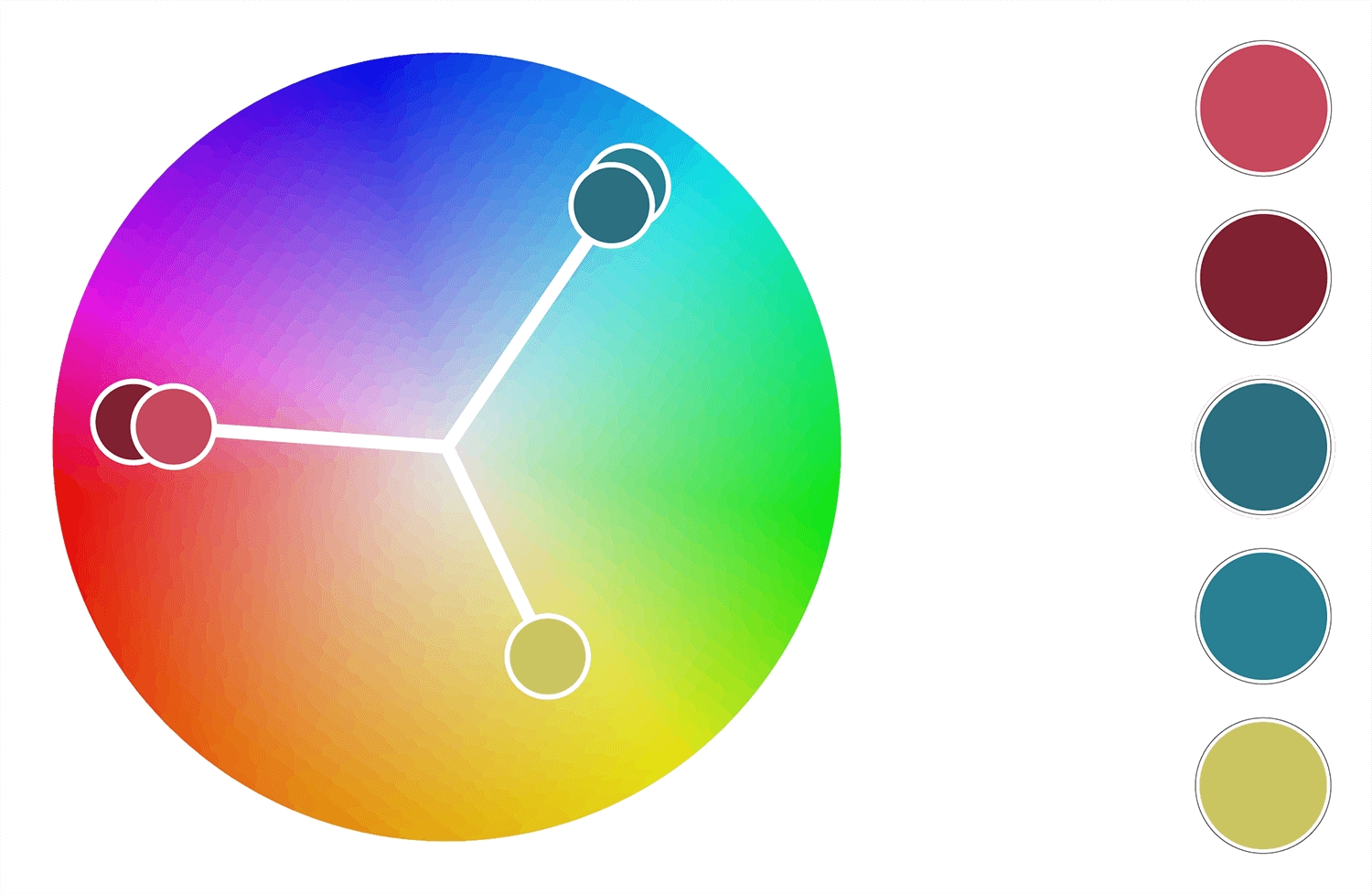
The colour palette was derived from the mood board and brand traits. I arrived at a triad colour palette that'll allow the website to create a vibrant feel that evokes colours widely used in Lebanon's shops, and streets. The961 is a media website, but it isn't only a news agency, it's about anything, and everything Lebanon - Going with a triad made the most sense in this context.
Guiding Concept
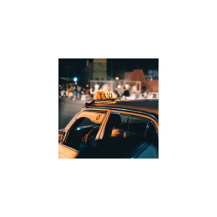
If you've been to Lebanon then you've definitely had encounters with the ‘service' in Lebanon and “the small but big” conversations taxi drivers tend to have.
The concept is to create a sense of Lebanese nostalgia of what is perhaps the most Lebanese experience in Lebanon. The Taxi ride serves as a hub of political, social, or comedic discourse.
The service spreads information, shares opinions, and creates discourse. When looking back on, the service is a common experience looked back on nostalgically, in the same manner, we look back at Lebanon while living abroad.
Construction Process
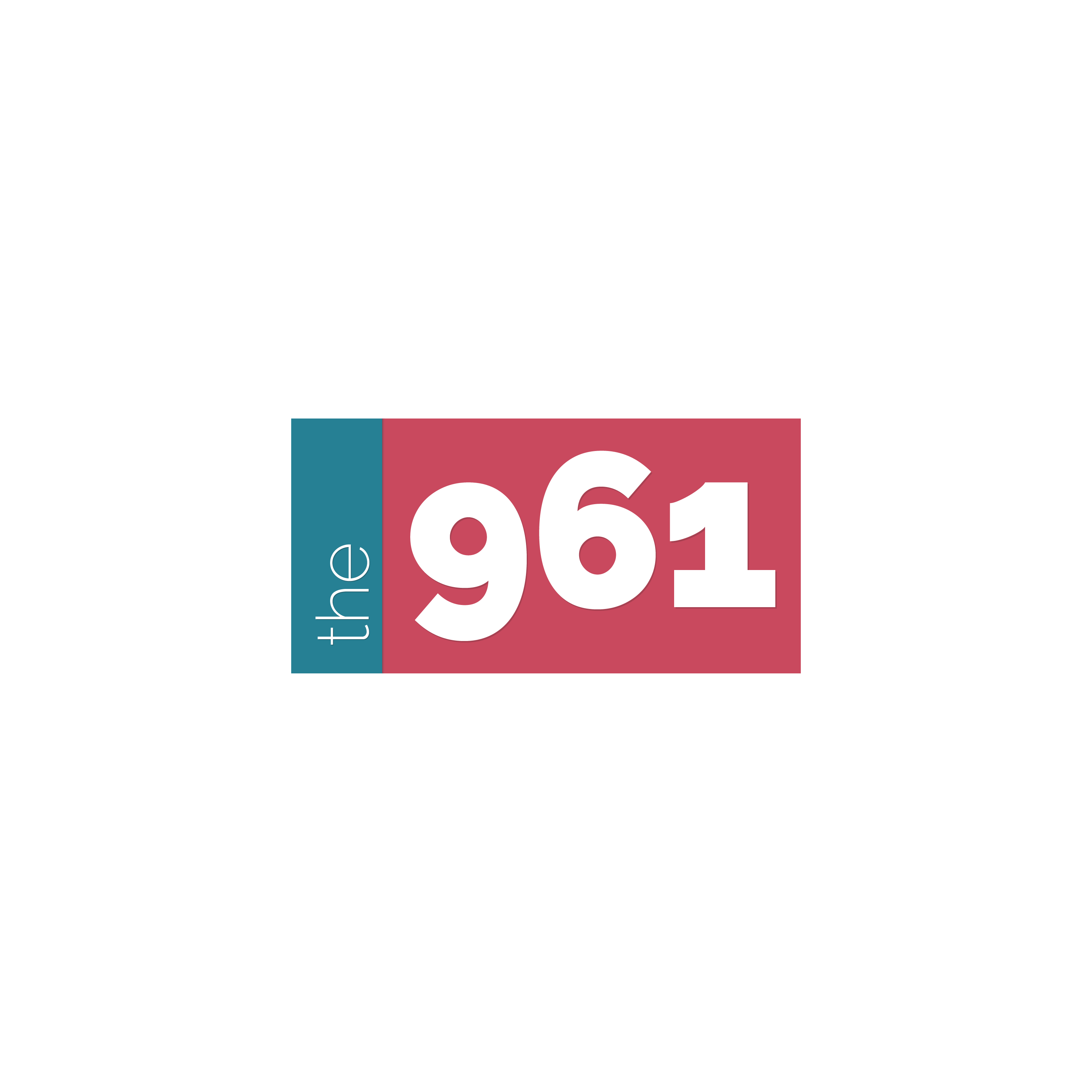
The second step was to keep any text in lowercase format and reduce the overall bulk of the logo. To reduce the bulk of the logo, I decided to use the "Light" version of the Raleway typeface in the first half of the brand name. Why? Simply put - 961 (Lebanon's country code) is far more important than "the".


The Logo
Optional Variations
Optional - Plate
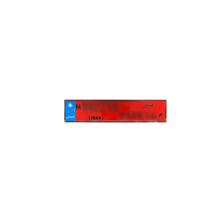
This is an optional variant that uses colours that closely mimic the Lebanese taxi license plate, but remains true to the suggested colour palette.
Optional - Bleed
A full bleed variant where the logo is not contained within the plate.
Main Variations
The Plate
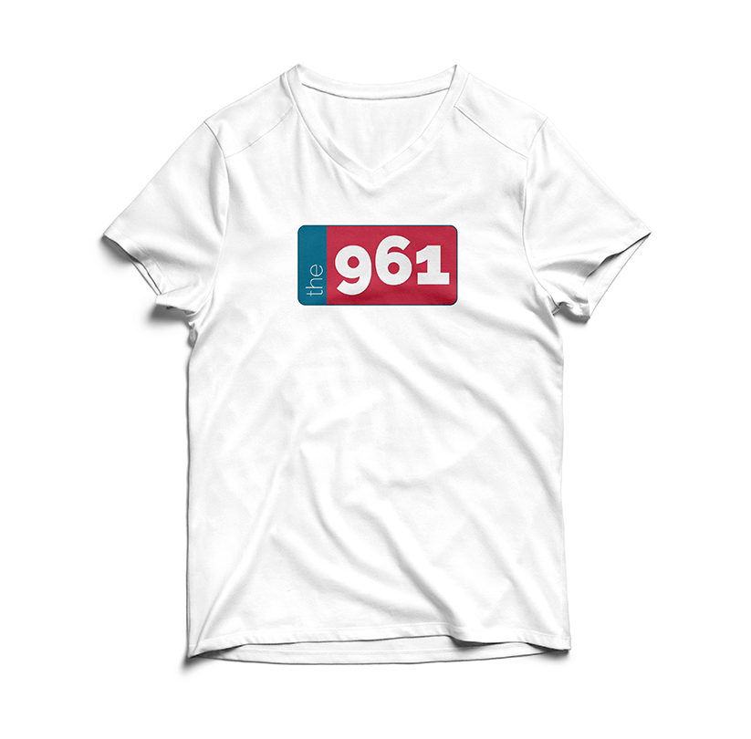
The main plate variant of the proposed logo design to be used as a standalone logo.
The Plate - Bleed
A full bleed variant of "The Plate".
Monochrome - Coloured Logotype
This is the only coloured variant of the logotype form that may be used.
Monochrome - Black Logotype
Monochrome - White Logotype
Final Thoughts
A brand's first impression is the very first handshake a company has with the general public. How a brand presents itself will create preconceived notions about who the brand is, what it does, and if it does it well. The psychological impact of a brand is a very important part of the Experience Design process, or really any design process for that matter. We could design the best user flow or physical space, but if the visual design elements aren't repelling potential users, then we have a major experience bottleneck.
