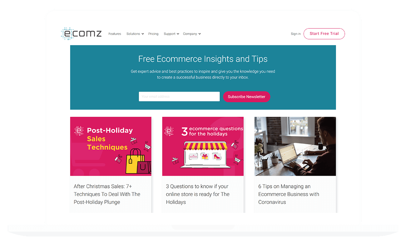
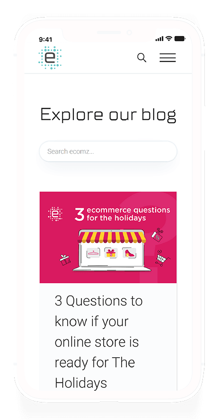
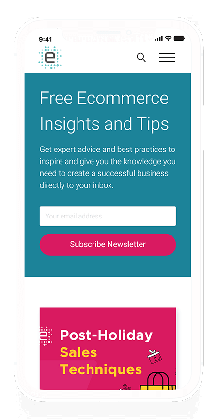
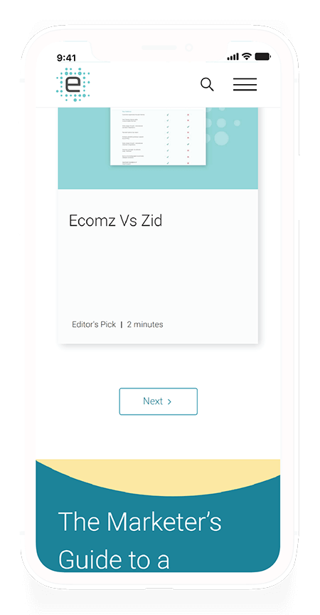
Ecommerce Marketing Website
Preface
This project was created as part of the Ecomz team, an eCommerce platform based in the MENA region. The project goal was to create a new face for the company in preparation for a product overhaul.
The road to completion was troublesome and filled with awry moments, but perseverance and advocating for customer-centric design eventually won this battle.
Sounds dramatic? Probably. I will say that this project was valuable to me. I learnt about who I am as a UX designer, art director, team lead, and frontend developer. The project helped show me just how much weight I can carry for an entire company to help them reach their goals.
I think I earned the title "UX Generalist" after this project.
Overview
Backstory
I'll spare you the details, but it's good to know that the company canned the project at one point. The project initially failed for reasons beyond my control. After the company shelved it, life continued as usual.
Then the bombs dropped.
We needed to deliver a complete website within two weeks, and we had no developers available to execute the designs.
I was to take on the role of an entire agency.
The Unicorn's To-Do List
- Re-design the website.
- Apply UX heuristics.
- Apply previous UX research I conducted on the website.
- Recreate site architecture.
- Update wireframes.
- Recreate the website from scratch.
- Inject custom CSS/HTML/Javascript where needed.
- Make the website entirely accessible.
- Create a database for the blogs.
- Create a database for the themes the platform sells.
- Hook up analytics to the website.
- Create customized HubSpot forms with phone number validation.
- Integrate an advanced filter.
- Apply an Arabic language version of the website.
- Migrate domains.
- Set up redirections for old pages that no longer exist.
There was no time to waste. I had two weeks to carry the company to success before an international conference took place.
My Role
- Project management.
- Pseudo-backend development.
- UX design.
- UI design.
I did not create the individual graphic elements (the icons and illustrations), the credits go to our talented in-house designer.
Identity
Branding colours
The company that initially created the re-brand of the company failed to supply a brand guideline. To fix that gap, I presented a series of colour swatches that fit the company's personality. The goal behind going through this effort wasn't just to say I supplemented the branding process. I wanted to take the brandmark and extend it into the software platform itself for future revamps. I wanted to boost brand recognition: I wanted you to know that our brand and platform are the same.
Typography
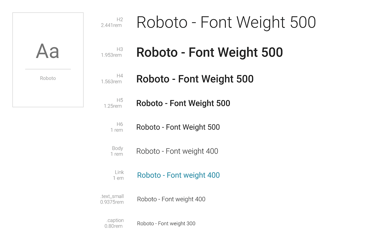
All type elements have been set using REM units. For most systems, this would mean that the body/paragraph fonts are set at the equivalent of 18px (1.125rem).
The selected fonts are in line with the brand guidelines. All H1 tags will be presented using TTSuperMolot Neue.
The Design Process
The Research
I cannot share the User Research itself; however, I will be adding blog posts in the future that explore best practices for SAAS websites. I'll include links to the posts in this section when they're ready.
Site Architecture
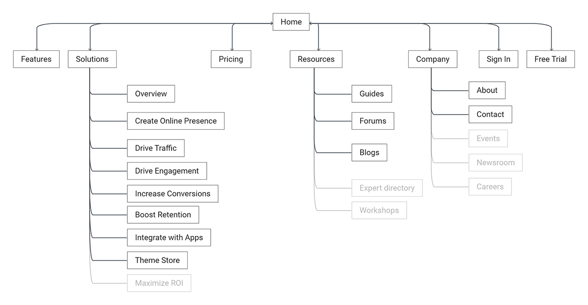
The initial site plan valued quantity, over quality. There were too many pages, and the written content was a bit lacklustre. I wanted to avoid creating a digital ghost town, so the first thing I did was simplify the structure.
The next step was to determine which of these pages I considered out-of-scope due to the time/resource limitations we were facing. The page titles that I greyed out are considered out-of-scope for this project.
The plan was to keep the site architecture as simple as possible. The previous strategy was to go deep and throw out as many pages as possible for SEO purposes. My approach was the opposite: Place only the pages you need but make sure the content provided offered real tangible value to the users. There was no need for ghost pages that no one will ever visit. The goal is to provide quality and useful content.
Design Principles
I set clear rules for the design of the website that would guide it's development. The rules were as follows:
- The website must be inclusive and accessible.
- The website must be WCAG compliant.
- The website must be user friendly and easy to navigate.
- The fonts must use REM units with a base font set at 18px (1.125rem)
- All dimensions must use EM units.
- The design must be responsive.
- The website must load in under a second.
My distinguishing factor perhaps appears here: I lay out my designs and present them the same way I would architectural drawings. I make sure every construction detail is known and clear. I leave no room for guess work. User experience is Architecture, but it uses a different format than a building for it's final product.
The Wireframes
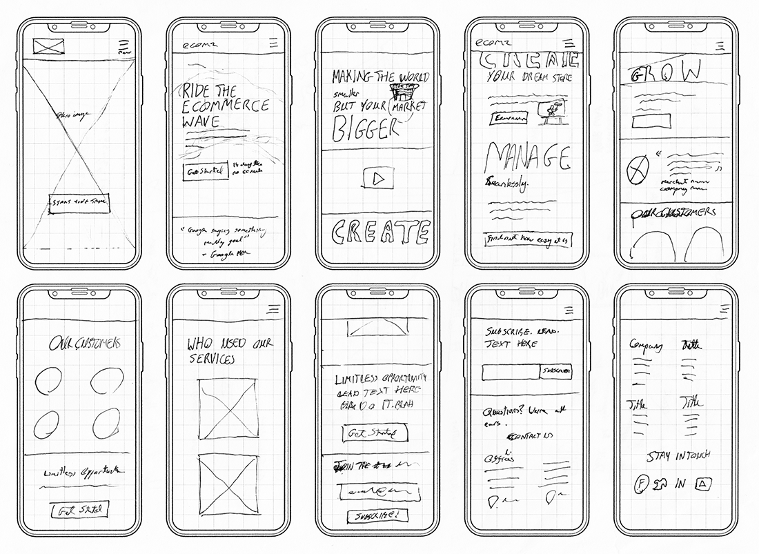
The website itself underwent many different design changes during the design development change, but the flow remained unchanged for most parts.
Component Design
Call-to-Action Buttons
The call to action button looks simple enough, but the process was anything but simple. I needed the CTA button to fit WCAG2.0 requirements, work with the brand, the website design, and the SAAS platform itself. It's funny, but the CTA button was the element that dictated how the brandmark would turn out.
Why go through so much effort for a button?
A button might be the most crucial element on a website. Users press a button for a product they want to X, and you get Y out of it. Buttons are points of interaction and transactions. It's worth going through the effort to unify your UX, UI and Brand experience. Make your users tap on your brand's button, and not just a generic one.
So tell me, what's in a button?
The alternative CTA button variant that should be used when you have multiple CTAs (e.g; a plan page). The alternative CTA is the only CTA button that can be used on the navigation bar, especially if the header is fixed to the top of the page.

Why did I specifically set these rules?
The main CTA button grabs attention, but it's ill-suited for the navigation bar. It's visually heavy, and if it's following you around the screen, it becomes intrusive. I needed to set these rules to keep the brand clean, but also to avoid abuse from future designers or web developers.
Navigation Bar
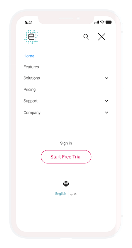
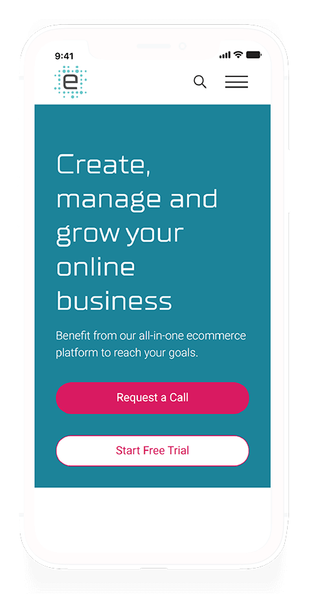
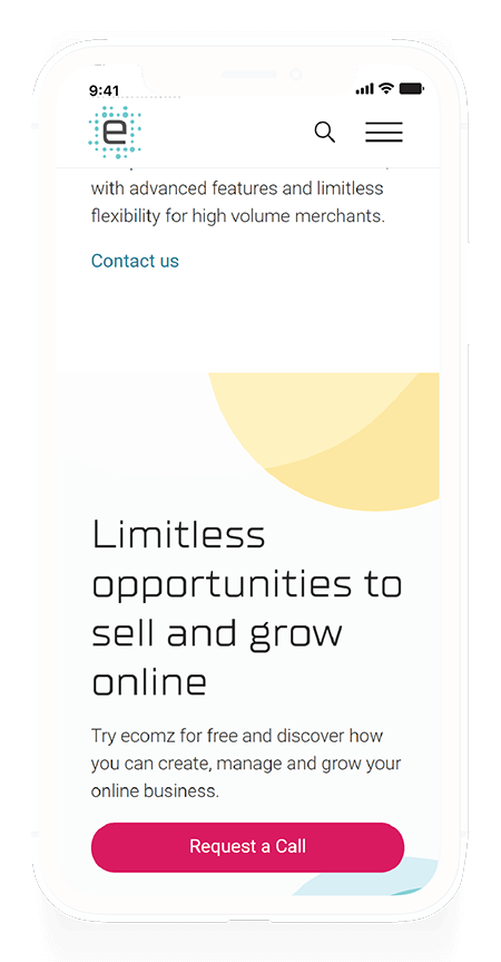
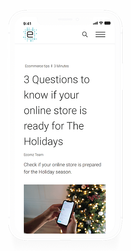
I admit I wanted to be a lot more experimental with the navigation bar on mobile, but the company preferred I stick with the traditional burger menu - Fair enough. It's not the best location for UX and usability, but it's a pattern that's become standard and easily recognizable.
Where would I have placed the navigation bar? I'd have stuck it on the bottom of the screen, to begin with at least.
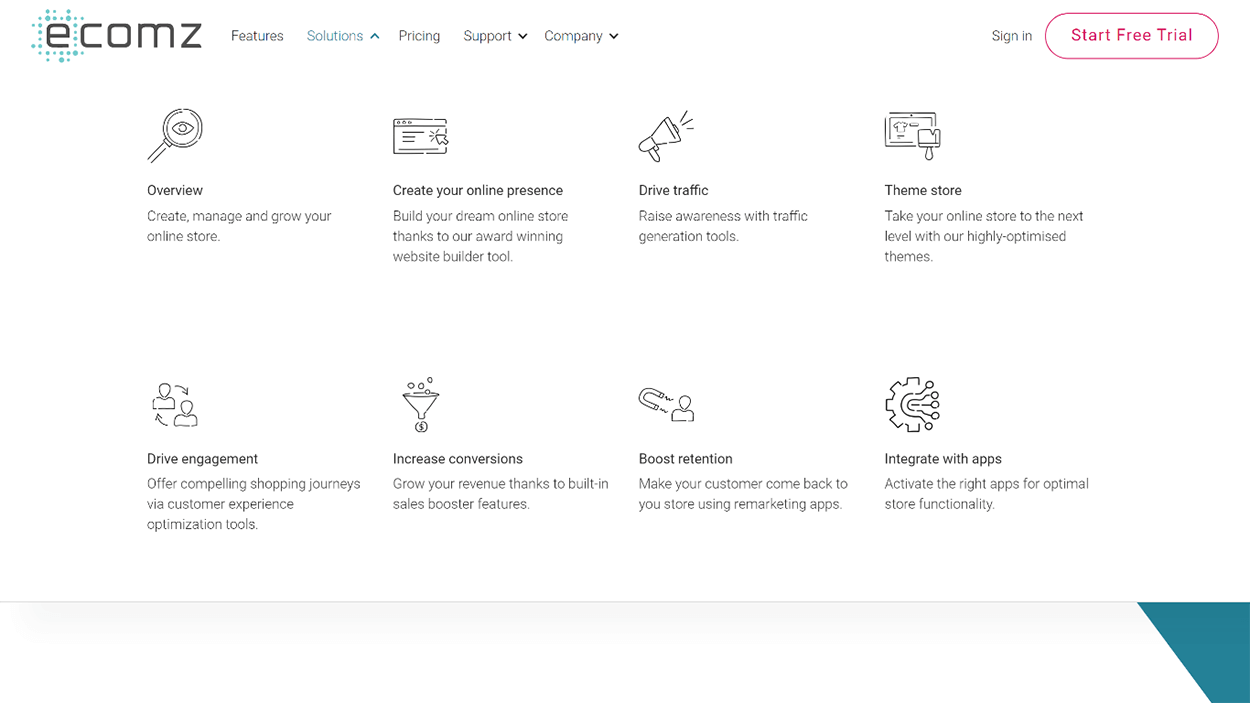
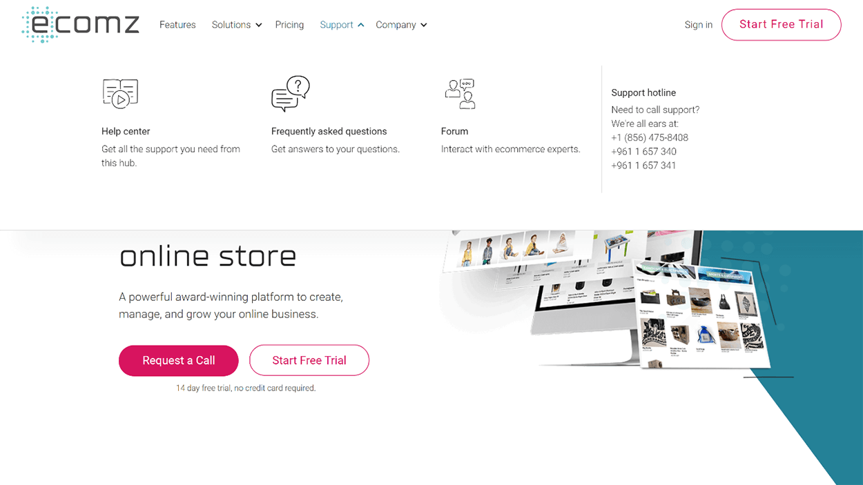
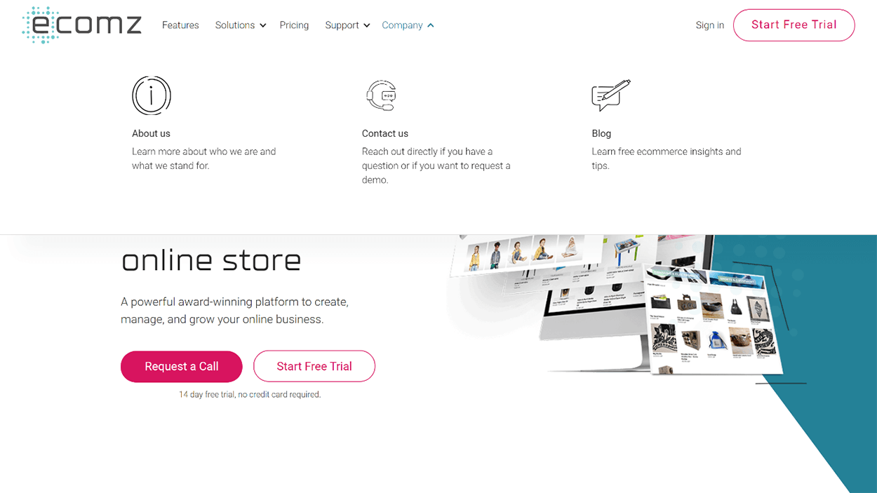
Navigation Menu
The support tab links users to customer support and the platform's community. While not evident here, the website also uses Zendesk to host a help centre. Users can contact support through a widget on the page, or directly by calling the support team. The mobile version allows users to call customer support through their devices.

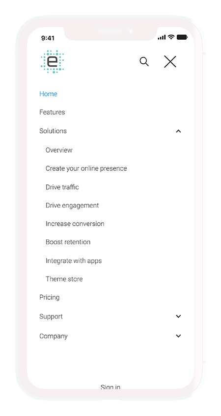
Mobile Navigation
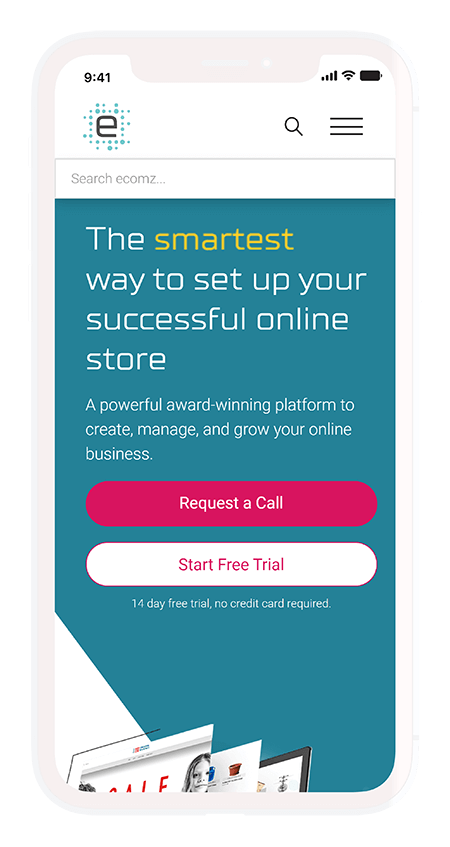
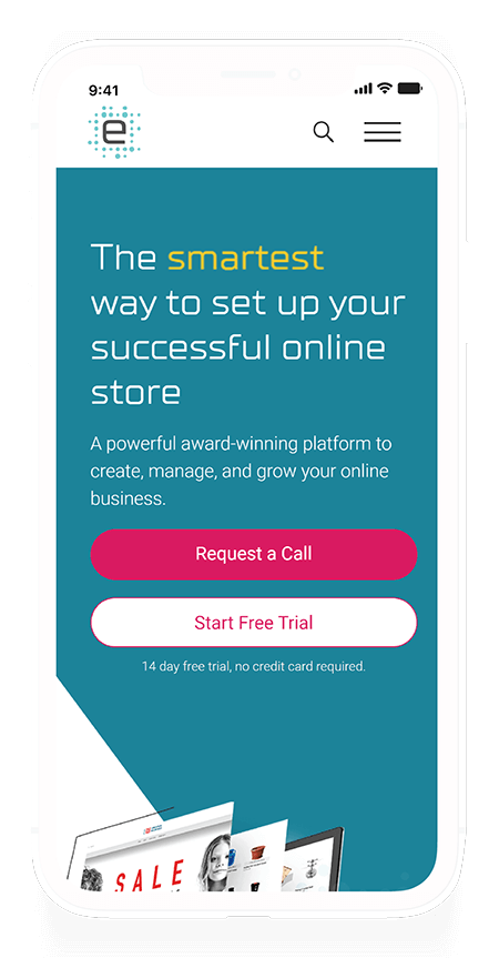
The mobile version focuses a lot on the ability to search the website. I wanted to allows users to directly use the search tool to find the information they're seeking.
I made it a point to keep the mobile menu simple and straight to the point. An efficient menu is one that takes you to your goal. You shouldn't be distracted by the menu, but rather enabled.
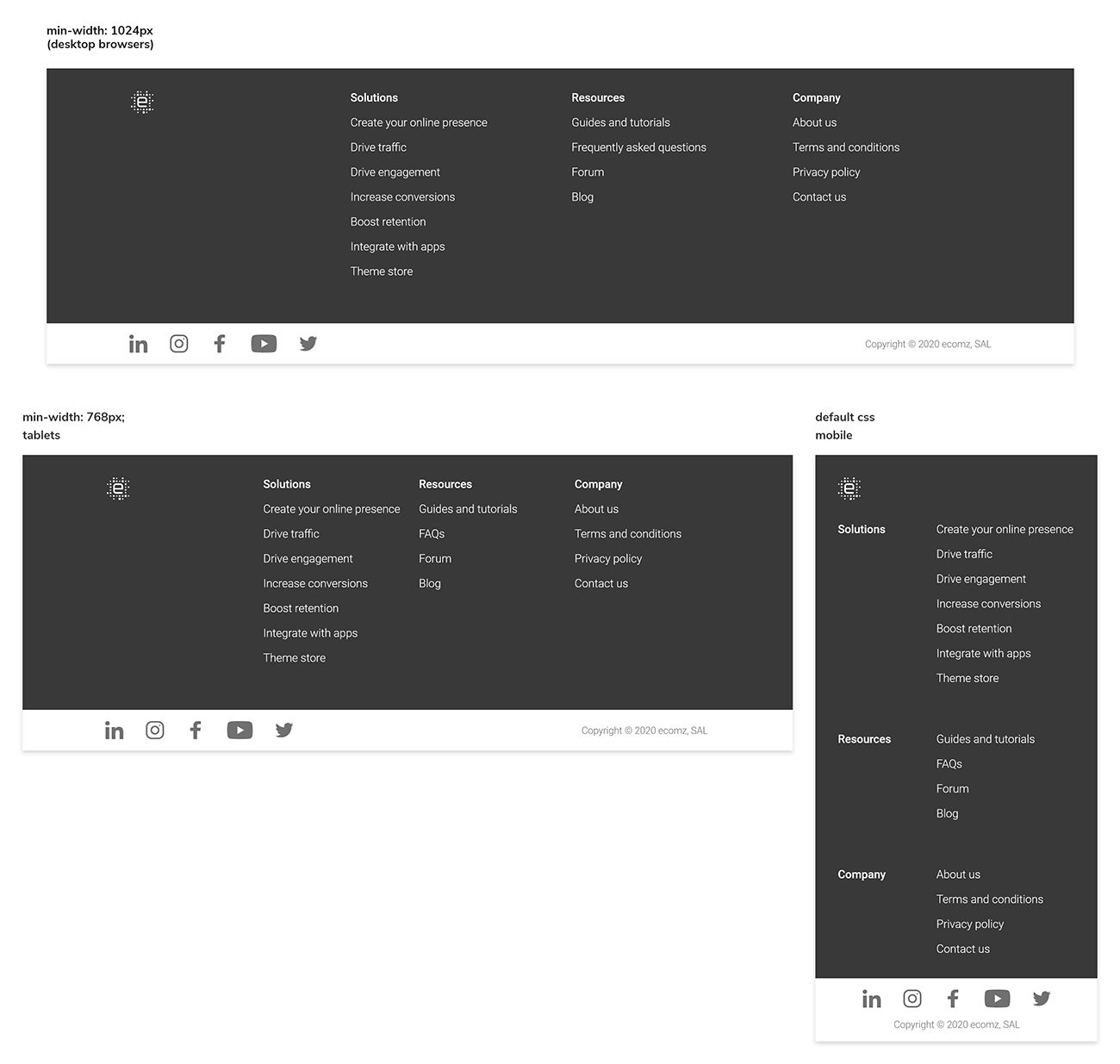
Footer
Footers don't always get the love they deserve, but the truth is, they're just as important as the navigation bar. I prefer to keep references to social media or external sites in the footer. I do this to keep users focused on the website, and not lose their attention before they've had enough time to decide if they care about the content they're reading.

Final Designs
Homepage
First, we have the original homepage. The layout used here, while generic, didn't help the team generate as many conversions and leads as they would have liked.


I like to call this the "duck, duck, goose" effect, or "not a designer, not a designer, a designer". Trust your designers to deliver what's best for you, and put faith in their design methodologies. Most design-monstrosities I've seen have come as a direct result of a non-designer intervention and the HiPPO effect.
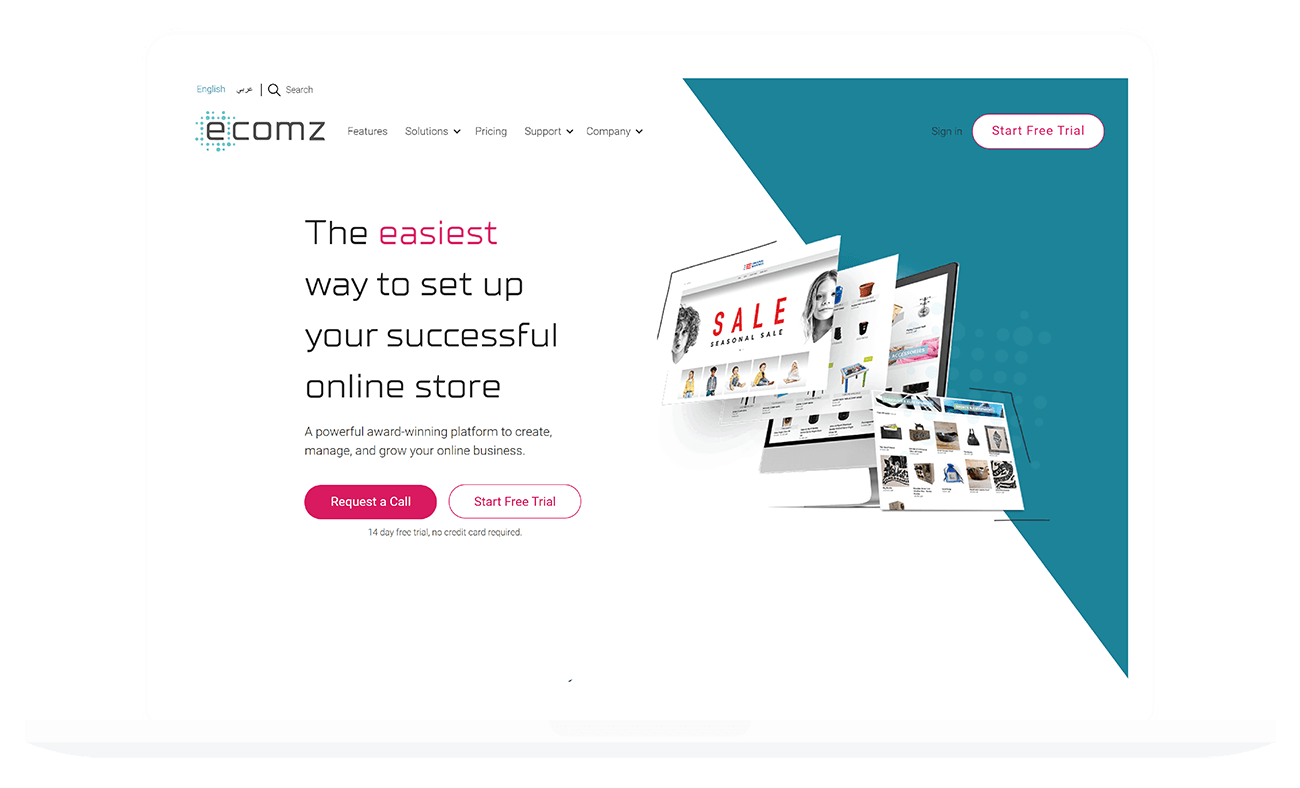
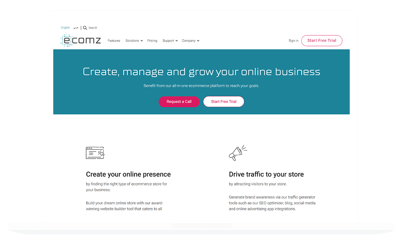
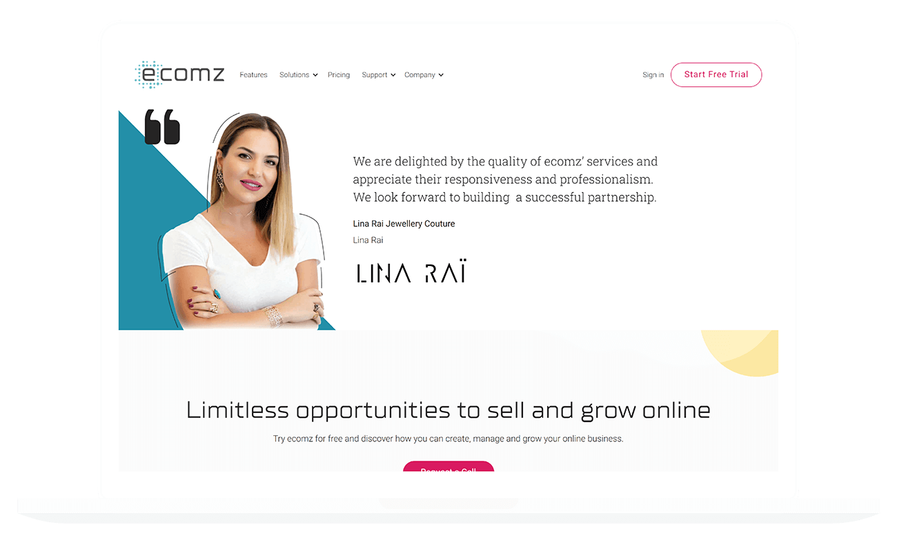
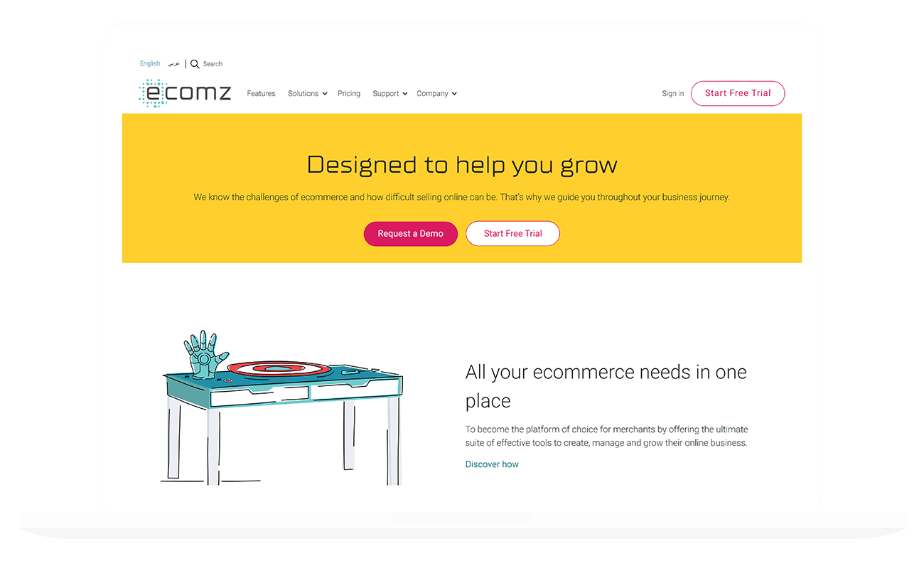
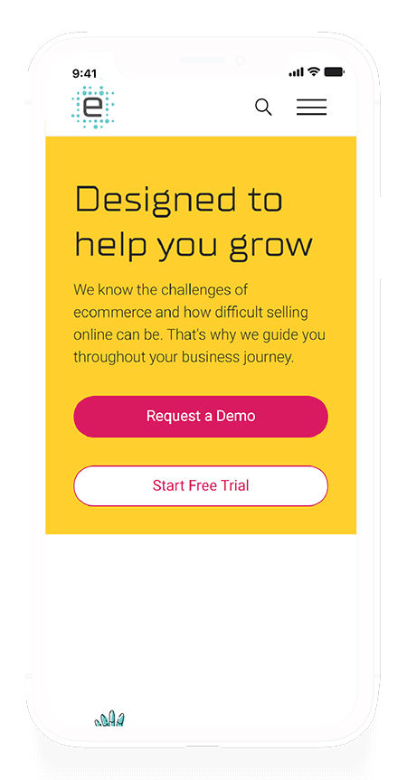
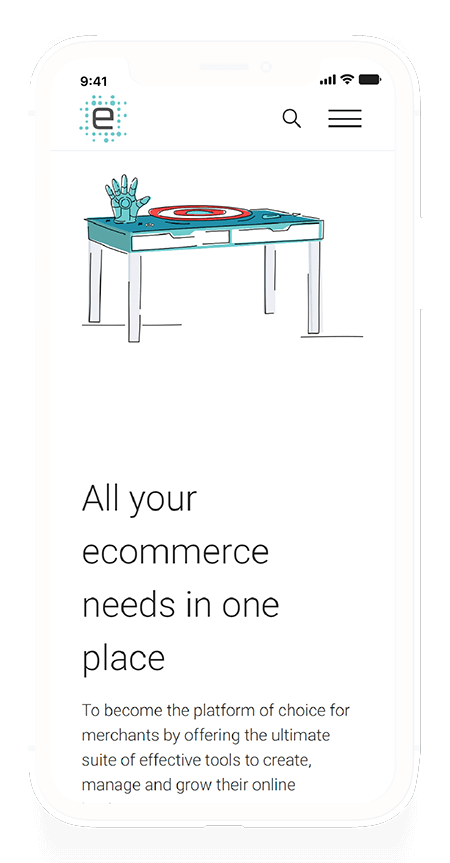
The new homepage design gets rid of all the excesses the previous designs had. There's a misunderstanding with non-designers that assumes "whitespace" is wrong. Negative space creates good design, and it's the differentiating factors that determine how legible or readable your compositions are. Colours are limited and only used when I needed them to help propagate/encourage a user down the page.
As you go through different page categories below, you'll notice that the hero banner always has a different colour. Each page type/category is colour tagged to help users make a mental association as to where they are. It's a very subtle technique, but observations have shown it to be somewhat effective in improving recall.
CSS Animation
I'm quite happy with myself for being able to make this CSS animation work. I'm not a fan of animations that don't add anything, but Marketing wanted one. I only imposed two limitations: There shall never be an animation that could cause accessibility issues or seizure risks.
Arabic Version
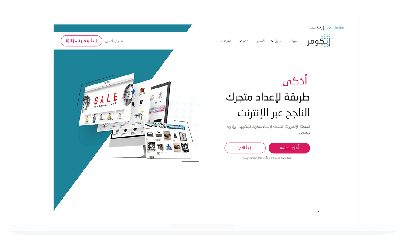
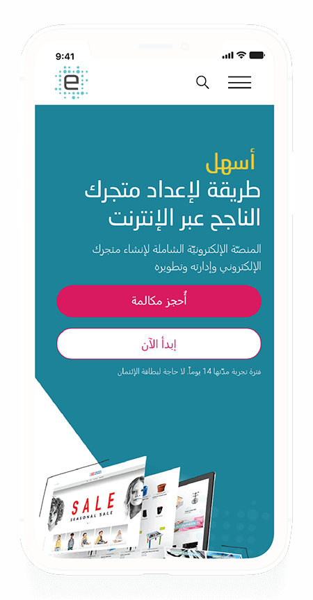
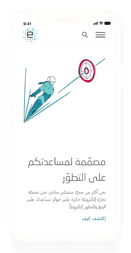
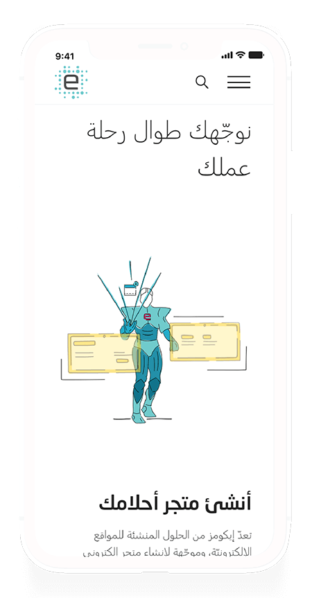
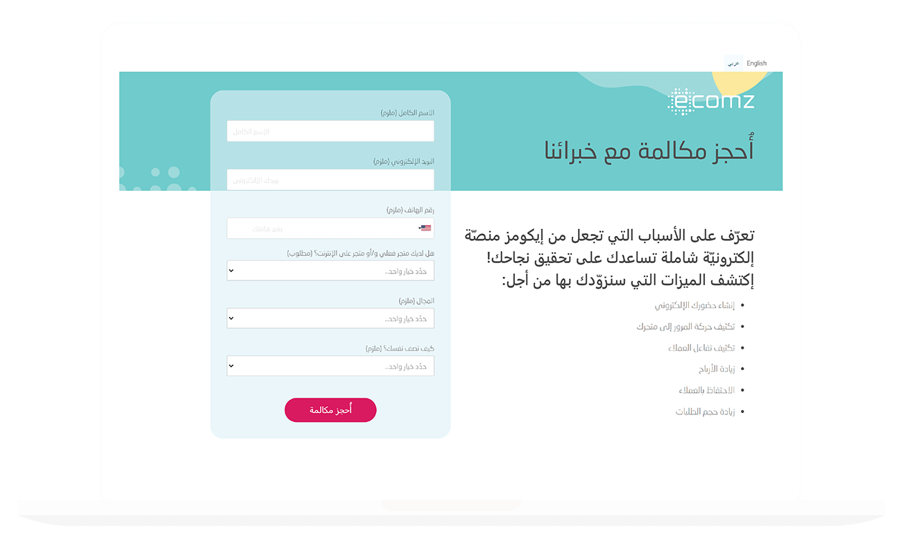
The most important part of the project was to make sure the website also supported Arabic content. User experience and localization go hand-in-hand. Localization cannot be an afterthought in the UX process. If this is something you wanted to do - Then I highly recommend you look into WeGlot. I wouldn't recommend it if you plan to create a blog, but for a regular website? It's very versatile.
Of course, it's not as simple as just adding Arabic content. I had to recreate my CSS to allow for language-responsive design without doubling the CSS I had.
Hint:
You have two best friends here:
<html lang="ar">
And:
              html[lang="ar] body {
                text-align: right;
              }
Of course, it's not as simple as just adding Arabic content. I had to recreate my CSS to allow for language-responsive design without doubling the CSS I had.
As long as you've made sure you haven't hard-coded left-aligned text into other CSS properties, this will typically do the trick instantly. Alternatively, using the "display: flex;" CSS property tends to take care of this for you too!
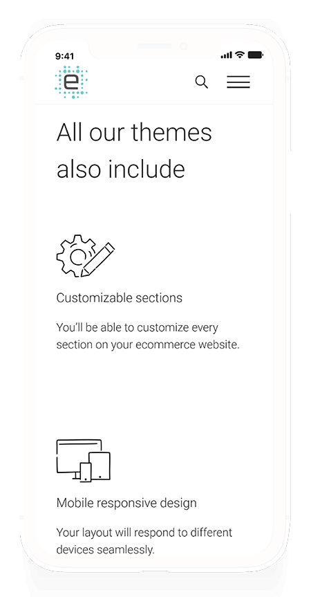
Solution Pages
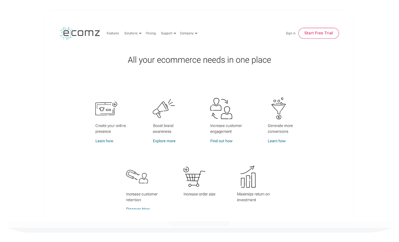
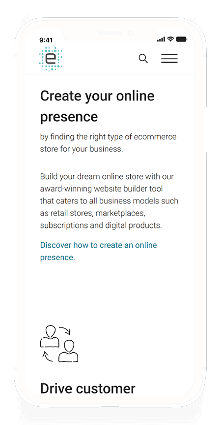
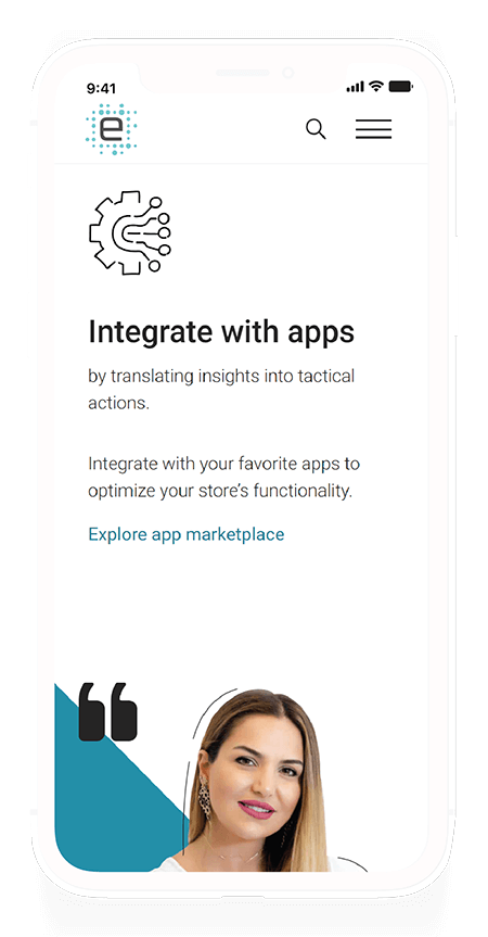
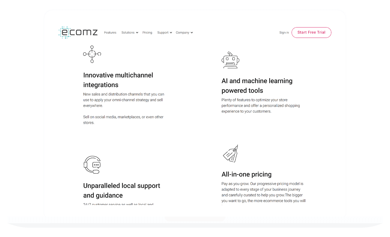
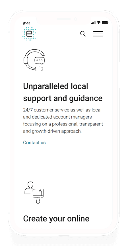
The solution page is a template-style page in which ~8 other related pages use the same design. You get the title, CTA, and feature lists with icons.
The initial design wanted to create custom illustrations for every single feature, but it wasn't feasible. Using icons, however, would allow the graphic designer involved to work more efficiently. The truth is, adding an illustration to every single one of our features was unnecessary and a waste of resource. This way, I managed to cut down the graphic work execution time to as little as a week, rather than the three months we would have needed if we illustrated everything.
Error 404
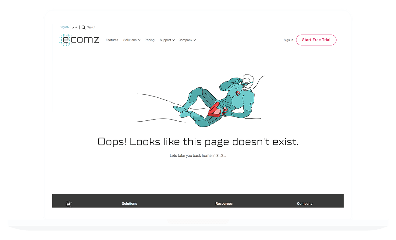
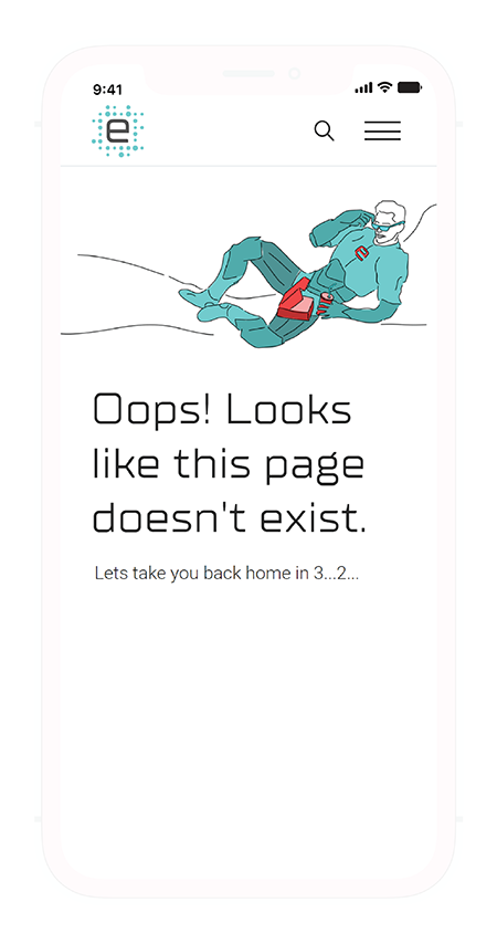
The 404 page is one of those pages that don't get the love they deserve. We needed this page to be funny, lighthearted, and as a transition hub, especially since many old pages no longer exist and do not have a new equivalent page.
When a user lands on the 404 pages, the page redirects him/her back to the homepage.
If an old page no longer exists but has a new equivalent, the page redirects the user to the updated page.
Before a user lands on a 404 page, the server checks to see if the page has a redirect set up. If not, the user enters the 404 page, and a countdown timer starts. When the countdown is over, we transfer the user to the homepage.
How does this look like in code? Take a look!
              setTimeout(function (){
                window.open('http://www.ecomz.com/', '_self');
              }.bind(this), 4000);
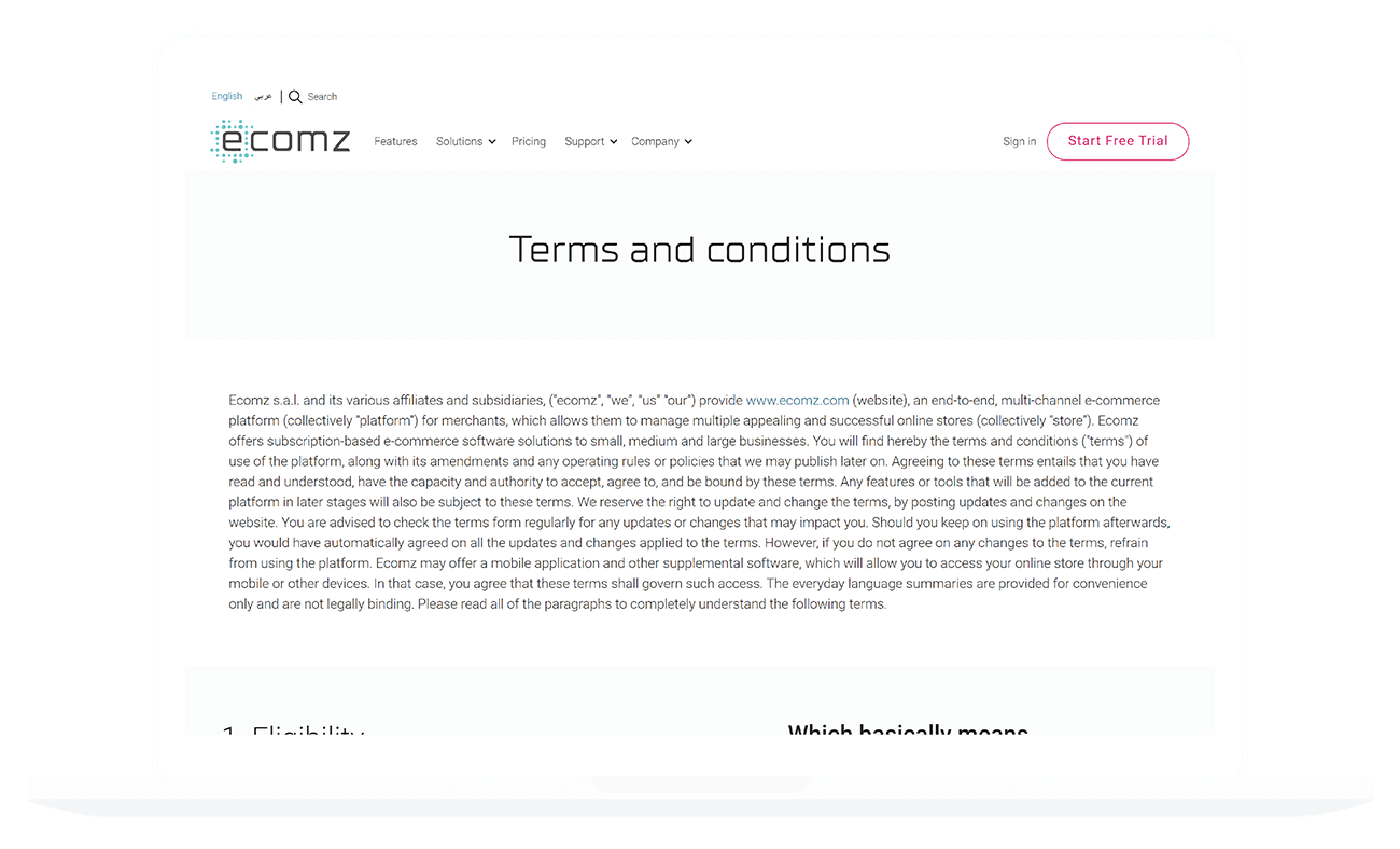
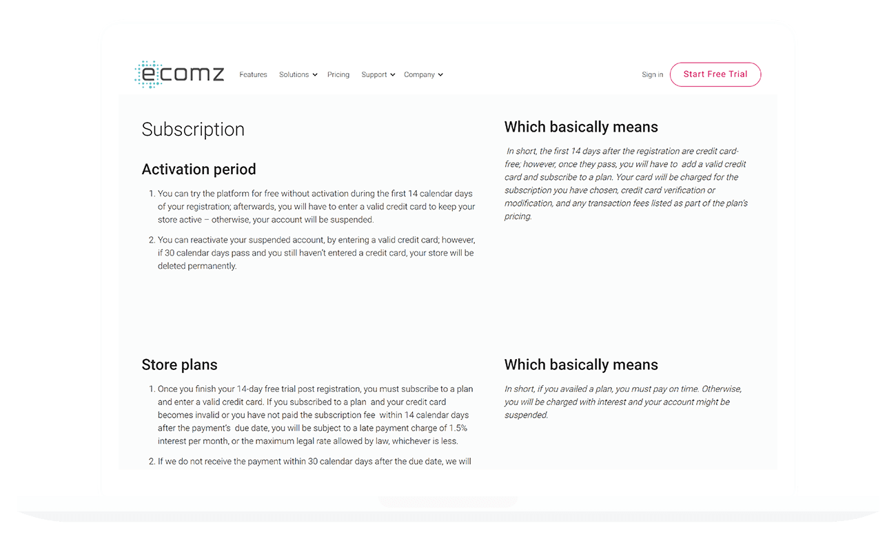
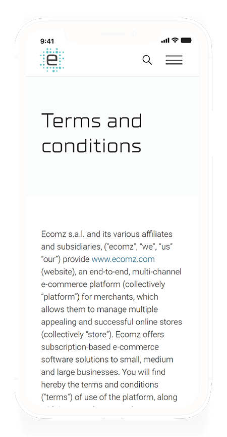
Legal Pages
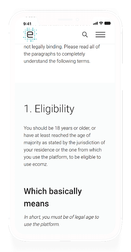
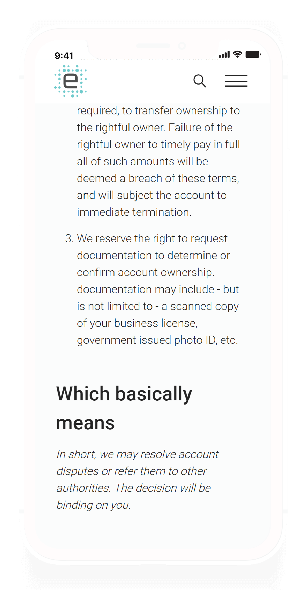
The legal pages don't usually get enough attention. They're pages that allow users to understand their rights, but they're also a bore to read through. To make the legal pages user friendly, I made it a point to make sure each section had a small summary on the side that explained the content in everyday language.
Integrated Apps Page
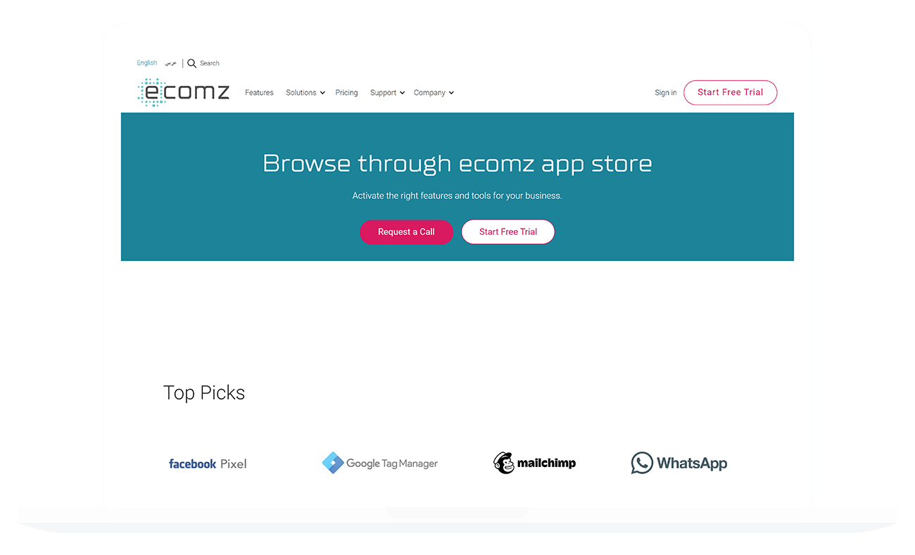
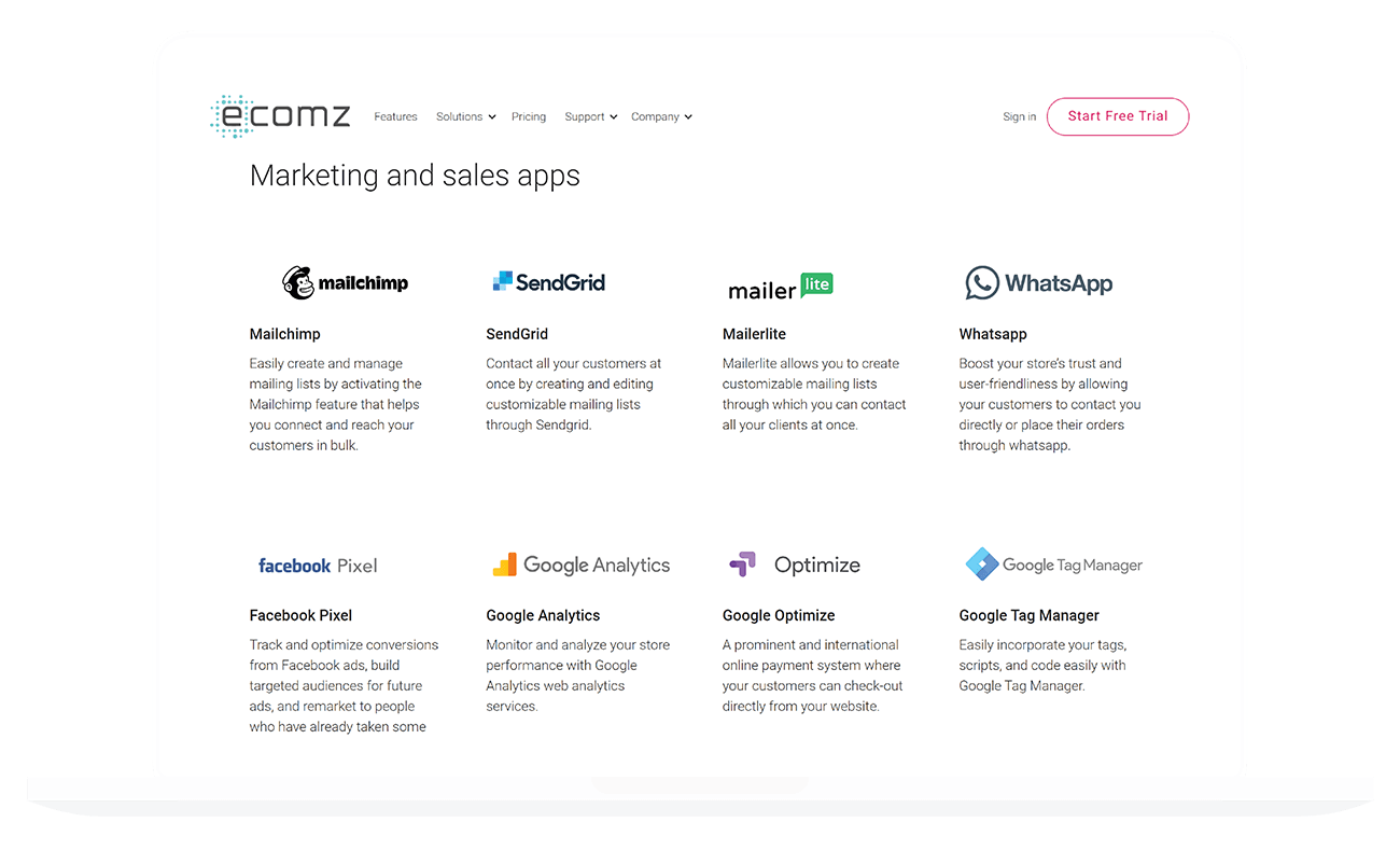
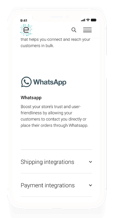
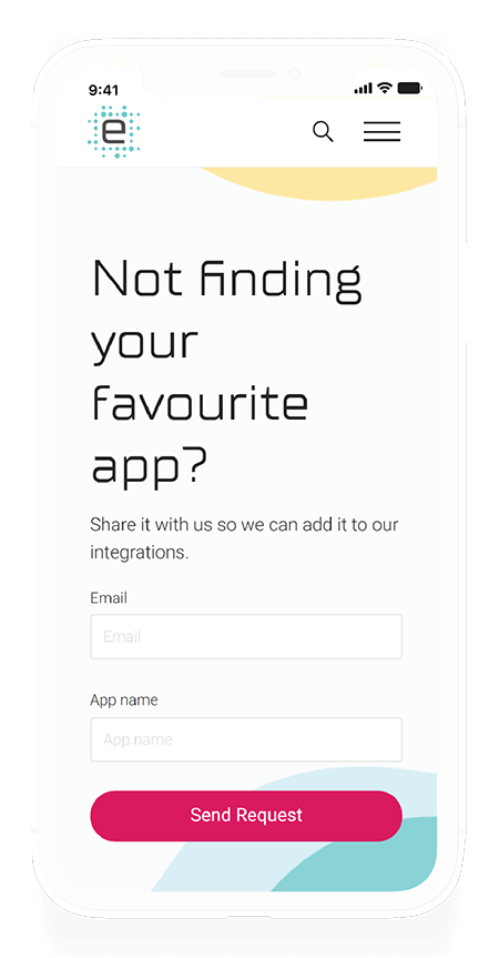
The app store page was simple, but I wanted to highlight a key consideration. The page scrolls neatly on a desktop, but when you're viewing it on your phone, the page becomes unnecessarily long. To avoid this situation, I decided to make these App listing sections collapsible on mobile. Chances are your user doesn't want to see every single app you have, but s/he might be looking for a specific type.
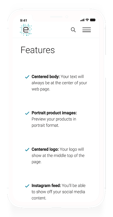
Features Page
The features page follow more-or-less the same pattern as the Solution pages. The only difference is its layout is the presence of a section that directs the user to the Overview page.
Pricing
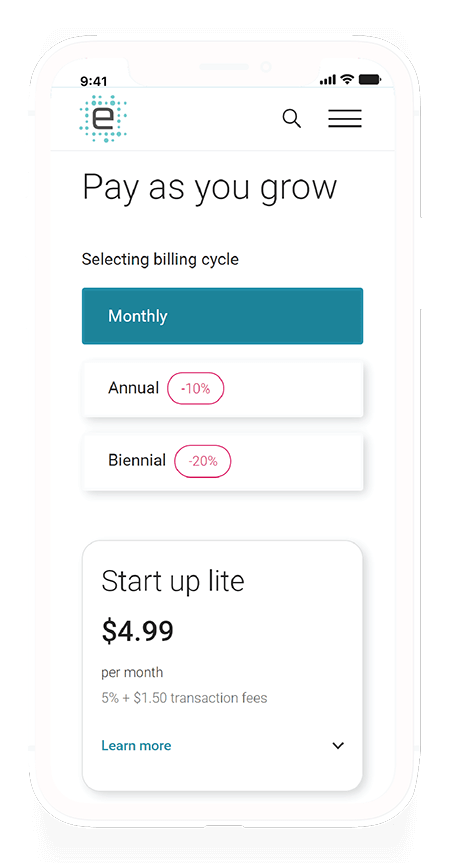
Admittedly I am not a fan of the pricing page due to the format imposed. It's hard to get a pricing table such as this to be accessible, so I had drawn up a proposal to fix this page in the future.
The page comes with two different version: a mobile-friendly table, and a desktop table. More specifically, I set a breakpoint at 767px where a different HTML/CSS structure is loaded that was better suited for mobile view.
Contact Page
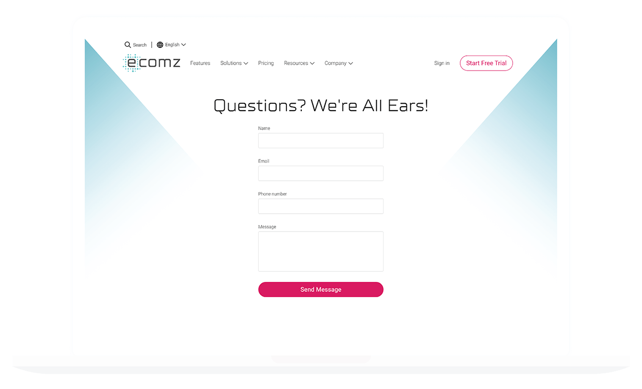
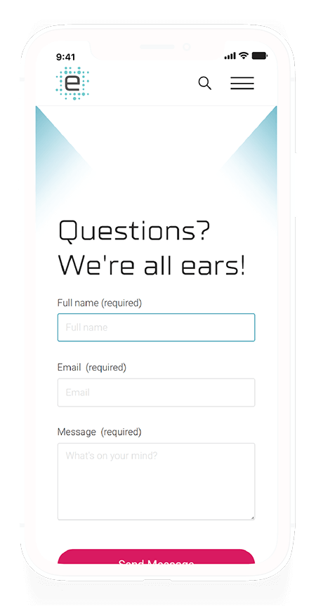
I kept the contact form minimal to reduce friction. I always like to preach the following fundamental rules when it comes to form design:
- Keep it short and very simple.
- Can two fields be merged into one? Then go ahead and do it.
- Only ask for what's necessary to communicate with your clients.
What do you need to establish rapport with a curious client? You certainly don't need the name of the company they work with or their address, or whether or not they like pecan pie. You only need their full name, their email address, and their message. I've effectively reduced the number of fields from 6 down to 3.
Here's a tip: If the form is the primary element in the page, then autofocus that first field. Don't forget to point out which fields are required, and which aren't.
Theme Store
The Theme Store page was a tough cookie!
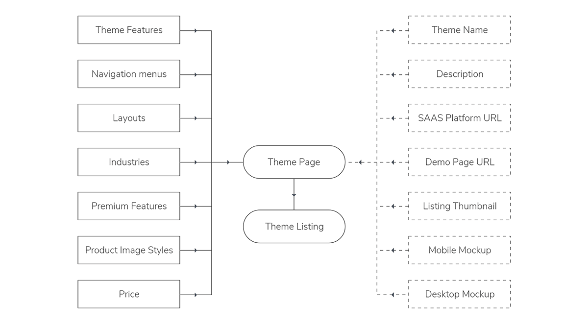
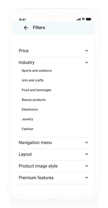
I had to set up a database of available fields, apply the appropriate tags and features to them, feed them into a DIV wrapper, then create a filtering system.
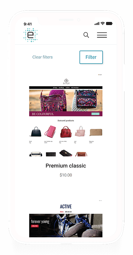
The theme store page looks simple enough, but there's a lot of magic going on under the hood. I created the themes database to allow anyone with access permission to log in to our database and add or edit a theme without needing any code intervention.
Let's take a look at how I did this:
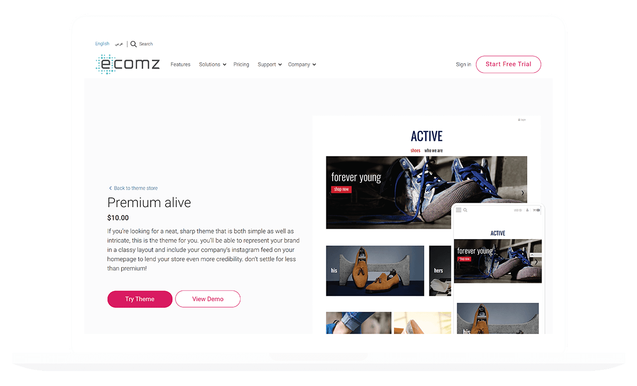
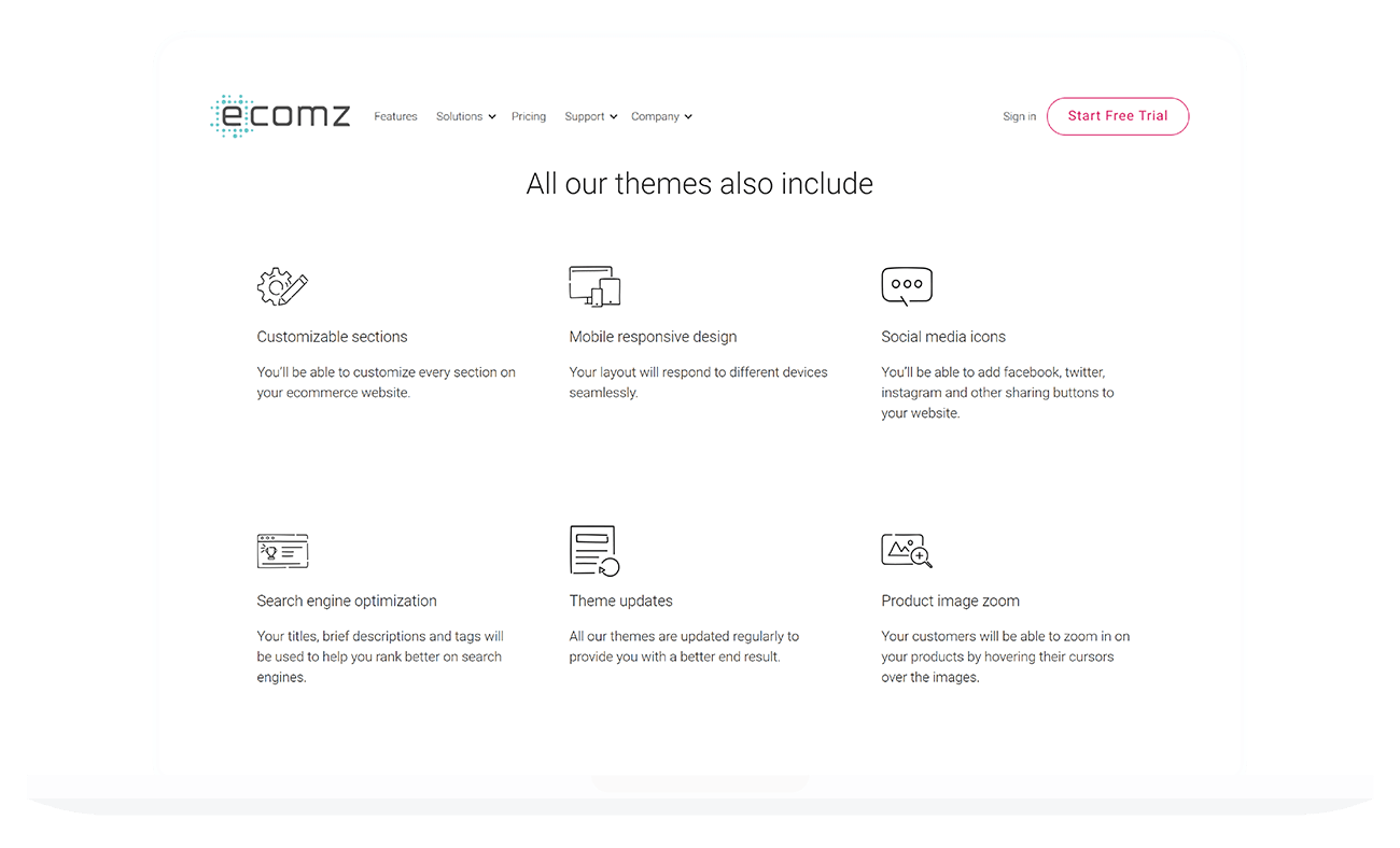
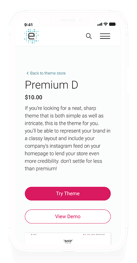
Each theme has a dedicated page. Each page contains an image of it's mobile and desktop views. The pages must also showcase the unique features unique to each theme.
So we've figured out we had the following databases:
- Master Theme CMS page
- Price category
- Target industry
- Navigation style
- Layout
- Product image layout
- Premium features
- Activated features
Each of these fields is input dynamically into each theme page.
We'll take an in-depth look at how the databases interact with one another. The Theme has data fields embedded in it, which I represented in dashed lines. These fields determine theme-specific qualities such as its name, description, and screenshots.
The Theme also pulls assigned information from external databases that contain fields that are present across different themes.
By implementing the theme database structure this way, we manage to create a dynamic Theme object that can change as needed without negatively affecting other themes.
The result is a theme listing, and theme detail pages that are dynamically generated by the CMS without requiring any design or code intervention from the Product team.
Theme Pages
The second part of the theme store page involves visiting individual themes and learning more about their features. These pages are generated dynamically by the databases set up for the theme page.
When you create a new theme, you only need to plug in the relevant data, and the database generates the theme page automatically. The theme listing page and filter will also automatically add the theme to the index.
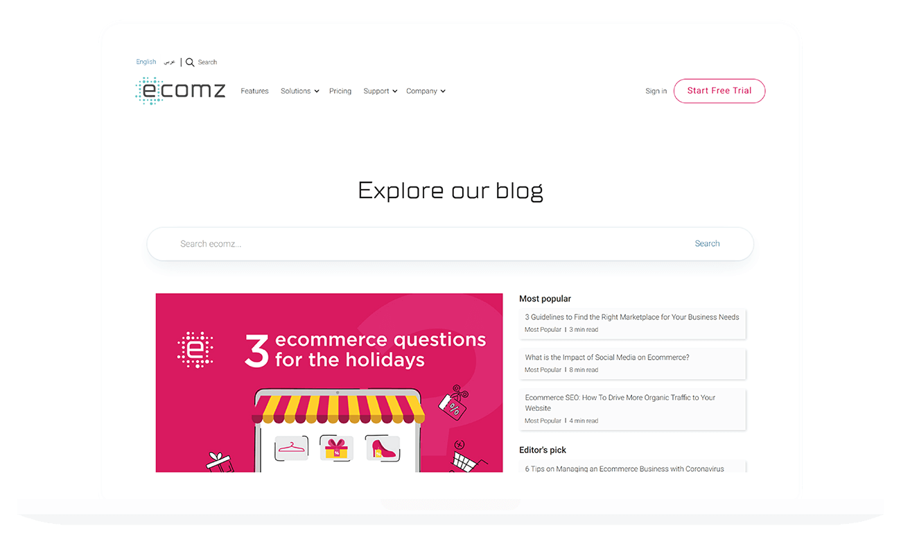
Blog
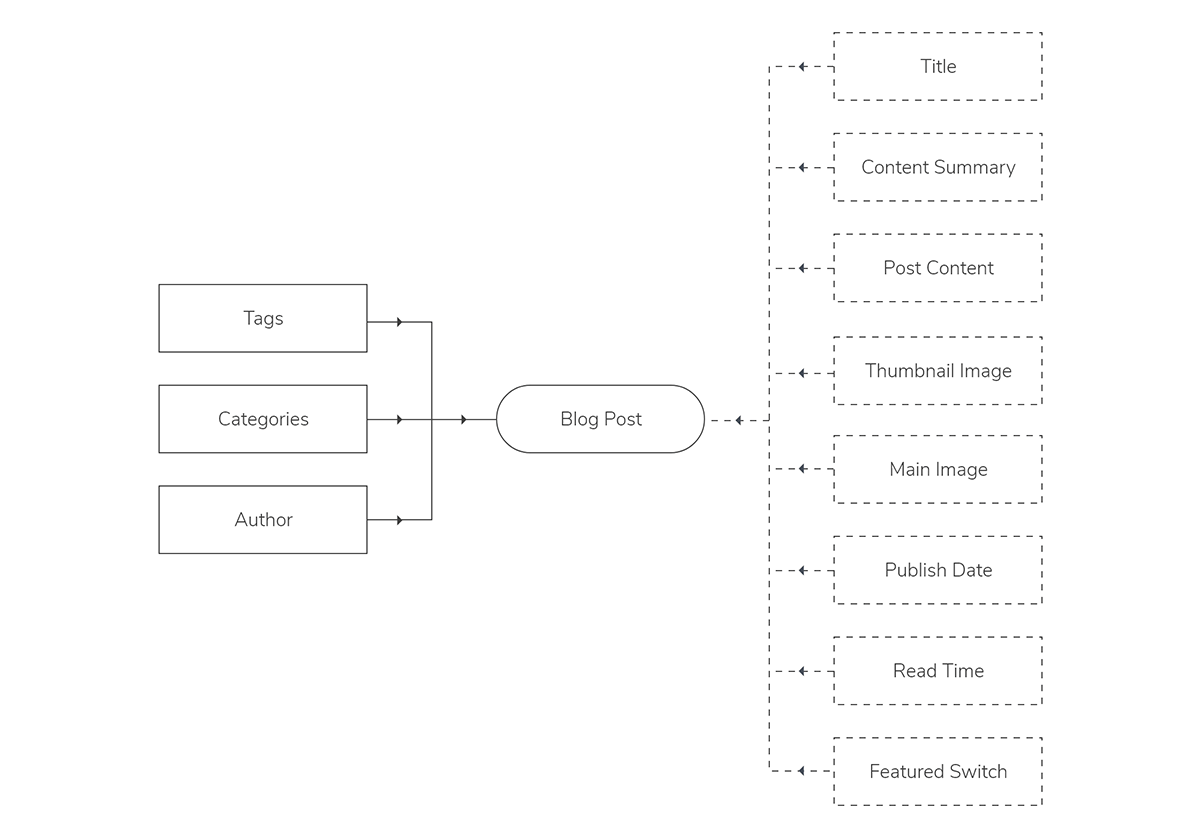
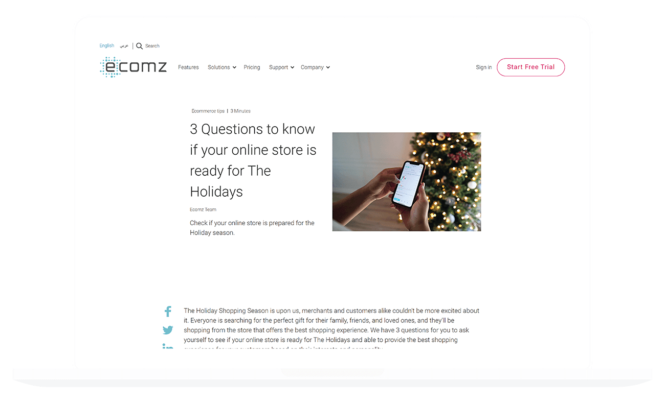
The blog is set up similarly as the Themes, but it didn't need the complexity that the theme pages required.
I migrated the old blog to the new website and optimised the old images for the web. I made sure that the Marketing team was aware of the size requirements and image optimisation process to ensure that the uploaded images did not affect load times.
Let's take a quick walkthrough of how I structured the blog database:
The blog database allows us to automate the blog index page and generate posts without requiring code/design intervention.
Blog Posts
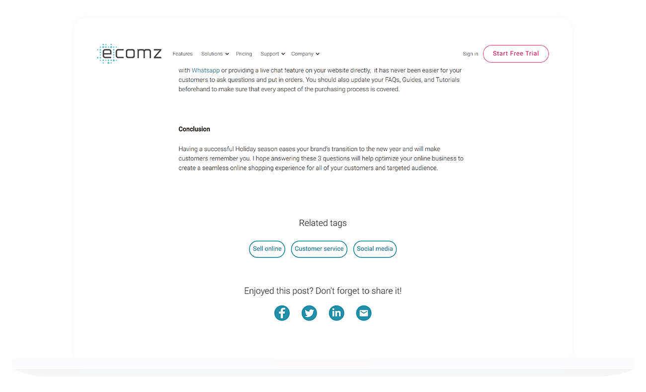
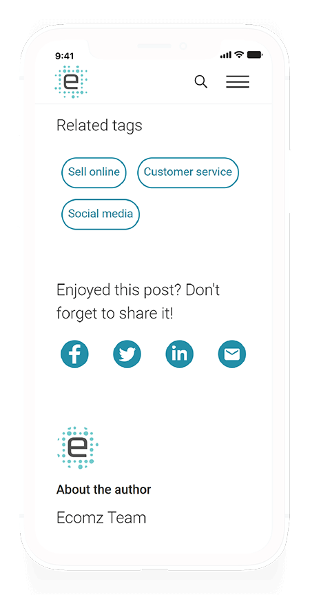
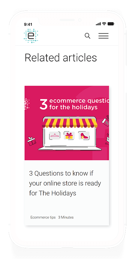
I'm quite happy with the blog post page. The database we went through above is responsible for generating the blog posts. All the marketing team has to do to is paste the articles they've prepared using Google Docs straight into the post's Rich Text Field editor, assign authors/tags/categories, and that's all there is to it!
I've hooked up the blog post page with three different functionalities:
- Sticky social share icons that follow the user as they scroll down the page while remaining unintrusive.
- I added a comment section to encourage community discussion.
- I placed code to dynamically generate a social share image whenever a user shares a post.
The comment section was a Facebook plugin and was easy to set up.
The social share icons were fairly straight forward to set up - You only need to add the appropriate link extension to share on the target platform. To make it dynamic, I set up the share button's HTML anchor link in the following manner:
              href="https://www.facebook.com/sharer/sharer.php?u=https://www.DOMAINNAME.com/blog/{{slug}}"
              target="_blank"
              rel="noopener"
              aria-label="Share on Facebook"
This way, I ensured that all the marketing team had to worry about was creating captivating and meaningful content.
Request a Demo Page
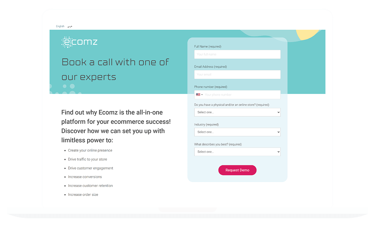
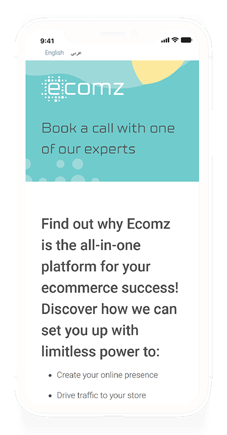
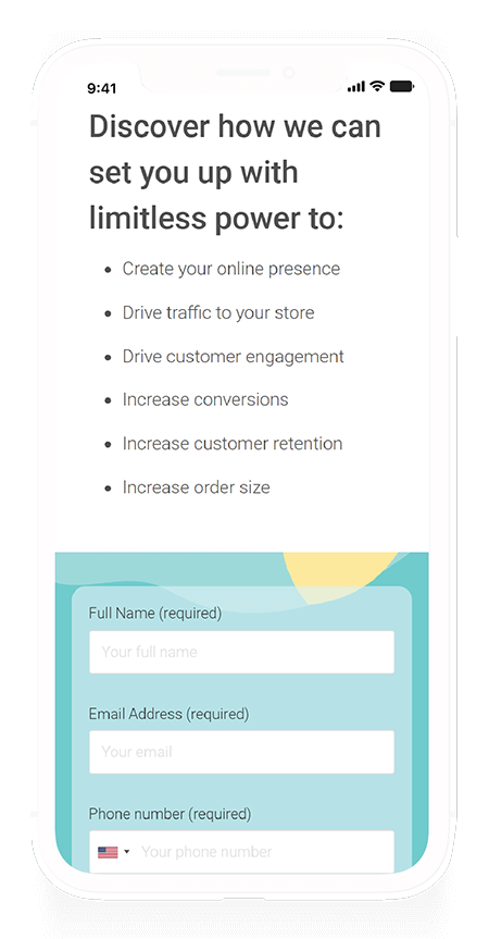
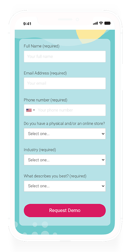
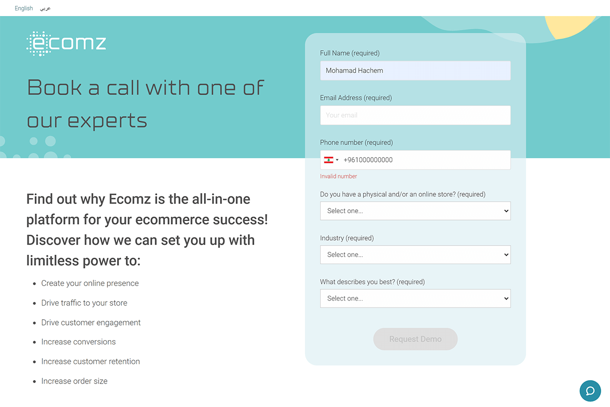
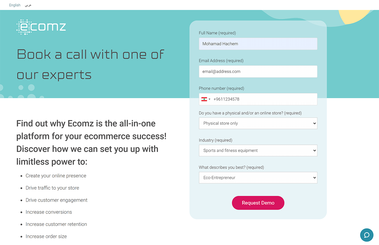
The request-a-demo page proved the hardest to set up. Initially, marketing asked for much more fields, but they agreed to reduce the number present to make the form appear less daunting.
Creating the form was simple enough, but hooking up the form to the Hubspot database when using a custom form format? That was a challenge. The "forms" also needed phone number validation to ensure submissions came from serious candidates. We also needed a way to track original and referral sources while to overcome a limitation with our Hubspot integration.
You'll find the landing page's design below:
Lets take a look at the code details of the form.
There were two requirements for the form: We needed to save the Arabic submissions in a separate database than the English ones. The initial solution involved using CSS to show/hide different forms depending on the active website language. This solution wasn't very feasible because we eventually had four 'forms' on the page: Two for mobile, and two for desktop.
What's the structure of a HubSpot form? To send a call to Hubspot to capture a form, you needed to use a specific form key to capture and save it in the correct location.
So in pseudo-code:
If the document language is Arabic, find the form element and change the form key to the Arabic key, else keep it the English form.
              function init() {
                //Get HTML Language
                var docLang = document.documentElement.lang;
                //Reference Form
                var myForm = document.getElementById('requestForm');
                // Set Arabic Form Key
                var formAR = "hubspot-key-goes-here";
                //If page is arabic change key
                if (docLang == "ar") {
                  myForm.setAttribute('data-vimkit-success', formAR);
                }
The next step is to slot in the referral and the original source to ensure our integration worked as expected. One of the issues we faced was that our integration automatically classified submissions as "Direct Traffic". We had no visibility whether people were coming from our ad campaigns or organically. To overcome this shortcoming, we injected code that would place sources in a hidden input field inside the form.
What does this have to do with user experience? Admittedly from a user's perspective, there isn't much that this adds to them. We made this move specifically to improve the employee experience of our marketing and sales team. Our team had more insight and information as to which playbook they should use when approaching prospective clients. Do I agree with this? On a personal level, no, but on a business level? I understand why they needed this visibility, and it was visibility I was willing to grant them because it allowed the company to understand whether our Ad campaigns were reaching our audience or not.
Okay so let's look at the pseudo-code:
First, we need to access local storage to get the "referrer" and "original" source and set them as properties of the page. Then we needed to take these sources and input them into two hidden form fields when the page loads.
How does this look like in code?
                //Get referrer source
                var referrer = localStorage.getItem("referrer");
                if (!referrer) {
                  localStorage.setItem("referrer", document.referrer);
                }
                //Get original source
                var original = localStorage.getItem("original");
                if (!original) {
                  localStorage.setItem("original", window.location.href);
                }
                //Input to sources to fields fields
                //The hidden input fields have an ID associated with them so that the code knows where to input the data.
                document.getElementById("originalsource").value = original;
                document.getElementById("referralsource").value = referrer;
Okay! There's one last step: We needed to make sure our submissions were coming from serious leads. There's no foolproof way to get this done since there's always going to be a spambot that'll be programmed to fool the system. We have built-in detectors, but there's one additional layer I needed to add: General form and Phone number validation.
For the Phone Number validation, I'll spare you the code, but it's good to know that we plugged the "Intl-Tel-Input" library. The plugin checks the user's number format against known international phone number formats.
If the user enters an invalid phone format (too short, too long, or a wrong format for the chosen country), then the form will ask the user to fix the number.
Setting up to the plugin was easy. Making it play nice with the form validation? Not so much.
Let's look at the pseudo-code to understand how I made it work:
If the user did not complete the form, then disable the submit button. Keep checking if the user filled all the required fields and provided a valid phone number. If everything checks out, enable the form submission button, and allow the user to submit the form.
Lets see at how it looked like in code:
                function validateButton() {
                  var buttonDisabled =
                  //If the name field is empty
                  $('#name').val().trim() === ''
                  // or the email field
                  || $('#email').val().trim() === ''
                  // or the phone number is not valid
                  || iti.isValidNumber() !== true
                  // or no dropdown option is selected for store, industry, or business description
                  || $('#store')[0].selectedIndex === 0
                  || $('#industry')[0].selectedIndex === 0
                  || $('#hs_persona')[0].selectedIndex === 0;
                  $('#form-submit').prop('disabled', buttonDisabled);
                }
That's it! Now we've got the form that's language-responsive, and self-validating.
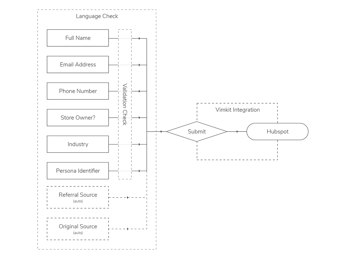
Creating the landing page was the easy part. The hard part is making the form work with the company's lead scoring system. Let's take a look at how we capture form data.
Since there's no way to connect Hubspot to the website's backend, we needed to use an integration to allow us to relay the information to Hubspot.
We first capture the referral/original sources automatically using our script, which I've represented in dashed lines. The next step is to validate the form. When all fields are filled and validated, the submit button activates.
When a user clicks on the submit button, our integration captures the form data and relays it to Hubspot.
Performance
Are you looking for numbers?
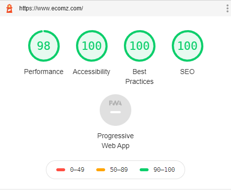
There was a 1,333% increase in form submission rates over the past three months. That's one thousand, three hundred, and thirty-three per cent. Sales are overbooked with client meetings and have stopped visiting the product team ever since.
Below, you can find the lighthouse site performance report before the company required me to add script plugins for Marketing and Customer Support purposes. To help alleviate the damage those plugins inflicted, I made sure that they were loaded asynchronously, which allowed the website to still load in under second.
Key Factors for Success
Teamwork is essential in creating successful projects. If a project has been, but the team did not have an assigned project manager, the project will probably fail.
Communication is essential for the delivery of successful projects. More importantly, checking out your ego will be the determining factor that affects your project success. Ego results in project failure because, by default, ego does not allow for clear communication.
When you've set up a project lead, and you've clearly outlined the project goals, then your team will be more likely to succeed. Every team member will know their role and will know what needs to get done. You also need to be proactive and foresee risks and failure modes. Planning a project is crucial, but failing to address possible risks could throw all your planning out the window.
This project taught me the value of teamwork and clear communication. Through leveraging these two principles, I managed to complete a task that was out of my job scope, and deliver it ahead of time. Had I failed to communicate the risks, or what I needed to guarantee success, then I would never have managed to deliver the project on time.
Final Thoughts
The original website took six months to implement then fail to launch, whereas it took me fourteen days to deliver the website from scratch. Of course, there's also the fact that conversion rates skyrocketed overnight, but I'm a lot happier with how I managed to prove myself (to myself).
What I loved about this project was it truly encompassed my stance towards Total Design. As a UX designer, my job is to understand the "why of things". I used design thinking to teach myself how to apply code I've never been exposed to before, set up databases, and create multilingual websites. I outlined the problems, gathered the resources I needed, and devised the solutions to address them.
While designers don't need to know how to code, they should understand how the pieces fit in together. This project allowed me to implement my design approach on all possible levels - Had I been asked to design the office space, I'd have gone ahead and done that to unify the brand experience at all levels.
You can find the second phase of the project in under the SaaS Help Centre.
You can find the Help Centre project here

