Context-Aware NFC Payment App
Preface
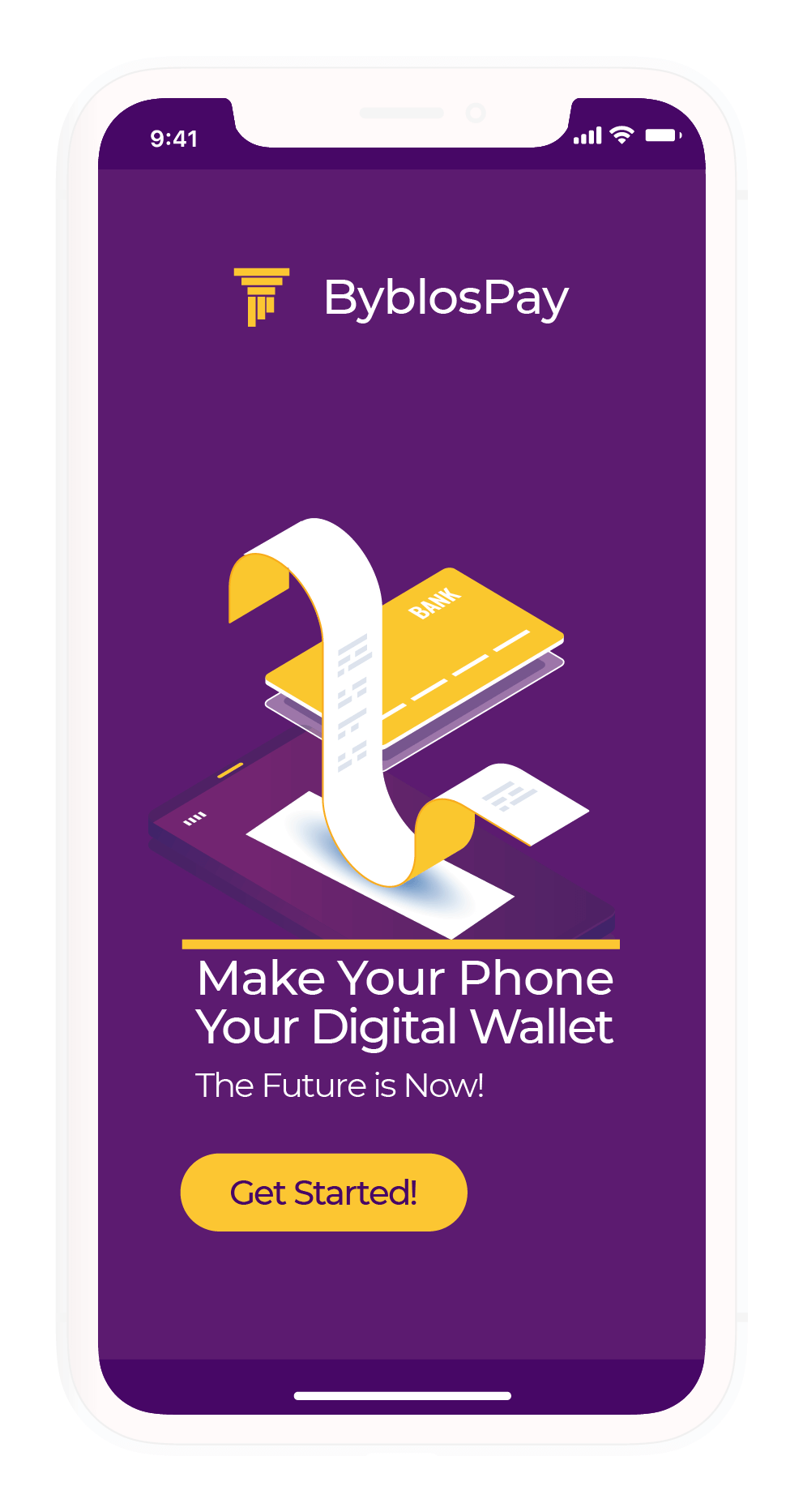
This is a case study that looks at an existing NFC payment platform within Lebanon, specifically the Byblos Pay app, and improving it's UX/UI, and giving it a whole new look and feel. ByblosPay is a mobile payment application launched by Byblos Bank. The app gives customers the ability to conduct purchases through contactless payments from their phones based on Host Card Emulation (HCE), and NFC technology.
Identifying Issues
First Launch
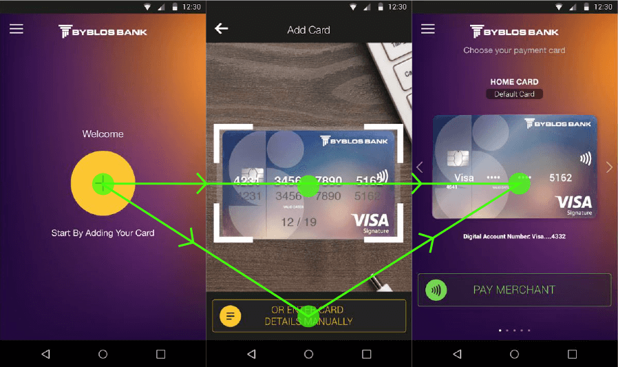
On the first launch, there's a noticeable issue with the application: When registering your first card, the application quickly asks for permission to use the camera, you cannot proceed otherwise. When you do give camera access to the application, the application lets you know that you can enter your card data manually, which is too little too late.
This is currently a privacy concern. What if the user does not want to give the app permission to use their cameras? It is important to keep in mind that the average Lebanese has a general distrust or aversion towards the use of debit/credit cards, let alone using a mobile application to conduct their card payments.
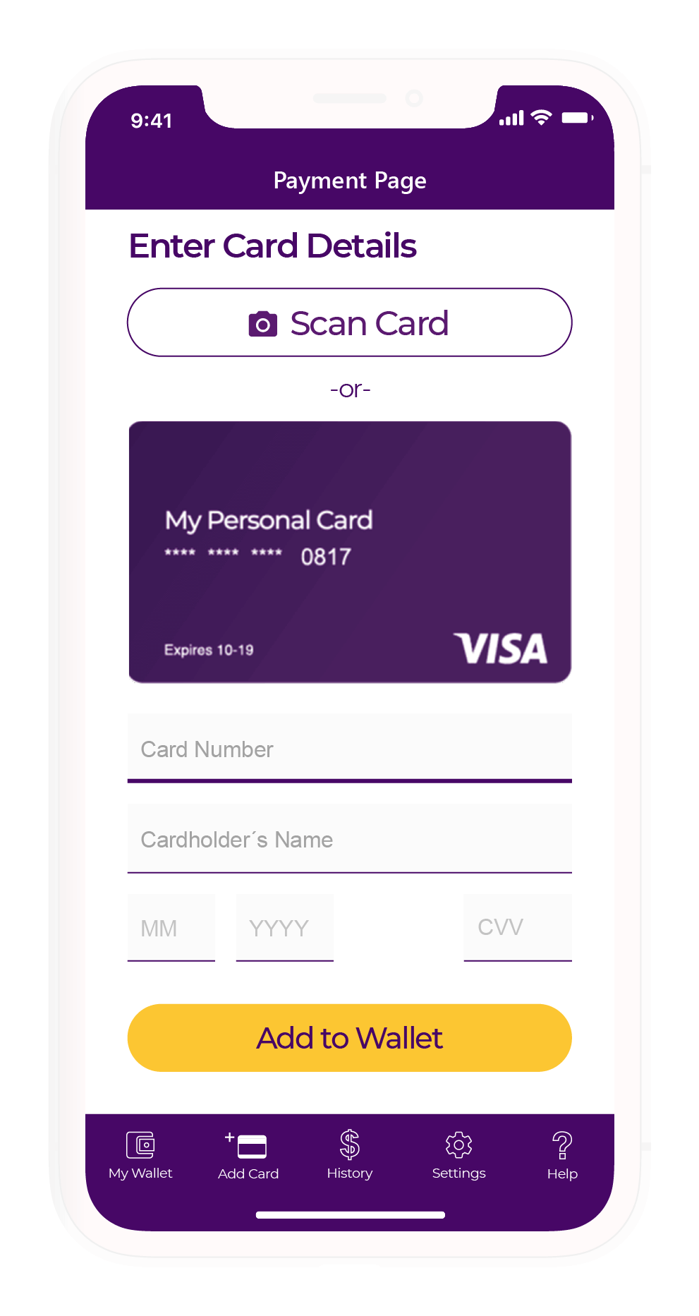
I propose that to establish trust between the application and the user, the user flow ought to change. Instead of opening the camera by default, allow for the user to land on the manual data entry page first, and then give the user the option to use the camera for automated data entry.
Payment User Flow
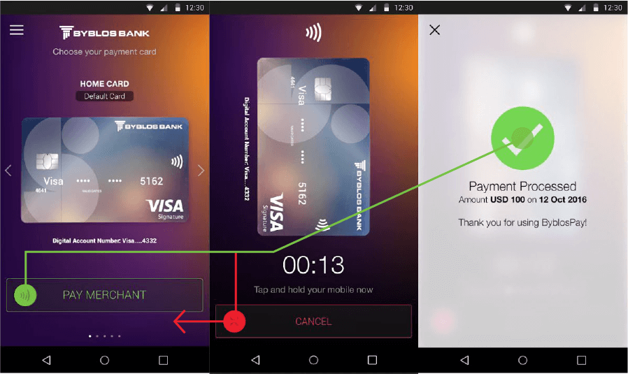
As is true with everything Lebanese - The app does a great job in conducting payment. It's so smooth you don't realise you've paid until it's too late, and you've no idea how much you've paid until you've paid it.
Generally in UI/UX, it's always great to have everything go smoothly - but that doesn't apply when money is on the line. The average user in Lebanon already distrusts debit/credit cards (or at least does not properly understand how to use them), and making this payment process so smooth to the point that the user doesn't figure out how much is being made until after the transaction is made makes things much worse.
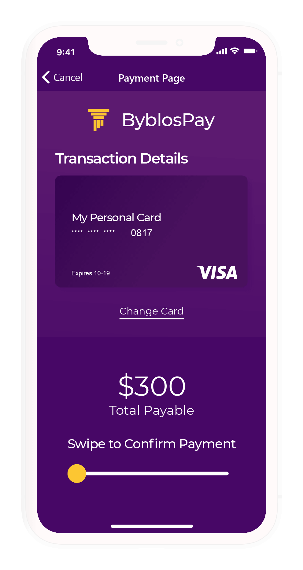
How much are you paying the merchant? This should be confirmed on the screen itself. This is an opportunity to establish more trust with users.
Card Management
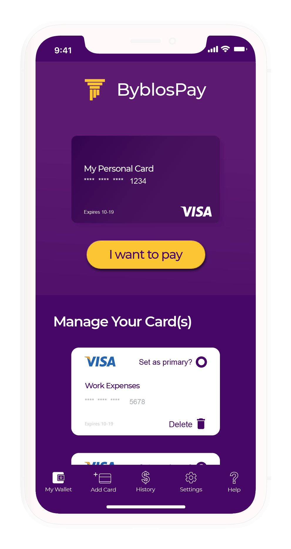
The process of adding a new card, and managing your cards is where the application begins to break down. Two issues need to be addressed here:
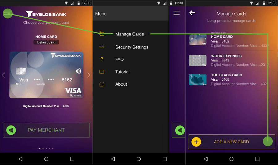
How is the user supposed to guess he or she needs to open the hamburger menu and find the "Add a New Card" button in the "Manage Cards" section? The other issue is the fact that the "Add a New Card" button is tucked at the bottom of the "Manage Cards" page in an in-ubiquitous manner.
Analysing Heuristics
Positives
What does the application do right?
- Shallow navigation allows the application to be quick and easy to use.
- The application makes use of the camera to eliminate manual data entry.
- Biometric/fingerprints can be used for an added layer of security.
Pain Points
Where does the application go wrong, and where could it improve? Please note that due to the application's security restrictions, screengrabs can't be provided, so I will attempt to illustrate the issues through text.
- When an application includes sensitive data entry (such as card data), the UX probably should add 'friction' to the user flow. This friction would allow users to feel that they are in control of the entire process. Smooth flows are great, but sometimes you do need some road bumps to slow down the process.
- An intermediary page should be added between Adding a Card on the first launch and requesting camera permissions. It makes little sense that one can enter their information manually but still be required to give the application their camera permissions.
- An animation or image needs to be added for users to understand how to use the camera, and what to scan.
- Manual record entry has a design issue. The application doesn't allow for screen-grabs so this will have to be explained through text: There is an image explaining what information to enter, but it is a lot more dominant than the input field. Having tested the screen with 5 different users, it took the majority of them far too long to understand what was happening on the screen.
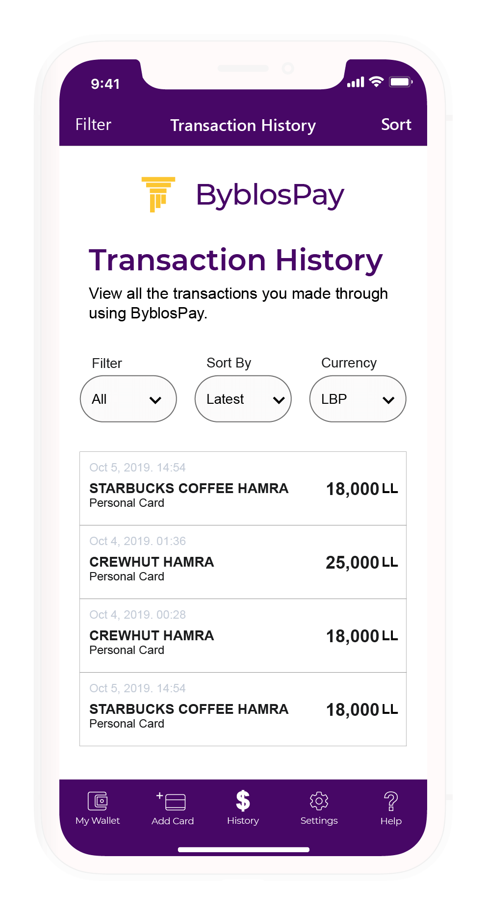
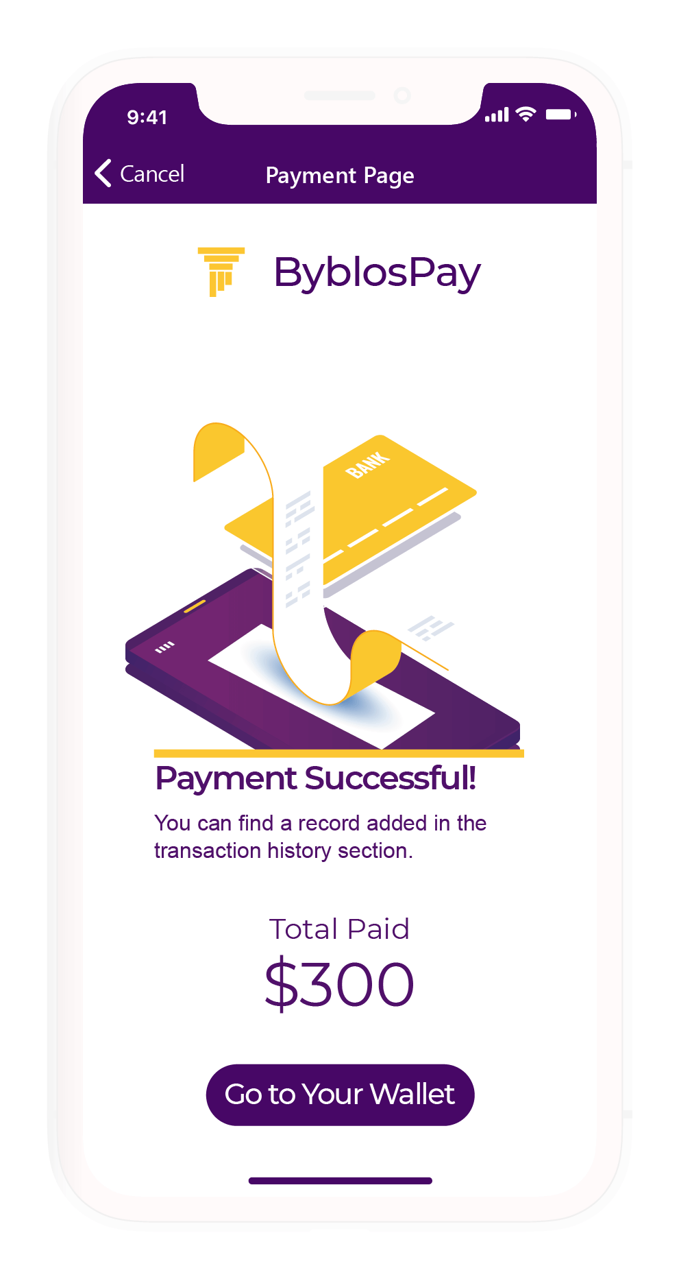
- It's unclear if there are transaction history records available. This should be made clearer or made available to establish even more trust between users and the application.
- The payment menu is susceptible to accidentally hitting Pay when the user might still be unsure.
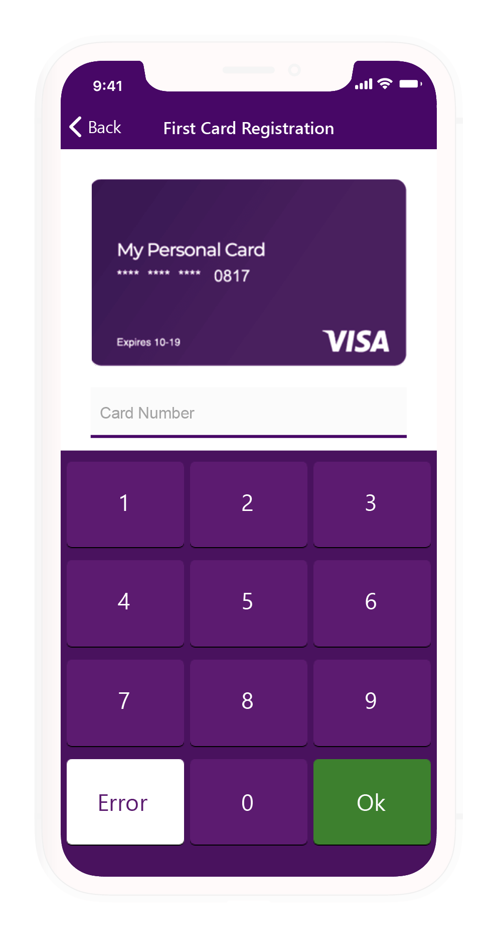
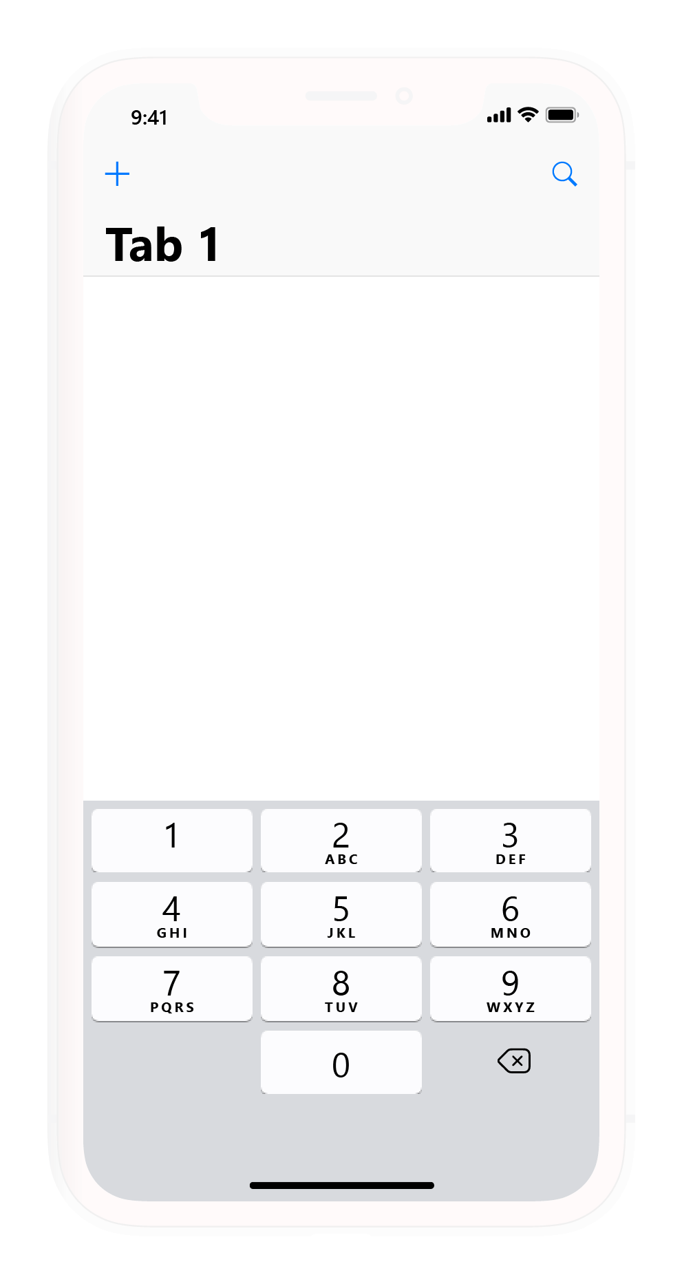
- The keypad used for numerical data entry is the default system keypad with a different skin. Customizing the keypad will allow the application to spread and change the coordinate points of the keypad dials. This prevents malicious software or trackers from listening in and being able to detect what the user's code numbers are.
Design Proposal
Colours
Existing Brand Colours
The following are the colours currently used by Byblos Bank (the bank deploying the application being studied).
Proposed Colour Palette
Staying in line with the colour choices established by the colours chosen by the parent bank, the following colours have been chosen to create a colour palette that works at further emphasising the brand identity of the application.
Typefaces
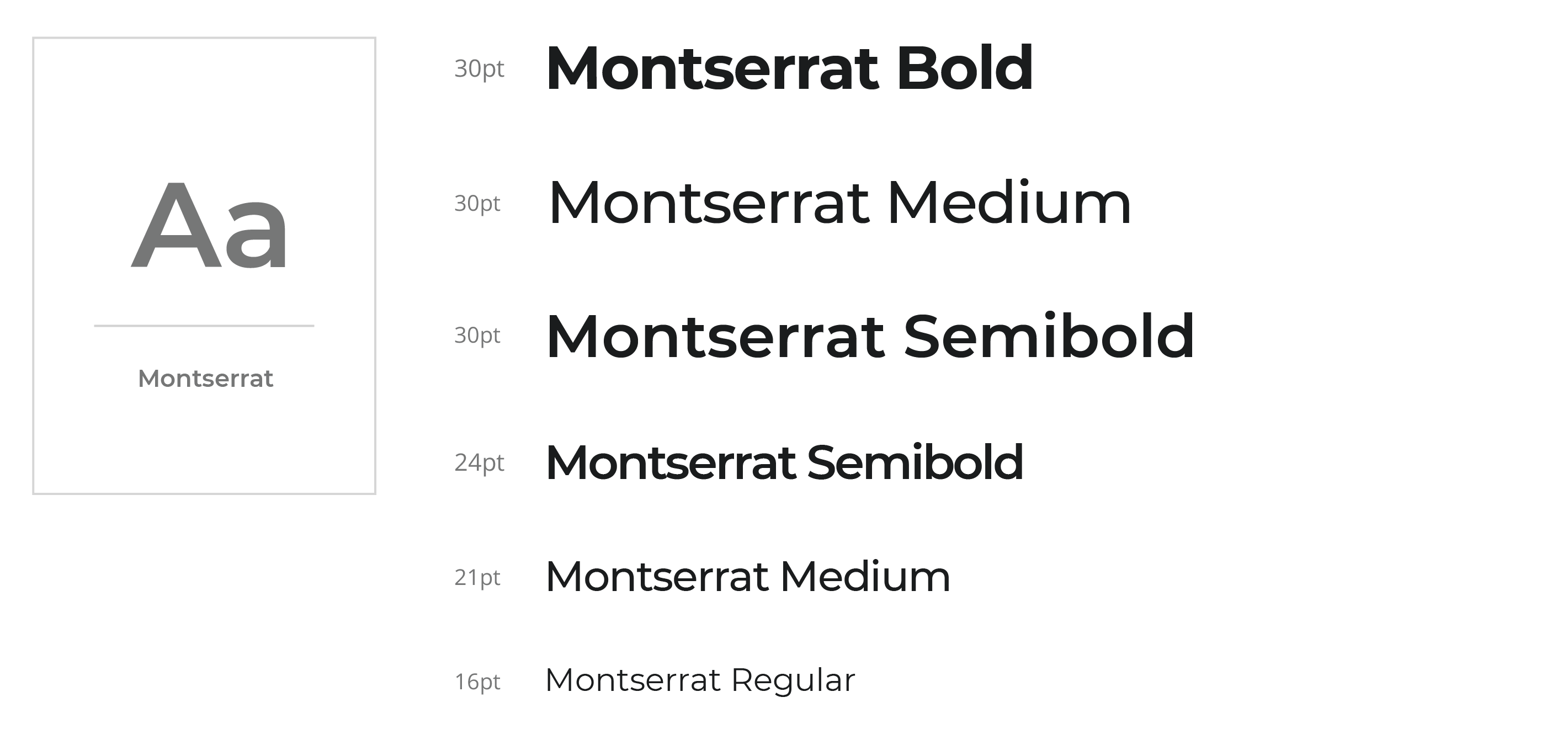
Any text that is used as a title, or overlayed or as an accent over an image will have the font family "Montserrat" ascribed to it.
All primary or body text will have the font family "Arial" ascribed to it.
Forms
Forms as they would appear in their unfocused, and focused states. The form fields shall autofocus upon loading.
Navigation Design
Tab Navigation
The current menu is a Hamburger Menu. Hamburger Menus are known for being terrible for navigation purposes from a UX perspective since they hide important content.
Judging how this is a very specialized app, I proposed that the navigation take place using tabs to allow for easy, quick navigation without leaving the user guessing "Can I do this?".
FAQ, Tutorial, and About are best grouped into Help. The FAQ is too vague a term for most users, "Tutorial" and "FAQ" are forms of Help, and it's common practice for many applications to put "About" under Help. The following are the new proposed menu items:
Existing Hamburger Menu
- Manage Card
- Security Setting
- FAQ
- Tutorial
- About
Proposed Tab Menu
- Add card
- Manage Card
- Transaction History
- Security Settings
- Help
Top Navigation Bar
Keypad
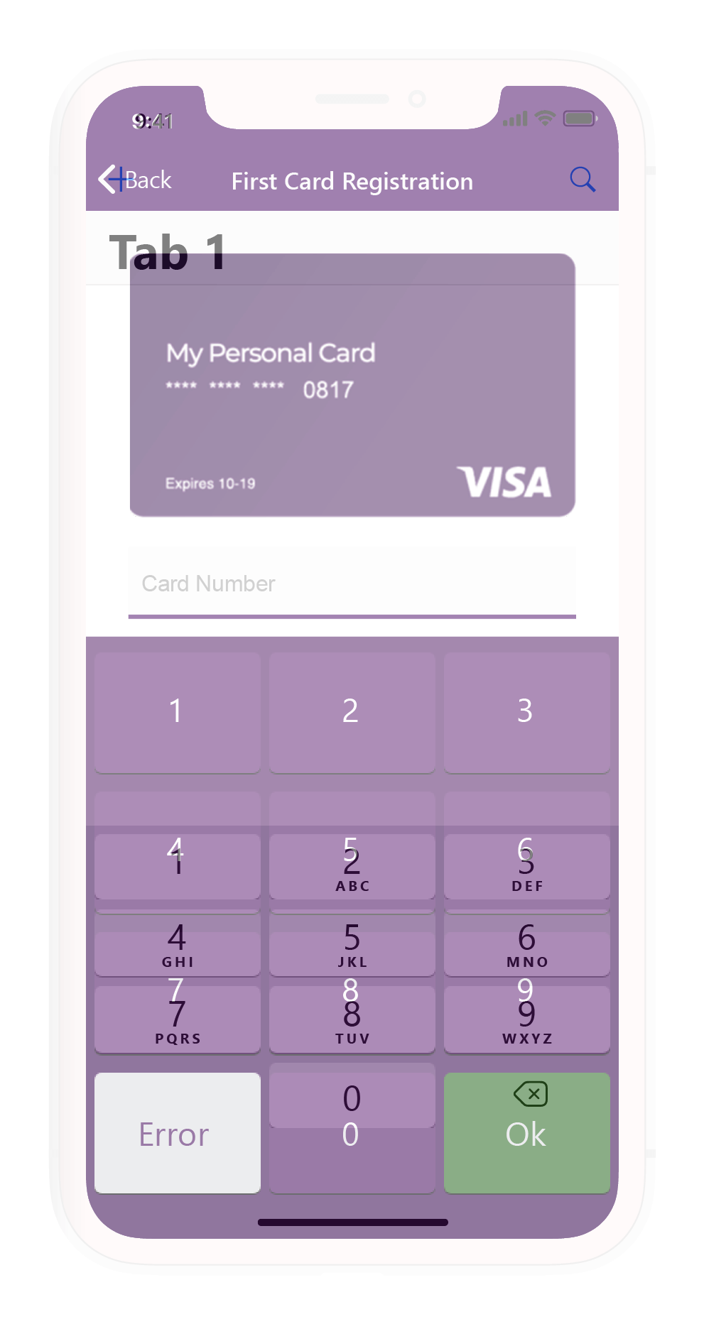
A customized keypad with X, Y co-ordinates spread out to reduce the chance of malicious apps and code from listening in to the device and predicting what the user's PIN might be.
Prototype
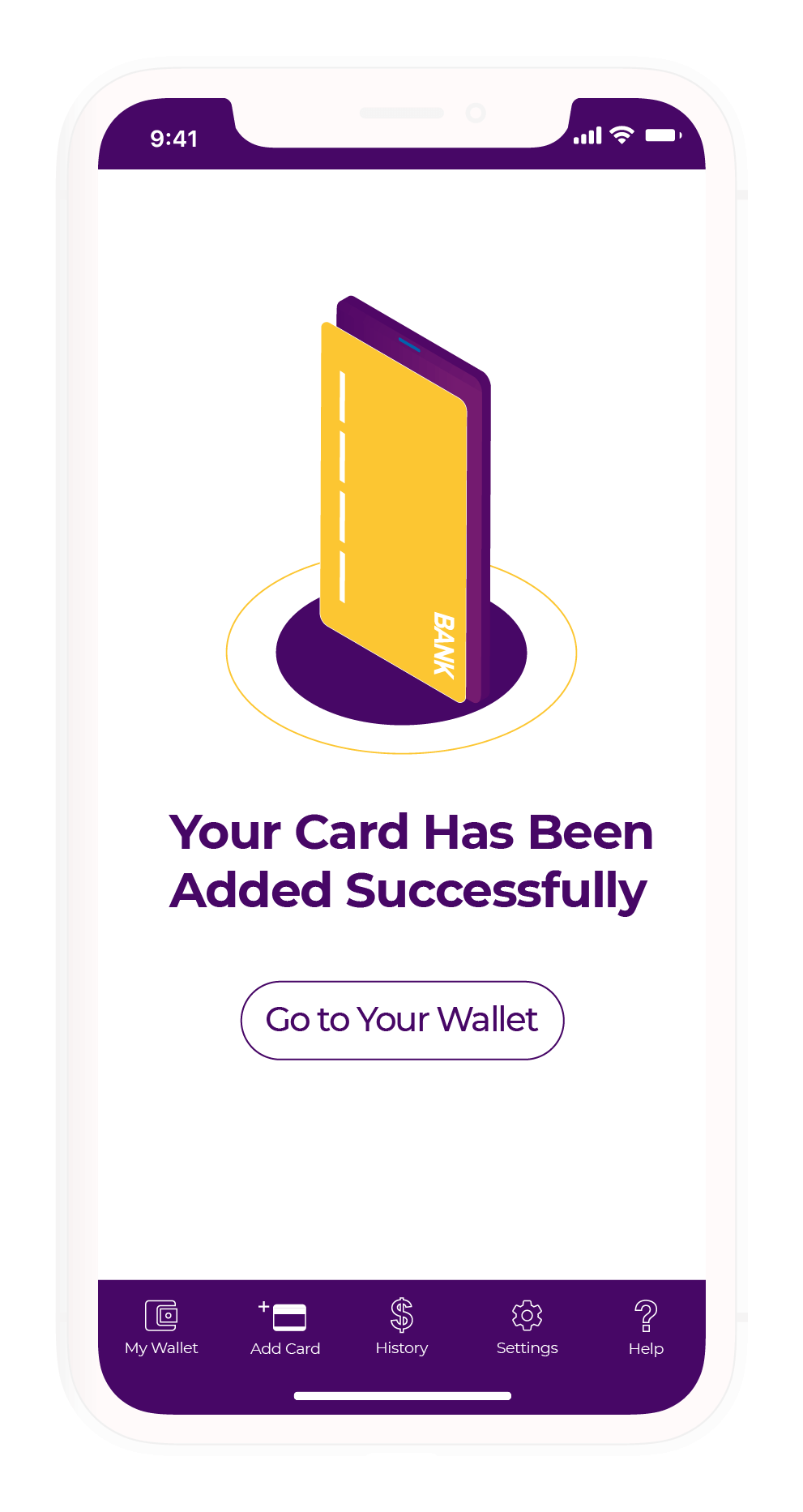
First Launch
Transactions
Payment Process
Final Thoughts
This project was a design charade that taught me a lot more than I expected. Looking back, I believe the main lesson this project taught me is that a smooth user flow is not necessarily the best user flow. Of course, this all depends on the context, but in the context of an application that involves money, that extra layer of privacy and friction allows for a better, safer, and far more trustworthy user experience. A smooth experience is great, but you don't want it to be too smooth that your money is gone before you even know it.
